Themes
In Avalonia, themes are complete sets of control themes and theme resources for built-in controls.
Official themes
Avalonia provides two built-in themes:
Fluent theme
- Fluent Theme is a modern theme inspired by Microsoft's Fluent Design System.
Simple theme
- Simple Theme is a minimal and lightweight theme with limited built-in styling.
Community themes
Community-developed themes in varying stages of development are also available.
Material.Avalonia
- Material.Avalonia is a modern theme inspired by Google's Material Design System.
Semi.Avalonia
- Semi.Avalonia is inspired by Semi Design
Classic.Avalonia
- Classic.Avalonia is a classic theme inspired by the design of Windows 9x family.
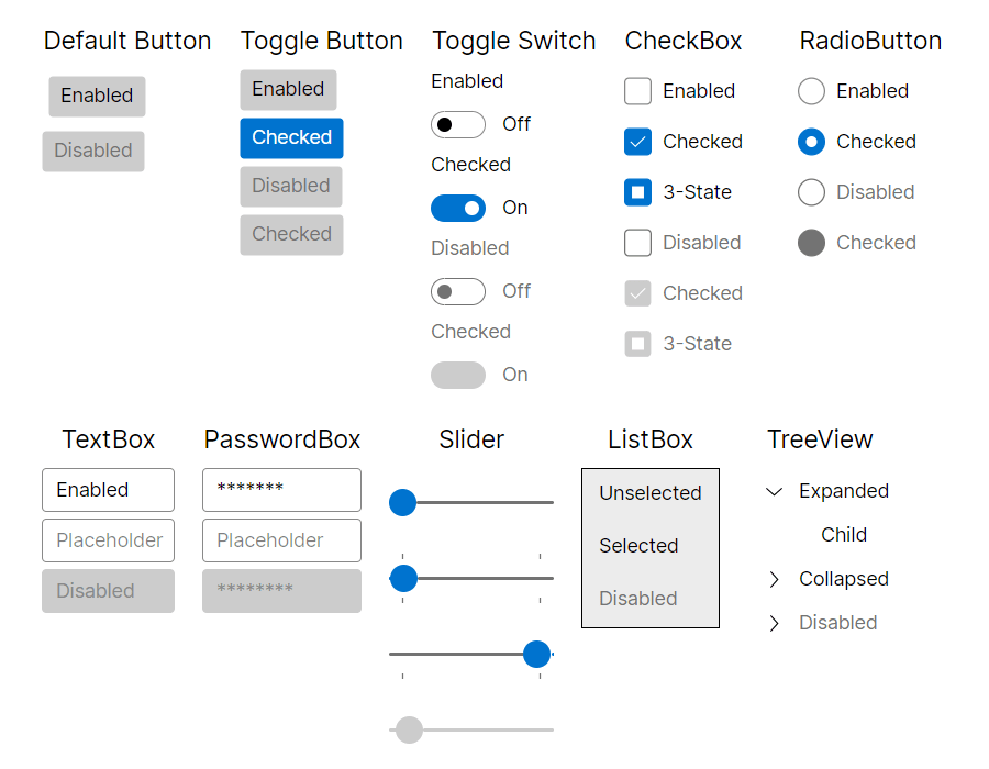
Fluent
The Avalonia Fluent theme is inspired by Microsoft's Fluent Design System, a set of design guidelines and components for creating visually appealing and interactive user interfaces. The Fluent Design System emphasizes modern, clean aesthetics, smooth animations, and intuitive interactions. It provides a consistent and polished look-and-feel across different platforms, while giving developers flexibility with the Avalonia styling system.
How to use
First, install the Avalonia.Themes.Fluent NuGet package.
For help adding a NuGet package, see the Visual Studio or Rider documentation.
Then include the theme in the Application class:
<Application xmlns="https://github.com/avaloniaui"
             xmlns:x="http://schemas.microsoft.com/winfx/2006/xaml"
             x:Class="AvaloniaApplication.App">
  <Application.Styles>
    <FluentTheme />
  </Application.Styles>
</Application>
If you need to specify a dark or light theme variant, see Theme variants.
Changing theme density
The Fluent theme has two sets of predefined density variants.
To switch to a more compact look, set the DensityStyle property:
<Application xmlns="https://github.com/avaloniaui"
             xmlns:x="http://schemas.microsoft.com/winfx/2006/xaml"
             x:Class="AvaloniaApplication.App">
  <Application.Styles>
    <FluentTheme DensityStyle="Compact" />
  </Application.Styles>
</Application>
Creating custom color palettes
While FluentTheme has built-in resources for dark and light variants, you can override the base palette for these variants.
This is useful when you want to use the same base theme but with different colors.
To do so, define custom ColorPaletteResources for each variant:
<Application xmlns="https://github.com/avaloniaui"
             xmlns:x="http://schemas.microsoft.com/winfx/2006/xaml"
             x:Class="AvaloniaApplication.App">
  <Application.Styles>
    <FluentTheme>
      <FluentTheme.Palettes>
        <!-- Palette for Light theme variant -->
        <ColorPaletteResources x:Key="Light" Accent="Green" RegionColor="White" ErrorText="Red" />
        <!-- Palette for Dark theme variant -->
        <ColorPaletteResources x:Key="Dark" Accent="DarkGreen" RegionColor="Black" ErrorText="Yellow" />
      </FluentTheme.Palettes>
    </FluentTheme>
  </Application.Styles>
</Application>
ColorPaletteResources has many color properties that can be overridden independently for each variant. You only need to redefine the properties you want to change; everything else keeps its default value. In the example above, only a few colors are overridden.
If Accent is not overridden, Avalonia uses the platform OS accent color when available.
Accent supports bindings and can be changed at runtime. Other palette properties are read once at startup and used statically for performance reasons.
You can also build palettes from code-behind, but the same rules apply: only Accent can be updated dynamically.
FluentTheme supports only Dark and Light theme variants, and it's not possible to define palettes for custom variants.
Creating custom color palettes with online editor
The Microsoft Fluent Theme Editor has been ported to Avalonia and is available for use with FluentTheme.
The Avalonia Theme Editor supports the following features:
- Editing palette colors for both Light and Dark variants.
- Previewing of the current palette.
- Exporting current palettes as XAML code that can be copied into your
App.axamlfile. - Saving current colors in a json file and loading it from the file system.
- Automatic hints when a palette has low contrast between colors.
- Quick-start presets.
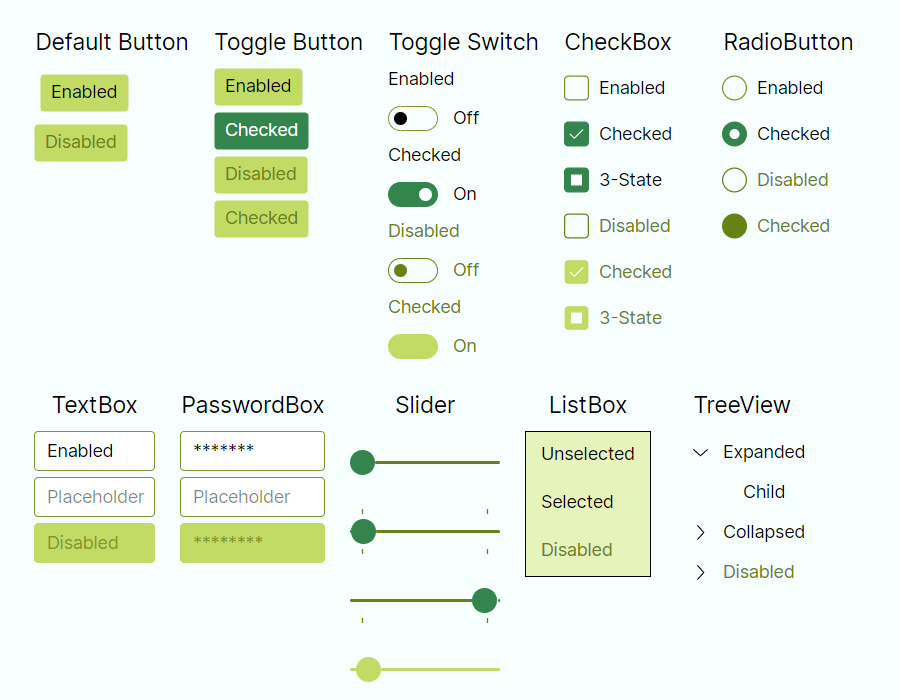
Example of FluentTheme with a Forest palette preset available on the web app:
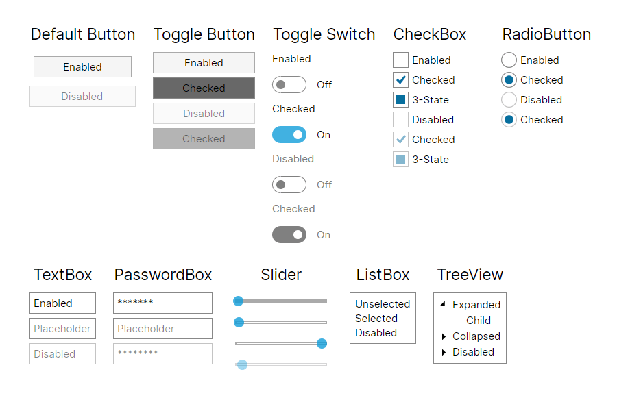
Simple
The Avalonia Simple theme is designed to be minimal and lightweight, with limited built-in styling. It provides a clean foundation for building custom styles on top. Its low visual and structural complexity makes it a good choice for applications running on embedded devices.
How to use
First, install the Avalonia.Themes.Simple NuGet package.
For help adding a NuGet package, see the Visual Studio or Rider documentation.
Then include the theme in the Application class:
<Application xmlns="https://github.com/avaloniaui"
             xmlns:x="http://schemas.microsoft.com/winfx/2006/xaml"
             x:Class="AvaloniaApplication.App">
  <Application.Styles>
    <SimpleTheme />
  </Application.Styles>
</Application>
If you need to specify a dark or light theme variant, see Theme variants.