CheckBox
The CheckBox control presents a Boolean value where the true value is represented using a check mark, and the false value is an empty box. You can also enable three-state mode, where a null value represents "unknown" and is drawn as a shaded box.
Clicking the control toggles the value in the sequence: checked, unchecked, unknown (if three-state is enabled).
Useful properties
You will probably use these properties most often:
| Property | Type | Description |
|---|---|---|
IsChecked | bool? | Gets or sets the checked state. true for checked, false for unchecked, null for indeterminate. |
IsThreeState | bool | When true, the control cycles through three states: checked, unchecked, and indeterminate. |
Content | object | The label content displayed beside the check mark. |
Command | ICommand | A command invoked when the user toggles the check box. |
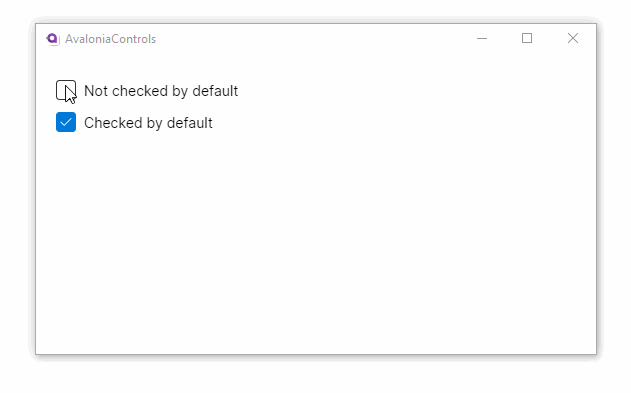
Two-state example
In the default two-state mode, IsChecked alternates between true and false:
- XAML
<UserControl xmlns="https://github.com/avaloniaui">
    <StackPanel Margin="20">
        <CheckBox>Not checked by default</CheckBox>
        <CheckBox IsChecked="True">Checked by default</CheckBox>
    </StackPanel>
</UserControl>
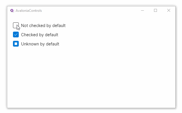
Three-state example
When you set IsThreeState to true, the control adds an indeterminate state. You can set IsChecked to {x:Null} to start in the indeterminate state:
- XAML
<UserControl xmlns="https://github.com/avaloniaui"
             xmlns:x="http://schemas.microsoft.com/winfx/2006/xaml">
    <StackPanel Margin="20">
        <CheckBox IsThreeState="True" IsChecked="False">Not checked by default</CheckBox>
        <CheckBox IsThreeState="True" IsChecked="True">Checked by default</CheckBox>
        <CheckBox IsThreeState="True" IsChecked="{x:Null}">Unknown by default</CheckBox>
    </StackPanel>
</UserControl>
When binding a three-state CheckBox to a view model, use a nullable bool? property so the indeterminate state can round-trip correctly.
Binding to a view model
Bind IsChecked to a bool property on your view model. The following example uses the MVVM Toolkit's source generators:
public partial class SettingsViewModel : ObservableObject
{
    [ObservableProperty]
    private bool _autoSave = true;

    [ObservableProperty]
    private bool _showLineNumbers;
}
<StackPanel Spacing="8">
    <CheckBox IsChecked="{Binding AutoSave}" Content="Auto-save on exit" />
    <CheckBox IsChecked="{Binding ShowLineNumbers}" Content="Show line numbers" />
</StackPanel>
If you need to react when the value changes, subscribe to the PropertyChanged event or use a partial method such as OnAutoSaveChanged.
CheckBox list from a collection
You can create a list of checkable items by combining an ItemsControl with a CheckBox inside the item template:
<ItemsControl ItemsSource="{Binding Features}">
    <ItemsControl.ItemTemplate>
        <DataTemplate>
            <CheckBox IsChecked="{Binding IsEnabled}" Content="{Binding Name}" />
        </DataTemplate>
    </ItemsControl.ItemTemplate>
</ItemsControl>
Select all pattern
A three-state CheckBox works well as a "select all" control. Set it to indeterminate when only some child items are selected, and update the children when the user clicks it:
[ObservableProperty]
private bool? _selectAll = false;

partial void OnSelectAllChanged(bool? value)
{
    if (value.HasValue)
    {
        foreach (var item in Items)
            item.IsSelected = value.Value;
    }
}
<StackPanel Spacing="4">
    <CheckBox IsThreeState="True"
              IsChecked="{Binding SelectAll}"
              Content="Select all" />
    <ItemsControl ItemsSource="{Binding Items}" Margin="24,0,0,0">
        <ItemsControl.ItemTemplate>
            <DataTemplate>
                <CheckBox IsChecked="{Binding IsSelected}" Content="{Binding Name}" />
            </DataTemplate>
        </ItemsControl.ItemTemplate>
    </ItemsControl>
</StackPanel>