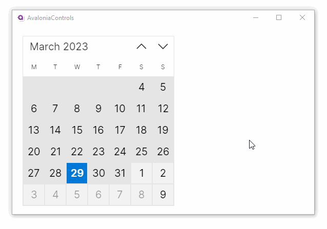
Calendar
The calendar is a control for users to select dates or date ranges.
Useful properties
You will probably use these properties most often:
| Property | Description |
|---|---|
SelectionMode | Indicates what kind of selections are allowed. Choose from: single date, single range, multiple ranges and none. |
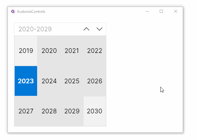
DisplayMode | Defines where the calendar starts in its drill-down levels. Choose from: decade, year and month (default). |
SelectedDate | The currently selected date. |
SelectedDates | A collection of selected dates, includes the dates in single and multiple ranges. |
DisplayDate | The date to display when the control first shows. |
DisplayDateStart | The first date to be displayed. |
DisplayDateEnd | The last date to be displayed. |
BlackoutDates | A collection of dates that are displayed as unavailable, and cannot be selected. |
AllowTapRangeSelection | When true (the default), allows selecting a date range by tapping a start date and then tapping an end date. Works in SingleRange and MultipleRange selection modes. |
Examples
This is a basic calendar allowing a single date selection. The calendar's selected date is shown in the text block below.
<StackPanel Margin="20">
  <Calendar SelectionMode="SingleDate"/>
  <TextBlock Margin="20"
             Text="{Binding #calendar.SelectedDate}"/>
</StackPanel>
This example allows multiple range selections:
  <StackPanel Margin="20">
    <Calendar SelectionMode="MultipleRange"/>
  </StackPanel>
To select a range, tap or click a start date and then tap or click on the end date. This tap-to-select behavior is controlled by the AllowTapRangeSelection property, which is enabled by default. Alternatively, hold the Shift key and click on the end date to extend a range. You can add extra dates and ranges by holding the Ctrl key and clicking on other dates.
This example has custom start and end dates, and some dates unavailable. This uses C# code behind the window.
<UserControl xmlns="https://github.org/avaloniaui">
<StackPanel Margin="20">
  <Calendar x:Name="calendar" SelectionMode="SingleDate"/>
</StackPanel>
</UserControl>
public partial class MainWindow : Window
{
    public MainWindow()
    {
        InitializeComponent();
        var today = DateTime.Today;
        calendar.DisplayDateStart = today.AddDays(-25);
        calendar.DisplayDateEnd = today.AddDays(25);
        calendar.BlackoutDates.Add(
            new CalendarDateRange( today.AddDays(5), today.AddDays(10)));
    }
}