Slider
The Slider control presents a numeric value as the relative position of a slider thumb along the length of a track. The position is relative to the Maximum and Minimum values you configure.
You can change the value by dragging the thumb, clicking on the track, using the arrow keys, or scrolling the mouse wheel. The slider is useful whenever you want to let users pick a value from a continuous or stepped range, such as volume, brightness, or zoom level.
Useful properties
You will probably use these properties most often:
| Property | Type | Description |
|---|---|---|
Minimum | double | Sets the lower bound of the range. Default is 0. |
Maximum | double | Sets the upper bound of the range. Default is 100. |
Value | double | Gets or sets the current slider value. |
SmallChange | double | The amount the value changes per arrow-key press. Default is 1. |
LargeChange | double | The amount the value changes per track click or Page key press. Default is 10. |
Orientation | Orientation | Horizontal (default) or Vertical. |
Example
In this example the slider value is displayed in the text block above it, using binding to a control.
To review how to bind one control to another, see the guide Binding to controls.
Here the maximum and minimum values are left at their defaults (0 and 100 respectively).
- XAML
<StackPanel xmlns="https://github.com/avaloniaui"
            xmlns:x="http://schemas.microsoft.com/winfx/2006/xaml"
            Margin="20">
  <TextBlock Text="{Binding #slider.Value}"
              HorizontalAlignment="Center"/>
  <Slider x:Name="slider" />
</StackPanel>
Tick marks and snapping
Use TickFrequency and IsSnapToTickEnabled to restrict the slider to discrete steps. This is helpful when you want users to pick from evenly spaced values rather than any point along the range.
<Slider Minimum="0" Maximum="100"
        TickFrequency="10"
        IsSnapToTickEnabled="True"
        TickPlacement="BottomRight" />
The TickPlacement property controls where tick marks appear relative to the track:
| Value | Description |
|---|---|
None | No tick marks are shown (default). |
TopLeft | Tick marks appear above a horizontal slider or to the left of a vertical slider. |
BottomRight | Tick marks appear below a horizontal slider or to the right of a vertical slider. |
Outside | Tick marks appear on both sides of the track. |
Vertical slider
Set the Orientation property to Vertical to render the slider vertically. When you use a vertical slider, make sure you give it an explicit Height so it has room to display.
<Slider Orientation="Vertical" Height="200"
        Minimum="0" Maximum="100" Value="30" />
Reversing the direction
Set IsDirectionReversed to True if you want the maximum value at the left (or bottom for vertical sliders) instead of the right (or top).
<Slider Minimum="0" Maximum="100"
        IsDirectionReversed="True" />
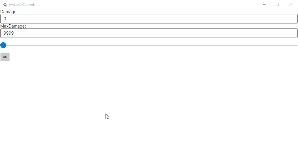
Binding to a view model
You can bind Value, Minimum, and Maximum to properties on your view model. The following example uses the MVVM Community Toolkit source generators:
<Slider Maximum="{Binding MaxDamage}" Value="{Binding Damage}" />
[ObservableProperty]
private double _damage;

[ObservableProperty]
private double _maxDamage = 9999;
All properties
| Property | Type | Description |
|---|---|---|
Minimum | double | Lower bound of the range. Default is 0. |
Maximum | double | Upper bound of the range. Default is 100. |
Value | double | Current slider value. |
SmallChange | double | Value change per arrow-key press. Default is 1. |
LargeChange | double | Value change per track click or Page key press. Default is 10. |
TickFrequency | double | Interval between tick marks. |
IsSnapToTickEnabled | bool | When true, the thumb snaps to the nearest tick. Default is false. |
TickPlacement | TickPlacement | Where to show tick marks: None, TopLeft, BottomRight, or Outside. |
Orientation | Orientation | Horizontal (default) or Vertical. |
IsDirectionReversed | bool | When true, reverses the increasing-value direction. Default is false. |