ComboBox
ComboBox presents a selected item with a dropdown button that displays a list of options. The length and height of the combo box are determined by the selected item, unless you define them explicitly.
You can compose, bind or template the items in the list. To review data templates, see Introduction to data templates.
Useful properties
You will probably use these properties most often:
| Property | Type | Description |
|---|---|---|
ItemsSource | IEnumerable? | The bound collection that is used as the data source for the control. Inherited from ItemsControl. |
SelectedIndex | int | The index (zero-based) of the selected item. |
SelectedItem | object? | The selected item itself. |
SelectedValue | object? | The value of the selected item, determined by SelectedValueBinding. |
IsEditable | bool | Enables text editing, allowing you to type into the combo box to filter or enter custom values. |
Text | string? | Gets or sets the text value when IsEditable is true. |
PlaceholderText | string? | Text shown when no item is selected. |
AutoScrollToSelectedItem | bool | Indicates whether to automatically scroll to newly selected items. |
IsDropDownOpen | bool | Indicates whether the dropdown is currently open. |
MaxDropDownHeight | double | The maximum height for the dropdown list. This is the actual height of the list part, not the number of items that show. |
ItemsPanel | ITemplate<Panel> | The container panel to place items in. By default, this is a StackPanel. See this page to customise the ItemsPanel. |
Practical notes
- Always set
SelectedIndexorSelectedItemto an initial value when you want the control to display a selection on load. If neither is set and you have not specifiedPlaceholderText, the control appears blank. - When you bind
ItemsSourceto a collection of complex objects, provide anItemTemplateso the control knows how to render each item. Without a template, the control callsToString()on each object. - Use
PlaceholderTextto give your users a hint when nothing is selected yet. (e.g., "Select an option...") - If you need to clear the selection programmatically, set
SelectedIndexto-1orSelectedItemtonull. - The
SelectionChangedevent fires whenever the selected item changes. Use this to run side-effect logic outside the view model.
Examples
Basic example
A basic list of text items. The dropdown list is fixed at a limited height.
- XAML
<StackPanel xmlns="https://github.com/avaloniaui"
             Margin="20">
  <ComboBox SelectedIndex="0" MaxDropDownHeight="100">
    <ComboBoxItem>Text Item 1</ComboBoxItem>
    <ComboBoxItem>Text Item 2</ComboBoxItem>
    <ComboBoxItem>Text Item 3</ComboBoxItem>
    <ComboBoxItem>Text Item 4</ComboBoxItem>
    <ComboBoxItem>Text Item 5</ComboBoxItem>
    <ComboBoxItem>Text Item 6</ComboBoxItem>
    <ComboBoxItem>Text Item 7</ComboBoxItem>
    <ComboBoxItem>Text Item 8</ComboBoxItem>
    <ComboBoxItem>Text Item 9</ComboBoxItem>
  </ComboBox>
</StackPanel>
Composed view
This combo box has a dropdown list that displays text overlaid on colored discs.
- XAML
<StackPanel xmlns="https://github.com/avaloniaui"
            Margin="20">
  <ComboBox SelectedIndex="0">
    <ComboBoxItem>
      <Panel>
        <Ellipse Width="50" Height="50" Fill="Red"/>
        <TextBlock VerticalAlignment="Center"
                   HorizontalAlignment="Center">Red</TextBlock>
      </Panel>
    </ComboBoxItem>
    <ComboBoxItem>
        <Panel>
          <Ellipse Width="50" Height="50" Fill="Orange"/>
          <TextBlock VerticalAlignment="Center"
                       HorizontalAlignment="Center">Amber</TextBlock>
        </Panel>
    </ComboBoxItem>
    <ComboBoxItem>
      <Panel>
        <Ellipse Width="50" Height="50" Fill="Green"/>
        <TextBlock VerticalAlignment="Center"
                   HorizontalAlignment="Center">Green</TextBlock>
        </Panel>
    </ComboBoxItem>
  </ComboBox>
</StackPanel>
Binding to a data template
This example binds the items in the combo box using a data template. The C# code-behind loads the installed font family names and binds them to the ItemsSource property.
- MainWindow.axaml
- MainWindow.axaml.cs
- Preview
<StackPanel Margin="20">
    <ComboBox x:Name="fontComboBox"
              SelectedIndex="0"
              Width="200" MaxDropDownHeight="300"
              ItemsSource="{Binding FontFamilies}"
              SelectedValue="{Binding SelectedFont}">
        <ComboBox.ItemTemplate>
            <DataTemplate x:DataType="FontFamily">
                <TextBlock Text="{Binding Name}" FontFamily="{Binding}" />
            </DataTemplate>
        </ComboBox.ItemTemplate>
    </ComboBox>
</StackPanel>
using Avalonia.Controls;
using Avalonia.Media;
using Avalonia.Media.Fonts;
using System.Collections.Generic;
using System.Linq;

namespace TmpAvaloniaApp;

public partial class MainWindow : Window

{
    public MainWindow()
    {
        InitializeComponent();
        IFontCollection fontCollection = FontManager.Current.SystemFonts;
        FontFamilies = new List<FontFamily>(fontCollection).OrderBy(x=>x.Name).ToList();
        DataContext = this;
    }

    public FontFamily? SelectedFont { get; set; }

    public List<FontFamily> FontFamilies { get; set; }

}
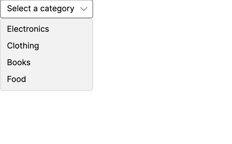
Binding to a view model
Bind ItemsSource, SelectedItem, and use an ItemTemplate.
- MainWindow.axaml
- MainWindowViewModel.cs
- Preview
<ComboBox ItemsSource="{Binding Categories}"
          SelectedItem="{Binding SelectedCategory}"
          PlaceholderText="Select a category" />
using System.Collections.ObjectModel;
using CommunityToolkit.Mvvm.ComponentModel;

public partial class MainWindowViewModel : ViewModelBase
{
    public ObservableCollection<string> Categories { get; } = new()
    {
        "Electronics", "Clothing", "Books", "Food"
    };

    [ObservableProperty]
    private string? _selectedCategory;
}
Editable combo box
Set IsEditable to true to allow text to be typed in the combo box. As you type, the control searches the items for a match and updates SelectedItem accordingly. The Text property holds the current text value.
<ComboBox IsEditable="True"
          Text="{Binding SearchText}"
          ItemsSource="{Binding Countries}"
          SelectedItem="{Binding SelectedCountry}"
          PlaceholderText="Type a country..." />
Searching for complex data objects
When items are complex objects, use TextSearch.TextBinding to specify which property the editable text should match against.
<ComboBox IsEditable="True"
          ItemsSource="{Binding People}"
          SelectedItem="{Binding SelectedPerson}"
          TextSearch.TextBinding="{Binding FullName}">
    <ComboBox.ItemTemplate>
        <DataTemplate>
            <TextBlock Text="{Binding FullName}" />
        </DataTemplate>
    </ComboBox.ItemTemplate>
</ComboBox>