ComboBox 组合框
组合框展示了一个选定的元素和一个下拉按钮,该按钮显示一个选项列表。组合框的长度和高度由选定的元素决定,除非另有定义。
列表中的元素可以组合、绑定和模板化。
信息
要�回顾数据模板背后的概念,请查看这里。
常用属性
你可能最常使用这些属性:
| 属性 | 描述 |
|---|---|
Items | 列表项集合。 |
SelectedIndex | 选定元素的索引(从零开始)。 |
SelectedItem | 选定的元素本身。 |
SelectedItems | 在设置为多选模式时,选定多个元素的集合。 |
AutoScrollToSelectedItem | 表示是否自动滚动到新选定的元素。 |
IsDropDownOpen | 表示下拉列表当前是否打开。 |
MaxDropDownHeight | 下拉列表的最大高度。这是列表部分的实际高度,而不是显示的元素数量。 |
示例
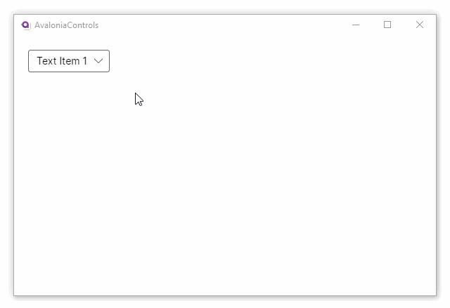
这是最基本的示例,其中对文本项的下拉列表高度设置了限制。
<StackPanel Margin="20">
  <ComboBox SelectedIndex="0" MaxDropDownHeight="100">
    <ComboBoxItem>Text Item 1</ComboBoxItem>
    <ComboBoxItem>Text Item 2</ComboBoxItem>
    <ComboBoxItem>Text Item 3</ComboBoxItem>
    <ComboBoxItem>Text Item 4</ComboBoxItem>
    <ComboBoxItem>Text Item 5</ComboBoxItem>
    <ComboBoxItem>Text Item 6</ComboBoxItem>
    <ComboBoxItem>Text Item 7</ComboBoxItem>
    <ComboBoxItem>Text Item 8</ComboBoxItem>
    <ComboBoxItem>Text Item 9</ComboBoxItem>
  </ComboBox>
</StackPanel>
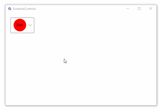
该示例使用组合视图的方式展示元素:
<StackPanel Margin="20">
  <ComboBox SelectedIndex="0">
    <ComboBoxItem>
      <Panel>
        <Ellipse Width="50" Height="50" Fill="Red"/>
        <TextBlock VerticalAlignment="Center"
                    HorizontalAlignment="Center">Red</TextBlock>
      </Panel>
    </ComboBoxItem>
    <ComboBoxItem>
        <Panel>
          <Ellipse Width="50" Height="50" Fill="Orange"/>
          <TextBlock VerticalAlignment="Center"
                      HorizontalAlignment="Center">Amber</TextBlock>
        </Panel>
    </ComboBoxItem>
    <ComboBoxItem>
      <Panel>
        <Ellipse Width="50" Height="50" Fill="Green"/>
        <TextBlock VerticalAlignment="Center"
                    HorizontalAlignment="Center">Green</TextBlock>
      </Panel>
    </ComboBoxItem>
  </ComboBox>
</StackPanel>
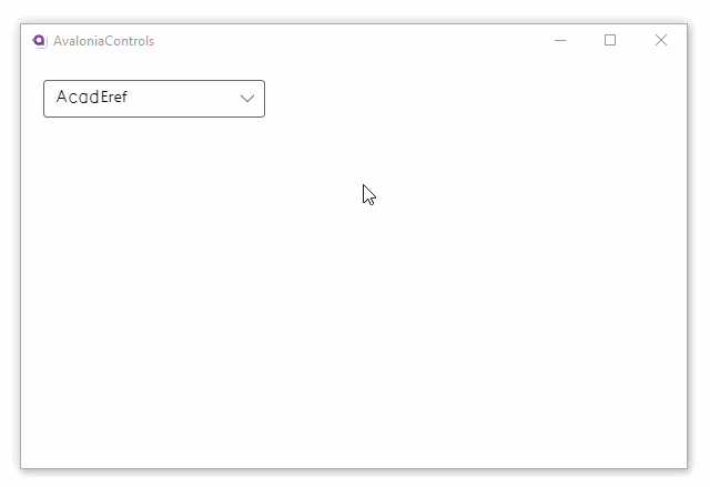
这个示例使用数据模板绑定了组合框中的每一个元素。在 c# code-behind 代码中,我们将加载系统中安装的字体家族名称,并将它们绑定到 ComboBox 的 Items 属性。
<StackPanel Margin="20">
  <ComboBox x:Name="fontComboBox" SelectedIndex="0"
            Width="200" MaxDropDownHeight="300"
            ItemsSource="{Binding FontFamilies}"
            SelectedValue="{Binding SelectedFont}">
    <ComboBox.ItemTemplate>
      <DataTemplate>
        <TextBlock Text="{Binding Name}" FontFamily="{Binding}" />
      </DataTemplate>
    </ComboBox.ItemTemplate>
  </ComboBox>
</StackPanel>
C#
using Avalonia.Controls;
using Avalonia.Media;
using Avalonia.Media.Fonts;
using System.Collections.Generic;
using System.Linq;

namespace TmpAvaloniaApp;

public partial class MainWindow : Window
{
    public MainWindow()
    {
        InitializeComponent();
        IFontCollection fontCollection = FontManager.Current.SystemFonts;
        FontFamilies = new List<FontFamily>(fontCollection).OrderBy(x=>x.Name).ToList();
        DataContext = this;
    }

    public FontFamily? SelectedFont { get; set; }

    public List<FontFamily> FontFamilies { get; set; }
}
更多信息
信息
要查看有关此控件的完整 API 文档,请参见这里。
信息
在 GitHub 上查看源代码 ComboBox.cs