Custom control library
Create a custom control library as a standalone project storing multiple controls. You can then reference the library in any Avalonia app to reuse those custom controls.
Creating a custom control library
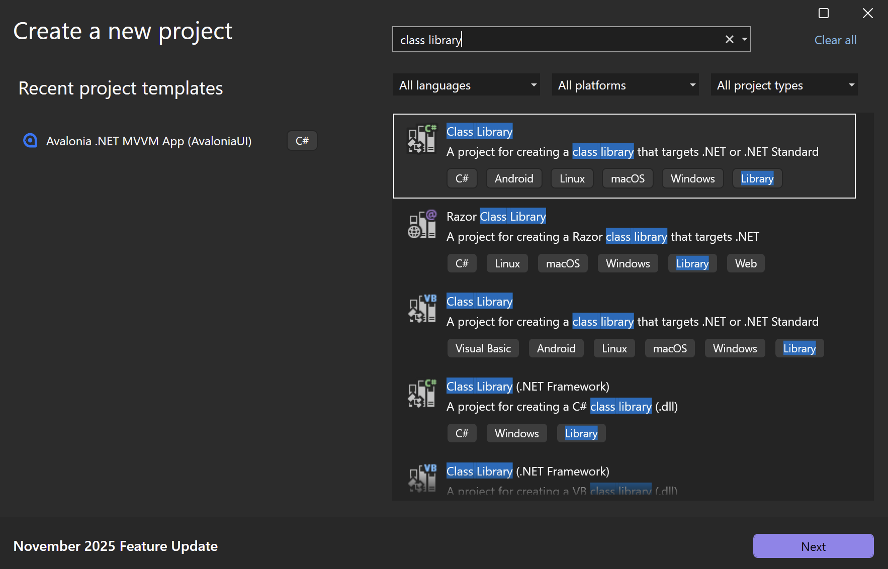
- Start by creating a new class library project. All recommended IDEs (Visual Studio, Visual Studio Code, Jetbrains Rider) have templates for .NET class libraries.
- Install Avalonia in the class library project. You can do this through the NuGet package management tab in your IDE.
Adding custom controls to the class library
A control library can contain as many controls as you wish and can mix all three types of custom control.
The examples below show a class library named CCLibrary, to which we will add the custom controls ConfirmationView, ToggleLabel and CircleControl.
CCLibrary/
├── CCLibrary.csproj
├── ConfirmationView.axaml
    └── ConfirmationView.axaml.cs
├── ToggleLabel.cs
├── CircleControl.cs
└── Themes/
    └── Generic.axaml
Adding a user control
ConfirmationView is a user control designed to be a reusable confirmation dialog. See the UserControl page to learn how to create this control.
To add it to CCLibrary, place both the XAML file (ConfirmationView.axaml) and the code-behind file (ConfirmationView.axaml.cs) into the directory of the control library.
Ensure both files use the namespace of the library project (CCLibrary in this case), not the namespace of the executable project.
- ConfirmationView.axaml
- ConfirmationView.axaml.cs
<UserControl xmlns="https://github.com/avaloniaui"
             xmlns:x="http://schemas.microsoft.com/winfx/2006/xaml"
             x:Class="CCLibrary.ConfirmationView"
             x:Name="root">

  <!-- Control's design and layout -->

</UserControl>
using Avalonia;
using Avalonia.Controls;

namespace CCLibrary;

public partial class ConfirmationView : UserControl
{
    public ConfirmationView()
    {
        InitializeComponent();
    }

    // Control's events, logic, properties, etc.
}
Adding a templated control
ToggleLabel is a custom control that displays a text label. Being a templated control, it has no fixed appearance—this is set in a control theme, which can vary between applications. See the Templated controls page to learn how to create this control.
To add it to CCLibrary, place the ToggleLabel.cs class file into the directory of the control library.
You can also add a default control theme to allow the templated control to be used immediately in the executable project. Like in WPF, the usual convention is to collect control themes in a resource dictionary under a Themes subdirectory. If you are adding multiple templated controls, each will require a separate control theme.
Like the previous example, both files must use the namespace of the class library project (CCLibrary in this case).
- ToggleLabel.cs
- Themes/Generic.axaml
using Avalonia;
using Avalonia.Controls.Primitives;

namespace CCLibrary;

public class ToggleLabel : TemplatedControl
{
    // Control's events, logic, properties, etc.
}
<ResourceDictionary xmlns="https://github.com/avaloniaui"
                    xmlns:x="http://schemas.microsoft.com/winfx/2006/xaml"
                    xmlns:cc="using:CCLibrary">

  <ControlTheme x:Key="{x:Type cc:ToggleLabel}" TargetType="cc:ToggleLabel">
    <!-- Control's default visual appearance-->
  </ControlTheme>

</ResourceDictionary>
Default control themes in a class library are not applied automatically. Without explicit inclusion of the resource dictionary, the templated control receives no template and does not render. See Using templated controls for more information.
Adding a custom-drawn control
CircleControl is a control that draws an ellipse that is colored with a configurable Fill property. See the Custom-drawn controls page to learn how to create this control. It is a custom-drawn control, meaning it paints itself and requires no control theme.
To add it to CCLibrary, place the single CircleControl.cs class file into the directory of the control library. Like the previous examples, the class file must use the namespace of the class library project (CCLibrary in this case).
using System;
using Avalonia;
using Avalonia.Controls;
using Avalonia.Media;

namespace CCLibrary;

public class CircleControl : Control
{
    // Control's specifications

    public override void Render(DrawingContext context)
    {
        // Control's appearance as drawn by DrawingContext
    }
}
Referencing a custom control library
To use the custom controls in a control library, you must reference the class library project in the executable project.
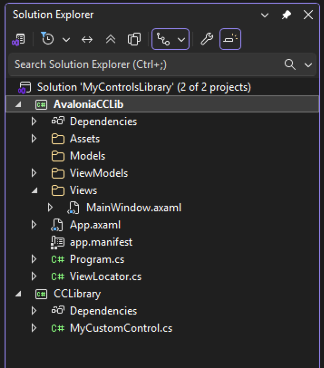
The example below demonstrates how this works using an Avalonia MVVM project named AvaloniaCCLib. This project and CCLibrary, from the section above, are included together in a solution titled MyControlsLibrary.
Adding a project reference
In the project file of the executable project (AvaloniaCCLib.csproj), add a ProjectReference pointing at the directory path of the control library's project file (CCLibrary.csproj).
<ItemGroup>
  <ProjectReference Include="..\MyControlsLibrary\CCLibrary.csproj" />
</ItemGroup>
Adding namespace declarations
To access your custom controls in the executable project, make a namespace declaration in any relevant XAML files. In the example below, cc is chosen as the namespace reference, which allows custom controls from CCLibrary to be used by prefixing with cc:.
<Window xmlns="https://github.com/avaloniaui"
        xmlns:x="http://schemas.microsoft.com/winfx/2006/xaml"
        xmlns:cc="using:CCLibrary"
        x:Class="AvaloniaCCLib.Views.MainWindow"
        Title="AvaloniaCCLib">
Using templated controls
To use a templated control in the executable project, it must have a control template. If no template is available, the control will not render when you run the app.
If you included a default control theme with your templated control, as shown in the ToggleLabel example above, be aware that the default control theme is not applied automatically. You must explicitly merge the resource dictionary containing the control theme into App.axaml of the executable project.
This is done using ResourceInclude, which uses the avares:// URI scheme to locate the resource dictionary file in the class library project. Here is an example using CCLibrary from the sections above.
<Application.Resources>
  <ResourceDictionary>
    <ResourceDictionary.MergedDictionaries>
      <ResourceInclude Source="avares://CCLibrary/Themes/Generic.axaml" />
    </ResourceDictionary.MergedDictionaries>
  </ResourceDictionary>
</Application.Resources>
Using user controls and custom-drawn controls
User controls and custom-drawn controls require no further configuration to use. So long as the control library is referenced in the project, and the appropriate namespace is declared, both can be directly used in XAML.
- ConfirmationView
- CircleControl
<Window xmlns="https://github.com/avaloniaui"
        xmlns:x="http://schemas.microsoft.com/winfx/2006/xaml"
        xmlns:vm="using:AvaloniaCCLib.ViewModels"
        xmlns:cc="using:CCLibrary"
        x:Class="AvaloniaCCLib.Views.MainWindow"
        x:DataType="vm:MainWindowViewModel"
        Title="AvaloniaCCLib">

    <cc:ConfirmationView />

</Window>
<Window xmlns="https://github.com/avaloniaui"
        xmlns:x="http://schemas.microsoft.com/winfx/2006/xaml"
        xmlns:vm="using:AvaloniaCCLib.ViewModels"
        xmlns:cc="using:CCLibrary"
        x:Class="AvaloniaCCLib.Views.MainWindow"
        x:DataType="vm:MainWindowViewModel"
        Title="AvaloniaCCLib">

    <!-- CircleControl from our example has no default width or height.
         These must be set in XAML when adding the control. -->
    <cc:CircleControl Width="100" Height="100" />

</Window>

XML namespace definitions
When referencing a control library in a .axaml file, you can use the URL identification format. For example:
<Window xmlns:cc="https://my.controls.url" />
This requires registration in the AssemblyInfo.cs file of the class library project. Multiple XML namespaces can share the same URL. (Avalonia itself shares the https://github.com/avaloniaui URL between most packages.)
using Avalonia.Metadata;

[assembly: XmlnsDefinition("https://my.controls.url", "My.NameSpace")]
[assembly: XmlnsDefinition("https://my.controls.url", "My.NameSpace.Other")]
The main reason to use the URL format is to share the same namespace identification across multiple assemblies, so that many separate namespaces can be referenced with a single prefix.
In contrast, the using: or clr-namespace: formats work strictly on a one-to-one basis: one namespace, one prefix. However, they require no registration in the assembly info.
For more information on referencing custom classes in XAML, see Referencing your own types.
See also
- Creating custom controls: Overview of the custom control types you can package in a library.
- UserControl: Compose existing controls into a reusable view with XAML and code-behind.
- Custom templated controls: Build a lookless control whose appearance is defined by a control theme.
- Custom-drawn controls: Create a control that draws itself by overriding
Render. - Custom panel: Implement a layout panel by overriding
MeasureOverrideandArrangeOverride. - Defining properties: Add styled, direct, and attached properties to a custom control.
- Resource dictionaries: How merged dictionaries resolve resources across assemblies.