Pointer devices
Avalonia operates on an abstraction called 'pointer devices'. This can represent devices including, but not limited to, mouse, touchpad, and pen.
Controls most often detect and respond to user input. The Avalonia input system uses both direct and routed events to support text input, focus management, and mouse positioning.
Applications often have complex input requirements. Avalonia provides a command system that separates user input actions from the code that responds to those actions.
Controls that implement ICommandSource have a HotKey property. Additionally, controls have events that allow you to subscribe to pointer movements, clicks and wheel movements:
| Event | Description |
|---|---|
PointerEntered | Raised when the pointer moves into a control's bounds. |
PointerExited | Raised when the pointer leaves a control's bounds. |
PointerMoved | Raised when the pointer moves while inside a control's bounds. |
PointerPressed | Raised when a pointer button is pressed over a control. |
PointerReleased | Raised when a previously pressed pointer button is released over a control. |
PointerWheelChanged | Raised when the mouse wheel or trackpad scroll is used over a control. |
Tapped | Raised after a pointer press and release on a control. |
DoubleTapped | Raised after two taps in the same location within the platform's double-tap threshold. |
Holding | Raised when a pointer is pressed and held for a duration defined by PlatformSettings.HoldWaitDuration. |
For example, you can subscribe to the event for one of the pointer buttons being pressed on a control, like this:
private void PointerPressedHandler (object sender, PointerPressedEventArgs args)
{
    var point = args.GetCurrentPoint(sender as Control);
    var x = point.Position.X;
    var y = point.Position.Y;
    var msg = $"Pointer press at {x}, {y} relative to sender.";
    if (point.Properties.IsLeftButtonPressed)
    {
        msg += " Left button pressed.";
    }
    if (point.Properties.IsRightButtonPressed)
    {
        msg += " Right button pressed.";
    }
    results.Text = msg ;
}
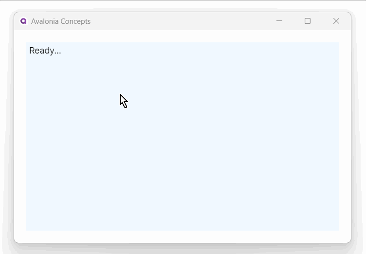
<StackPanel Margin="20" Background="AliceBlue"
            PointerPressed="PointerPressedHandler" >
  <TextBlock x:Name="results" Margin="5">Ready...</TextBlock>
</StackPanel>
Pointer types
Avalonia distinguishes between different input device types through the PointerPoint.Pointer.Type property:
| Type | Description |
|---|---|
Mouse | Standard mouse or trackpad input. |
Touch | Touch screen input. |
Pen | Pen or stylus input (graphics tablets, active pens). |
Pen and stylus properties
When the pointer type is Pen, additional properties are available on PointerPointProperties:
| Property | Type | Description |
|---|---|---|
Pressure | float | Pressure level from 0 (no pressure) to 1 (maximum pressure). |
XTilt | float | Tilt of the pen along the X axis. |
YTilt | float | Tilt of the pen along the Y axis. |
Twist | float | Clockwise rotation of the pen around its own axis. |
IsEraser | bool | true when the pen eraser tip is active. |
IsBarrelButtonPressed | bool | true when the pen barrel button is held. |
private void OnPointerMoved(object? sender, PointerEventArgs e)
{
    var point = e.GetCurrentPoint(this);

    if (point.Pointer.Type == PointerType.Pen)
    {
        var pressure = point.Properties.Pressure;
        var isEraser = point.Properties.IsEraser;
        // Adjust brush size or tool based on pressure and eraser state
    }
}
These properties are available on all platforms that support pen input (Windows, macOS, and Linux with X11).
Pointer position
In the example above, the pointer coordinates (x and y) have been calculated relative to the sender control origin (top, left), in this case the stack panel. If you want the coordinates relative to the containing window, then you can use the GetCurrentPoint method as follows:
var point = args.GetCurrentPoint(this);
Tap events
Controls also have special gesture events, these are: Tapped, DoubleTapped and Holding. The tapped event is raised after the pointer is pressed on the control and then released. Double tapped is raised after pointer is pressed twice in the same place.
Holding is raised after the pointer is pressed for a set duration. The duration to hold for is defined in the HoldWaitDuration property in TopLevel PlatformSettings. Holding can be enabled on a control by setting the InputElement.IsHoldingEnabled attached property. When the hold duration has elapsed, the control's HoldingEvent is raised with the args' HoldingState set to HoldingState.Started. On pointer release, the event is raised again with HoldingState.Completed state. If a new gesture is initiated or a second pointer is pressed while Holding has started, the Holding gesture is cancelled and a HoldingEvent is raised with the HoldingState.Canceled state. Holding can also be initiated using the mouse pointer, by setting the InputElement.IsHoldWithMouseEnabled attached property on the control.
Note that the maximum distance between a first and second tap, and the time delay between them, will depend on the target platform and usually is bigger for touch devices.
Pointer capture
Pointer capture directs all subsequent pointer events to a specific control, even if the pointer moves outside the control's bounds. This is essential for drag operations and slider-like interactions.
protected override void OnPointerPressed(PointerPressedEventArgs e)
{
    base.OnPointerPressed(e);
    e.Pointer.Capture(this);
}

protected override void OnPointerReleased(PointerReleasedEventArgs e)
{
    base.OnPointerReleased(e);
    e.Pointer.Capture(null); // Release capture
}
Only one element can hold pointer capture at a time across the entire application. If a different control captures the pointer, the previous control's capture is released and it receives a PointerCaptureLost event. Handle this event to clean up any in-progress interaction:
protected override void OnPointerCaptureLost(PointerCaptureLostEventArgs e)
{
    base.OnPointerCaptureLost(e);
    _isDragging = false;
}
Cursor management
Setting the cursor on a control
Use the Cursor property to change the cursor when the pointer is over a control:
<Border Cursor="Hand" Background="LightGray" Padding="20">
    <TextBlock Text="Click me" />
</Border>

<Border Cursor="SizeWestEast" Background="LightBlue" Padding="20">
    <TextBlock Text="Resize horizontally" />
</Border>
Common cursor types
| Cursor | Description |
|---|---|
Arrow | Default arrow pointer. |
Hand | Pointing hand (indicates a clickable element). |
IBeam | Text editing cursor. |
Cross | Crosshair. |
SizeWestEast | Horizontal resize. |
SizeNorthSouth | Vertical resize. |
SizeAll | Move/drag in any direction. |
Wait | Busy indicator (hourglass/spinner). |
AppStarting | Arrow with small hourglass. |
No | Not allowed (circle with line). |
None | Hidden cursor. |
Setting the cursor in code
myControl.Cursor = new Cursor(StandardCursorType.Hand);
Changing the cursor during drag operations
private void OnPointerMoved(object? sender, PointerEventArgs e)
{
    if (_isDragging)
    {
        Cursor = new Cursor(StandardCursorType.SizeAll);
    }
}

private void OnPointerReleased(object? sender, PointerReleasedEventArgs e)
{
    _isDragging = false;
    Cursor = Cursor.Default;
}
More information
For the complete API documentation about pointer and tap events, see the PointerEventArgs API reference.
See also
- Gestures: Higher-level gesture events built on pointer events.
- Drag and Drop: Drag-and-drop operations using pointer events.
- Routed Events: How events propagate through the element tree.