添加控件
温度转换器应用程序的第一步是添加一个控件。所谓"控件",是指允许与应用程序交互的界面元素。控件的示例包括按钮、滑块、复选框或菜单。
有关控件的更多信息,请参阅控件参考页面。
插入按钮
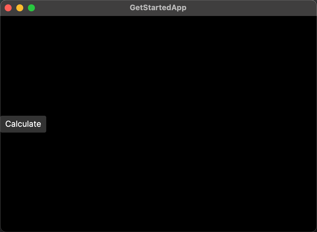
尝试用按钮替换应用程序中的文本。
- 如果应用程序仍在运行,请停止它。
- 在文件 MainWindow.axaml 中,找这一行:
<TextBlock Text="{Binding Greeting}" HorizontalAlignment="Center" VerticalAlignment="Center"/>
- 用以下内容替换整行:
<Button>Calculate</Button>
- 运行应用程序或检查预览器。您现在应该在应用程序窗口中看到一个 Calculate 按钮。
- 您可以尝试将鼠标悬停在按钮上或单击按钮,看看它的外观如何变化。
设置按钮的属性
Avalonia 中的控件使用 XML 属性来指定其呈现和行为。
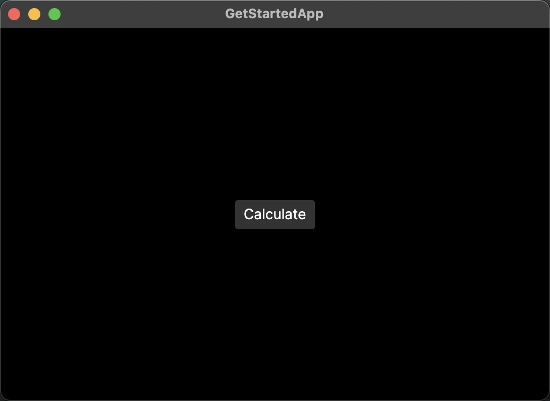
您的 Calculate 按钮目前与窗口的左边缘对齐。这是因为 HorizontalAlignment 属性的默认值是 Left。让我们更改此属性,将按钮放在中心位置。
- 在文件 MainWindow.axaml 中,转到您为按钮添加的那一行:
<Button>Calculate</Button>
- 将
HorizontalAlignment属性添加到<Button>标签中。将其设置为Center。
<Button HorizontalAlignment="Center">Calculate</Button>
- 运行应用程序或检查预览器。您应该看到 Calculate 按钮移动到窗口中心。
在本教程的下一页中,您将学习如何使用布局控件在应用程序添加多个元素。