添加布局
此时,您的温度转换器应用程序在窗口中心有一个按钮。您无法添加更多元素,因为每个 Avalonia 窗口的内容区域只允许一个控件。(稍后会详细介绍布局区域,请参阅下一页:自定义 Avalonia 窗口。)
要在窗口中放置多个界面元素,您必须使用布局控件。
有关布局控件的更多信息,请参阅布局控件页面。
插入堆栈面板
我们可以使用 StackPanel 布局控件在按钮上方放置一些文本。
- 在文件 MainWindow.axaml 中,用
<StackPanel>...</StackPanel>标签包裹您的Button。
<StackPanel>
	<Button>Calculate</Button>
</StackPanel>
- 在 Button 上方添加一个
TextBlock。(您可能还记得默认 MainWindow.axaml 中的TextBlock标签——此控件在窗口中打印文本。)按如下方式设置TextBlock的属性:
Margin="5"FontSize="24"HorizontalAlignment="Center"Text="Temperature Converter"
<StackPanel>
    <TextBlock Margin="5"
               FontSize="24"
               HorizontalAlignment="Center"
               Text="Temperature Converter">
    </TextBlock>

    <Button HorizontalAlignment="Center">Calculate</Button>
</StackPanel>
- 运行应用程序或检查预览器。您应该看到文本 "Temperature Converter" 位于 Calculate 按钮上方。
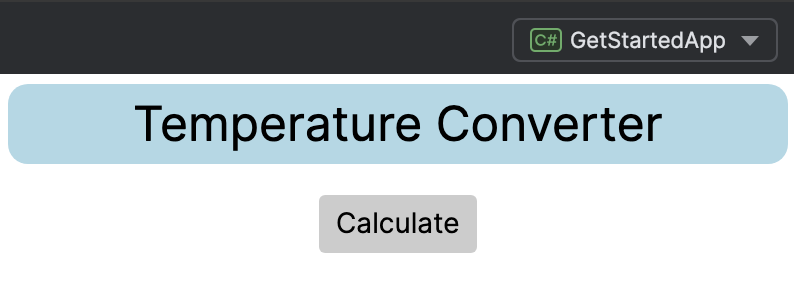
- 用
<Border>...</Border>标签包裹TextBlock。按如下方式设置Border的属性:
Margin="5"CornerRadius="10"Background="LightBlue"
<StackPanel>
    <Border Margin="5" CornerRadius="10" Background="LightBlue">
        <TextBlock Margin="5"
                   FontSize="24"
                   HorizontalAlignment="Center"
                   Text="Temperature Converter">
        </TextBlock>
    </Border>

    <Button HorizontalAlignment="Center">Calculate</Button>
</StackPanel>
- 运行应用程序或检查预览器。您应该看到文本 "Temperature Converter" 现在位于一个圆角蓝色框内。
备注
默认情况下,StackPanel 以垂直堆栈排列元素。您可以将 Orientation 属性设置为 Horizontal 来将其更改为水平排列。
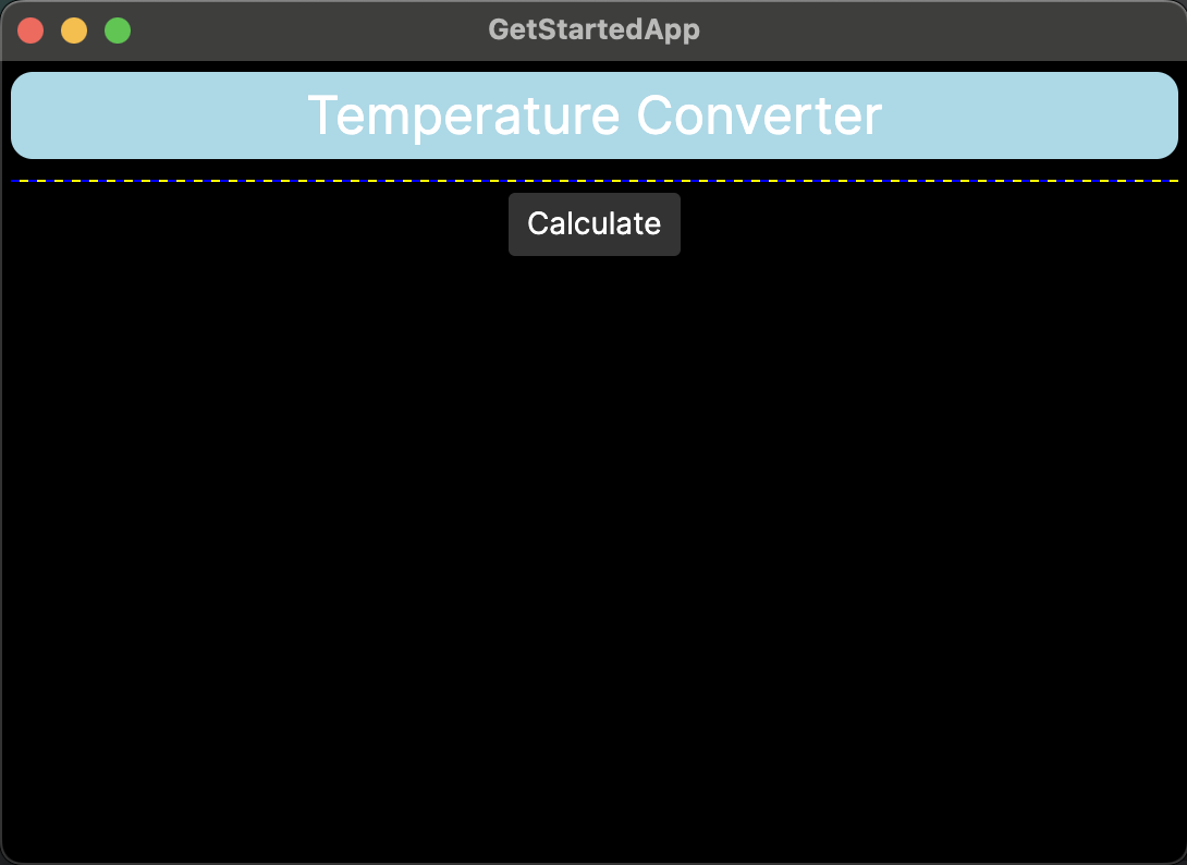
插入网格
接下来,我们在温度转换器应用程序添加一个 Grid 布局控件。Grid 在行和列中创建单元格,您可以在其中放置更多控件。
- 如果应用程序仍在运行,请停止它。
- 在文件 MainWindow.axaml 中,在
</Border>和<Button>之间插入<Grid>...</Grid>标签。
<StackPanel>
    <Border Margin="5" CornerRadius="10" Background="LightBlue">
        <TextBlock Margin="5"
            HorizontalAlignment="Center"
            FontSize="24"
            Text="Temperature Converter">
        </TextBlock>
    </Border>
    <Grid ShowGridLines="True" Margin="5"
          ColumnDefinitions="120, 100"
          RowDefinitions="Auto, Auto">
    </Grid>
    <Button HorizontalAlignment="Center">Calculate</Button>
</StackPanel>
我们为 Grid 指定了一些属性:
- 它有两列和两行。
- 网格线可见。
- 单元格高度自动缩放以匹配内容。因为空单元格的自动高度为零,所以
Grid目前在预览器上显示为一条水平直线。
在网格中插入控件
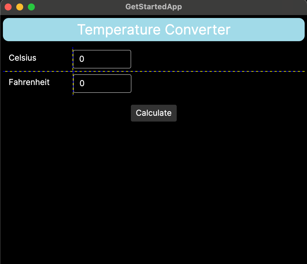
- 在网格的左侧单元格中插入
TextBlock控件,使用Grid.Row和Grid.Column属性来分配目标单元格。用文本 "Celsius" 和 "Fahrenheit" 填充单元格。
备注
Grid 的行或列中的第一个单元格编号为 0。
        <Grid ShowGridLines="True" Margin="5"
              ColumnDefinitions="120, 100"
              RowDefinitions="Auto, Auto">
            <TextBlock Grid.Row="0" Grid.Column="0" Margin="10">Celsius</TextBlock>
            <TextBlock Grid.Row="1" Grid.Column="0" Margin="10">Fahrenheit</TextBlock>
        </Grid>
- 在网格的右侧单元格中插入
TextBox控件,同样使用Grid.Row和Grid.Column属性来分配目标单元格。TextBox是一个创建键盘输入区域的控件。
        <Grid ShowGridLines="True" Margin="5"
              ColumnDefinitions="120, 100"
              RowDefinitions="Auto, Auto">
            <TextBlock Grid.Row="0" Grid.Column="0" Margin="10">Celsius</TextBlock>
            <TextBox Grid.Row="0" Grid.Column="1" Margin="0 5" Text="0"/>
            <TextBlock Grid.Row="1" Grid.Column="0" Margin="10">Fahrenheit</TextBlock>
            <TextBox Grid.Row="1" Grid.Column="1" Margin="0 5" Text="0"/>
        </Grid>
- 运行应用程序或检查预览器。您应该看到文本和输入框已添加到窗口中,位于网格线标记的单元格内。
在本教程的下一页中,您将学习如何调整应用程序窗口的大小。