How to Create and Reference a Custom Control Library
This guide shows you how to create a custom control library and reference it for use in an Avalonia UI app.
Creating a custom control library
Creating a new class library project
To start, you need a class library project in which to collect your custom control files.
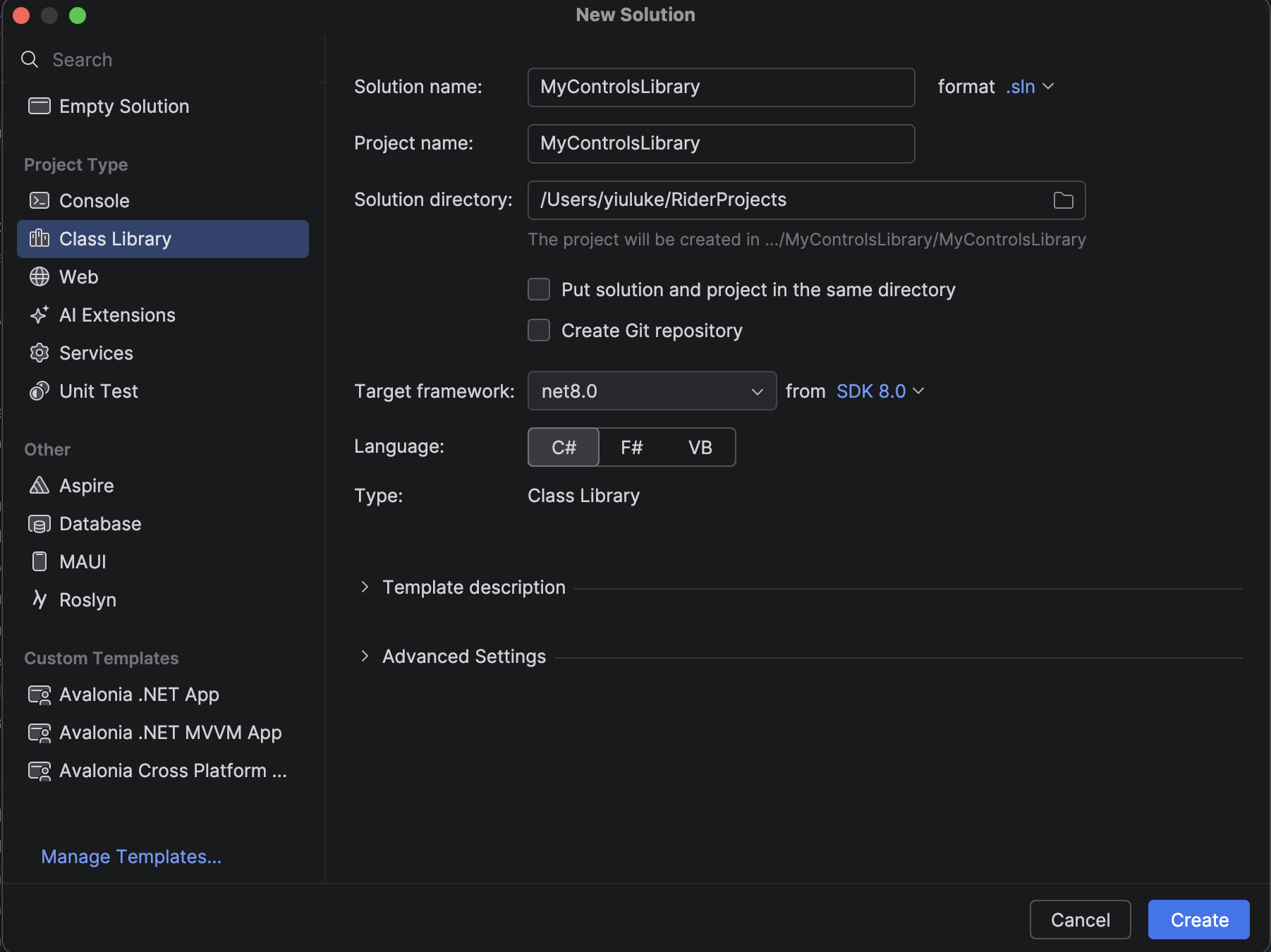
- Rider
- Visual Studio
- Go to File → New Solution. Alternatively, Add → New Project to add the class library as a new project within an existing solution.
- In the left panel, under the section "Project Type", select Class Library.
- Name the project, e.g. "CCLibrary".
- For "Target framework", select the preferred .NET version.
- Click Create.
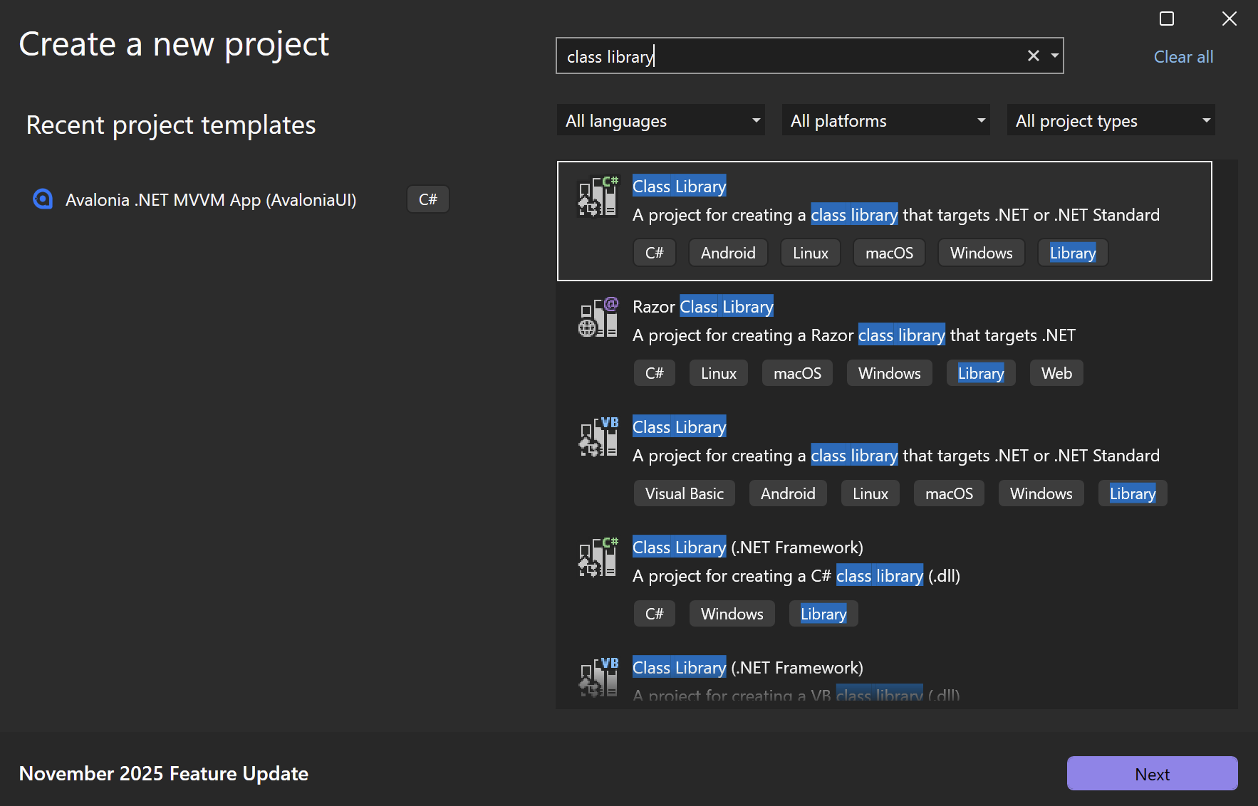
- Go to File → New → Project/Solution.
- Select .NET Class Library as the project template. Use the search bar to locate this template if it does not appear on the suggested list.
- Name the project, e.g. "CCLibrary".
- For "Target framework", select the preferred .NET version.
- Click Create.
Installing Avalonia in the class library project
Next, you must install the Avalonia NuGet package in the class library.
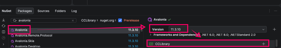
- Rider
- Visual Studio
- In the solution panel, select your class library project.
- Click Tools → NuGet → Manage NuGet Packages.
- Search for "Avalonia" in the search bar.
- Select Avalonia.
- Select the preferred version.
- Click the name of your class library project at the bottom of the panel to install Avalonia to that project.
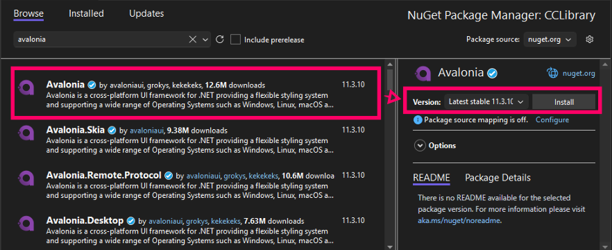
- In the solution explorer, select your class library project.
- Click Project → Manage NuGet Packages.
- Go to the Browse tab. Search for "Avalonia".
- Select Avalonia.
- Select the preferred version.
- Click Install.
Adding a custom control to the class library
Now that your class library is set up, you can start adding custom controls to it.
In this example, we'll create a simple custom control named MyCustomControl, a blank box that can be filled with a colour of your choice.
- In the class library project, create a new
.csfile. - Create the custom control as shown below.
using Avalonia;
using Avalonia.Controls;
using Avalonia.Media;

namespace CCLibrary
{

    /// <summary>A custom control that renders a coloured rectangle.</summary>
    public class MyCustomControl : Control
    {
        /// <remarks>
        /// Defines a styled property for the background colour, which can be set in XAML.<br/>
        /// AddOwner reuses the existing BackgroundProperty from Border.<br/>
        /// </remarks>
        public static readonly StyledProperty<IBrush?> BackgroundProperty =
            Border.BackgroundProperty.AddOwner<MyCustomControl>();

        /// <summary>Gets and sets the colour used to fill the rectangle.</summary>
        public IBrush? Background
        {
            get { return GetValue(BackgroundProperty); }
            set { SetValue(BackgroundProperty, value); }
        }

        /// <summary>Renders the control.</summary>
        public sealed override void Render(DrawingContext context)
        {
            if (Background != null) // Only render if a colour is set.
            {
                var renderSize = Bounds.Size; // Get the size of the control.
                context.FillRectangle(Background, new Rect(renderSize)); // Fill the rectangle with the colour.
            }
            base.Render(context);
        }
    }
}
You can continue adding as many custom controls to the library as you wish.
Referencing a custom control library
Reference your custom control library in an Avalonia project to allow those custom controls to be used.
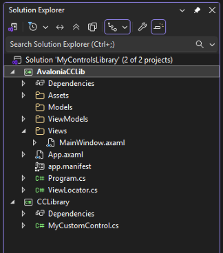
In this example, we have created a new project using the Avalonia MVVM template titled AvaloniaCCLib.
Add a project reference
- Open the .csproj file of your Avalonia project.
- Within the
<Project>...</Project>tags, add aProjectReferencetag pointing to the directory path of the .csproj file of the class library project.
<ItemGroup>
  <ProjectReference Include="..\MyControlsLibrary\CCLibrary.csproj" />
</ItemGroup>
Add XML namespace declaration
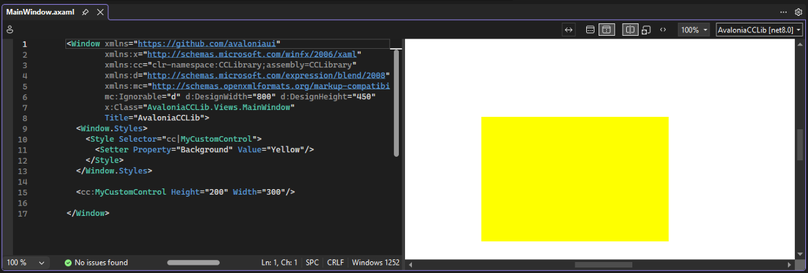
You can now make a namespace declaration in .axaml files of your Avalonia project to access your custom controls in XAML.
-
Add a line similar to this one to the opening
<Window>tag:xmlns:cc="using:CCLibrary". (Remember to change the name of the class library project if you used a different one.) -
Add a custom control to the window's content zone by prefixing with
cc.
<Window xmlns="https://github.com/avaloniaui"
        xmlns:x="http://schemas.microsoft.com/winfx/2006/xaml"
        xmlns:cc="using:CCLibrary"
        xmlns:d="http://schemas.microsoft.com/expression/blend/2008"
        xmlns:mc="http://schemas.openxmlformats.org/markup-compatibility/2006"
        mc:Ignorable="d" d:DesignWidth="800" d:DesignHeight="450"
        x:Class="AvaloniaCCLib.Views.MainWindow"
        Title="AvaloniaCCLib">
  <Window.Styles>
    <Style Selector="cc|MyCustomControl">
      <Setter Property="Background" Value="Yellow"/>
    </Style>
  </Window.Styles>

  <cc:MyCustomControl Height="200" Width="300"/>

</Window>
- Build the solution.
- Verify you can see the custom control in the running window or preview.
XML Namespace Definitions
When referencing a control library in a .axaml file, you can use the URL identification format. For example:
xmlns:cc="https://my.controls.url"
This is possible because of the presence of XML namespace definitions in a control library. These map URLs to the code namespaces, and are in the project's Properties/AssemblyInfo.cs file. (See this source code for an example.)
[assembly: XmlnsDefinition("https://github.com/avaloniaui", "Avalonia")]
Common Namespace Definitions
You can make one URL map several namespaces in your control library. To do this, simply add multiple XML namespace definitions that use the same URL, but which map to different code namespaces.
using Avalonia.Metadata;

[assembly: XmlnsDefinition("https://my.controls.url", "My.NameSpace")]
[assembly: XmlnsDefinition("https://my.controls.url", "My.NameSpace.Other")]