Creating a Modern looking Window
Use Dark Mode and Add a little Acrylic
Let's try and make this look a little more modern by applying Dark mode and some Acrylic styling to the Window.
-
Open App.axaml
Change the FluentTheme Mode from Default to Dark.
<Application xmlns="https://github.com/avaloniaui"
             xmlns:x="http://schemas.microsoft.com/winfx/2006/xaml"
             x:Class="Avalonia.MusicStore.App"
             xmlns:local="using:Avalonia.MusicStore"
             RequestedThemeVariant="Dark">
             <!-- "Default" ThemeVariant follows system theme variant. "Dark" or "Light" are other available options. -->
-
Open
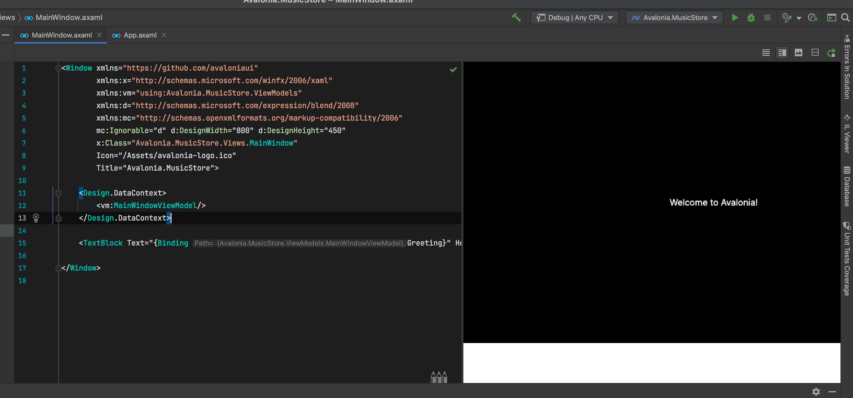
MainWindow.axamlnotice that it's still showing the Light mode version in the previewer.This is because the previewer actually runs your application in a special mode.
-
Using the menu click
Build→Build Startup ProjectNotice that the preview now changes to the dark mode.
The previewer knows about changes you make to the file your editing, but it doesn't know about changes in other files. This is why you need to build the project if another file was changed.

- After where it says
Title="Avalonia.MusicStore"add the following code:
<Window xmlns="https://github.com/avaloniaui"
        xmlns:x="http://schemas.microsoft.com/winfx/2006/xaml"
        xmlns:vm="using:Avalonia.MusicStore.ViewModels"
        xmlns:d="http://schemas.microsoft.com/expression/blend/2008"
        xmlns:mc="http://schemas.openxmlformats.org/markup-compatibility/2006"
        mc:Ignorable="d" d:DesignWidth="800" d:DesignHeight="450"
        x:Class="Avalonia.MusicStore.Views.MainWindow"
        Icon="/Assets/avalonia-logo.ico"
        Title="Avalonia.MusicStore"

        TransparencyLevelHint="AcrylicBlur"
        Background="Transparent">
This will make the Window Transparent and apply a Blur.
To apply acrylic to the window, that we can tint and customize for a modern look, replace the <TextBlock> with the following code:
   <Window xmlns="https://github.com/avaloniaui"
           xmlns:x="http://schemas.microsoft.com/winfx/2006/xaml"
           xmlns:vm="using:Avalonia.MusicStore.ViewModels"
           xmlns:d="http://schemas.microsoft.com/expression/blend/2008"
           xmlns:mc="http://schemas.openxmlformats.org/markup-compatibility/2006"
           mc:Ignorable="d" d:DesignWidth="800" d:DesignHeight="450"
           x:Class="Avalonia.MusicStore.Views.MainWindow"
           Icon="/Assets/avalonia-logo.ico"
           Title="Avalonia.MusicStore"
           TransparencyLevelHint="AcrylicBlur"
           Background="Transparent">

       <Design.DataContext>
           <vm:MainWindowViewModel />
       </Design.DataContext>

       <Panel>
           <ExperimentalAcrylicBorder IsHitTestVisible="False">
               <ExperimentalAcrylicBorder.Material>
                   <ExperimentalAcrylicMaterial
                       BackgroundSource="Digger"
                       TintColor="Black"
                       TintOpacity="1"
                       MaterialOpacity="0.65" />
               </ExperimentalAcrylicBorder.Material>
           </ExperimentalAcrylicBorder>
       </Panel>
   </Window>
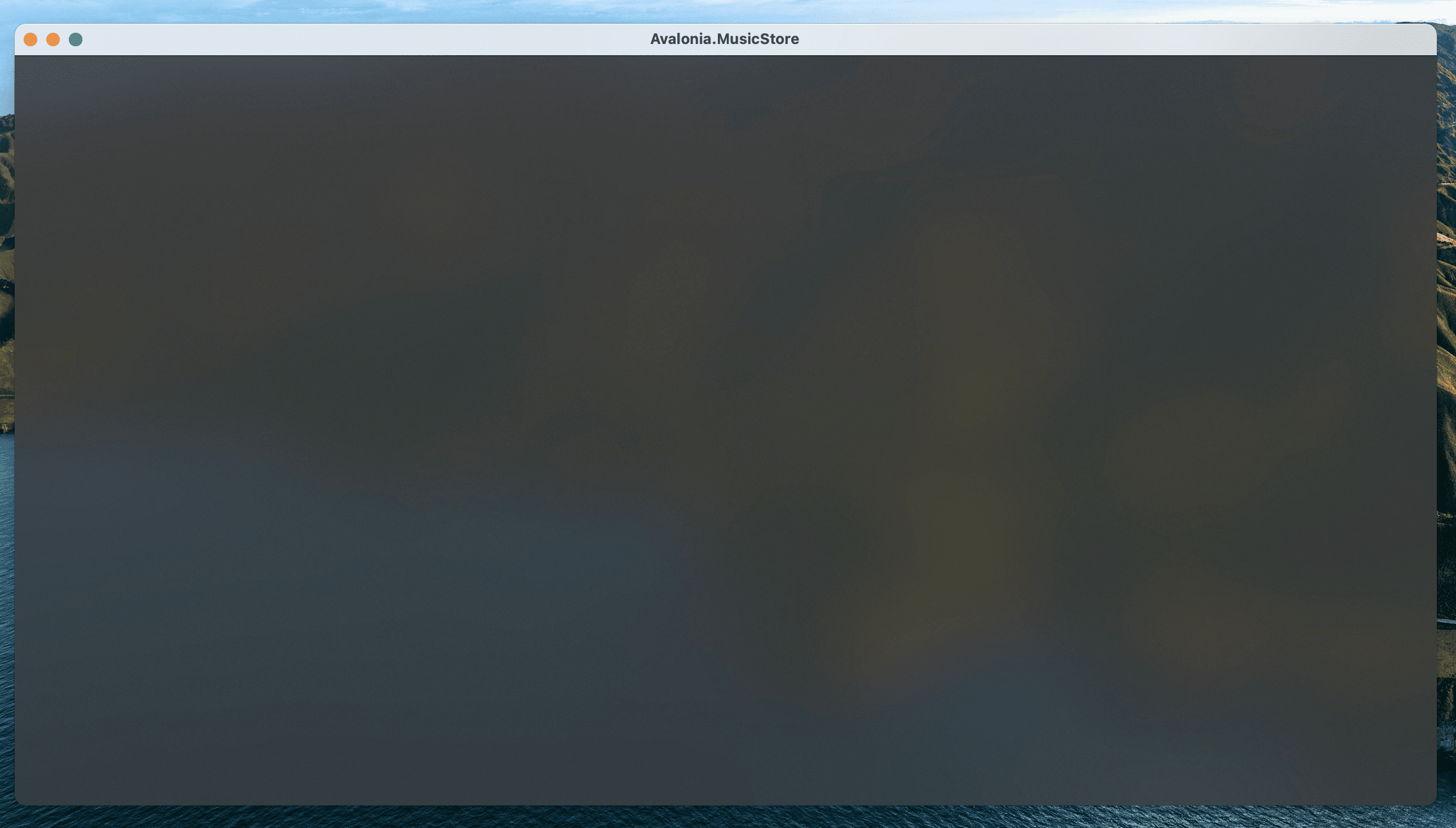
Now click the Debug Button to run the application again.
Notice we have a nice acrylic window effect. Shame about the titlebar, though. Let's see how we can make that blend in a bit more.

*Note, Linux users can not yet take advantage of this due to limitations of X11. The code will run and the window will still work on Linux, but the full effect will not be realised.
-
It is possible to have Avalonia render into the
titlebar, allowing us to create a more blended look. Modern web browsers tend to render tabs into the titlebar with this technique.This works by extending the
Windowsclient area into thenon-clientarea.To enable this mode on the
Windowelement set theExtendClientAreaToDecorationsHintproperty toTrue.
   <Window xmlns="https://github.com/avaloniaui"
           xmlns:x="http://schemas.microsoft.com/winfx/2006/xaml"
           xmlns:vm="using:Avalonia.MusicStore.ViewModels"
           xmlns:d="http://schemas.microsoft.com/expression/blend/2008"
           xmlns:mc="http://schemas.openxmlformats.org/markup-compatibility/2006"
           mc:Ignorable="d" d:DesignWidth="800" d:DesignHeight="450"
           x:Class="Avalonia.MusicStore.Views.MainWindow"
           Icon="/Assets/avalonia-logo.ico"
           Title="Avalonia.MusicStore"
           TransparencyLevelHint="AcrylicBlur"
           Background="Transparent"

           ExtendClientAreaToDecorationsHint="True">
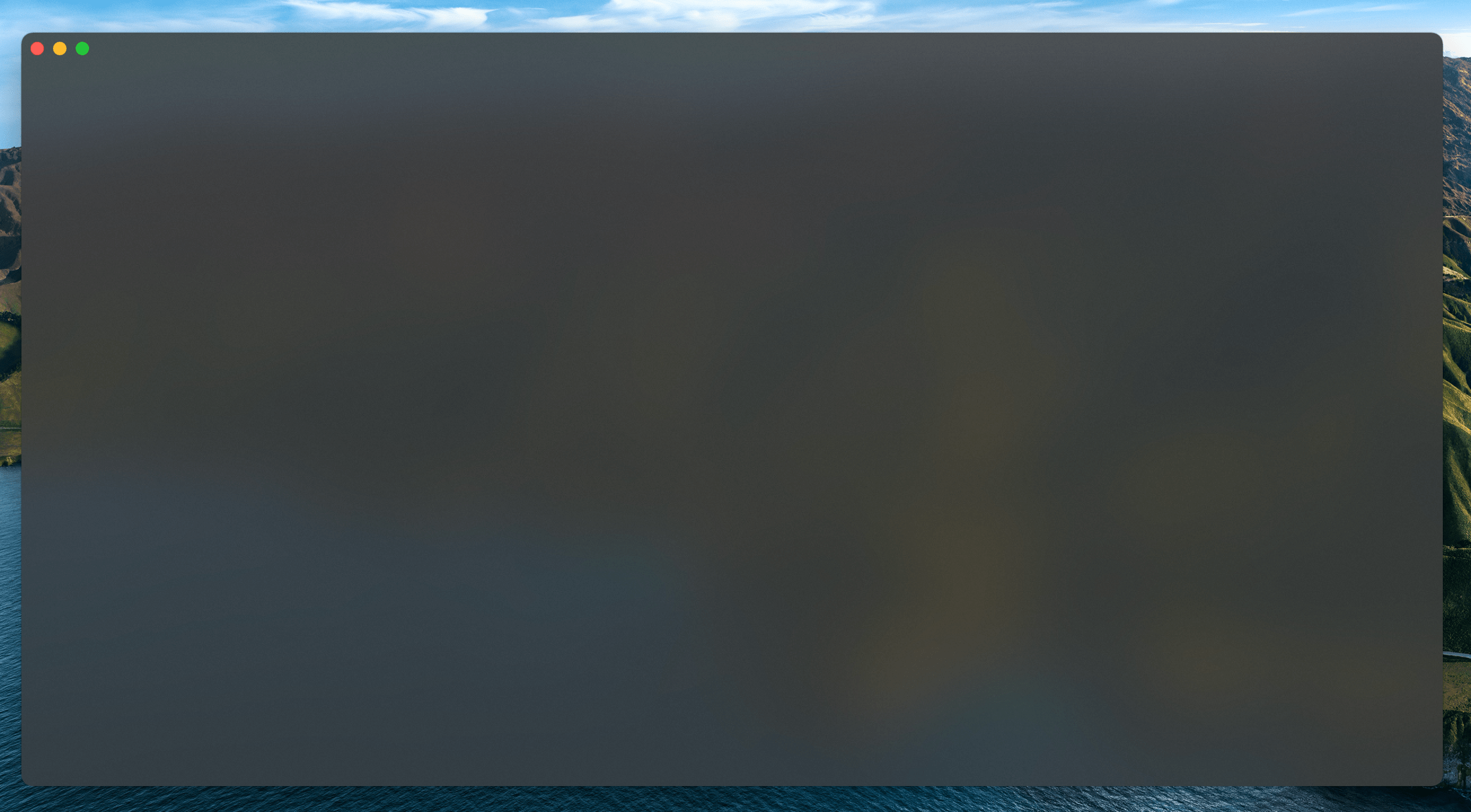
Press the Debug button again to run.

Perfect, a modern looking Window, Avalonia is able to render every pixel.