Add and Layout Controls
Add and Layout some Controls
Let's start by adding a Button to the MainWindow. The button will allow the user to purchase music in order to add to their collection.
In MainWindow.axaml change the code as follows, adding a Button inside the Panel.
<Panel>
    <ExperimentalAcrylicBorder IsHitTestVisible="False">
        <ExperimentalAcrylicBorder.Material>
            <ExperimentalAcrylicMaterial
                 BackgroundSource="Digger"
                 TintColor="Black"
                 TintOpacity="1"
                 MaterialOpacity="0.65" />
        </ExperimentalAcrylicBorder.Material>
     </ExperimentalAcrylicBorder>

     <Button Content="Buy Music" Command="{Binding BuyMusicCommand}"/>
</Panel>
Notice that we have set the Content property of the Button to Buy Music, and we also set a property called Command to {Binding BuyMusicCommand}.
If you remember earlier in the section about MVVM we discussed how Views use Bindings to talk to the ViewModel.
This Binding Expression is saying, when the button is clicked, then execute the command called BuyMusicCommand on the ViewModel.
Open MainWindowViewModel.cs and add the following code (the ICommand Interface requires System.Windows.Input but you'll need the additional namespaces, specified at the top, later on in the tutorial):
using System;
using System.Collections.ObjectModel;
using System.Linq;
using System.Reactive.Concurrency;
using System.Reactive.Linq;
using System.Windows.Input;
using ReactiveUI;

namespace Avalonia.MusicStore.ViewModels

public class MainWindowViewModel : ViewModelBase
    {
        public MainWindowViewModel()
        {
            BuyMusicCommand = ReactiveCommand.Create(() =>
            {
                // Code here will be executed when the button is clicked.
            });
        }

        public ICommand BuyMusicCommand { get; }
    }
Pressing the Debug Button again to run the program we can see we have a button and when clicked setting a breakpoint inside the BuyMusicCommand code we can see that the code is executed when it's hit.
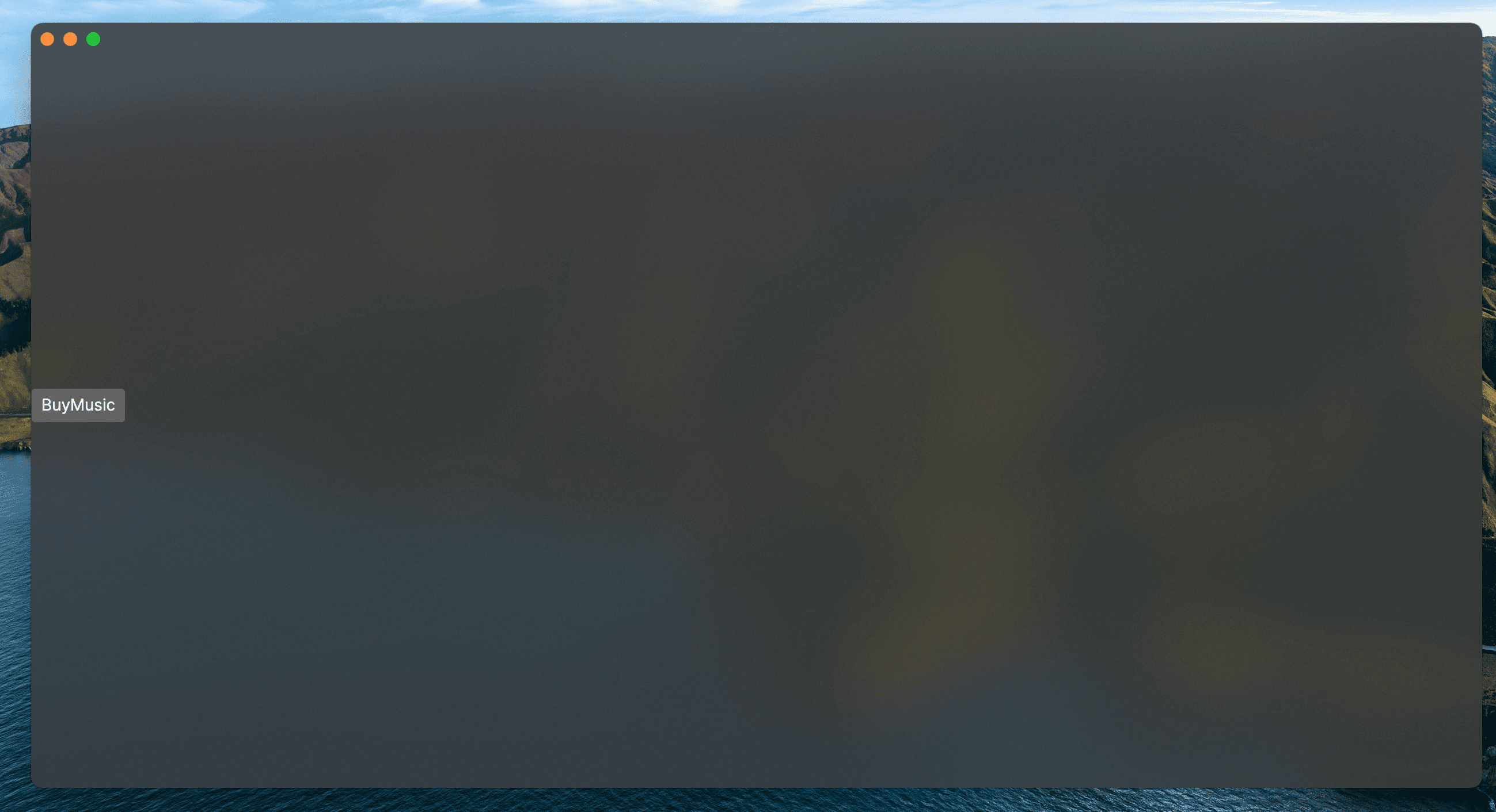
Let's position the button to the top right of the screen and make it look a bit nicer.
Place the <Button> element inside a simple <Panel> element.
The simplest way to control the layout of a control is with the HorizontalAlignmentand VerticalAlignment properties.
<Panel>
  <Button Content="Buy Music" Margin="40" Command="{Binding BuyMusicCommand}" HorizontalAlignment="Right" VerticalAlignment="Top" />
</Panel>
We also add a Margin of 40 to the Button so that the button is not right at the edge of the Window.
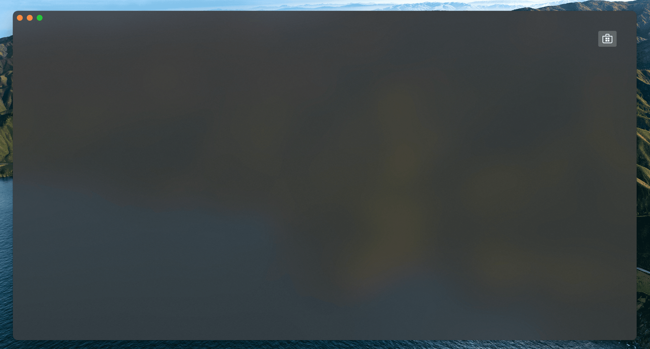
You may prefer to have an icon or image instead of text inside your button. The are a few ways to do this, let's grab a store icon from Avalonia - Fluent Icons
Scroll through this page and find an icon you like, then simply copy the code provided.
Find the name, in this case store_microsoft_regular.
There should be some code similar to:
<StreamGeometry x:Key="store_microsoft_regular">M11.5 9.5V13H8V9.5H11.5Z M11.5 17.5V14H8V17.5H11.5Z M16 9.5V13H12.5V9.5H16Z M16 17.5V14H12.5V17.5H16Z M8 6V3.75C8 2.7835 8.7835 2 9.75 2H14.25C15.2165 2 16 2.7835 16 3.75V6H21.25C21.6642 6 22 6.33579 22 6.75V18.25C22 19.7688 20.7688 21 19.25 21H4.75C3.23122 21 2 19.7688 2 18.25V6.75C2 6.33579 2.33579 6 2.75 6H8ZM9.5 3.75V6H14.5V3.75C14.5 3.61193 14.3881 3.5 14.25 3.5H9.75C9.61193 3.5 9.5 3.61193 9.5 3.75ZM3.5 18.25C3.5 18.9404 4.05964 19.5 4.75 19.5H19.25C19.9404 19.5 20.5 18.9404 20.5 18.25V7.5H3.5V18.25Z</StreamGeometry>
Let's create a file just for Icons.
In Rider right click on the project and select Add → Avalonia Styles
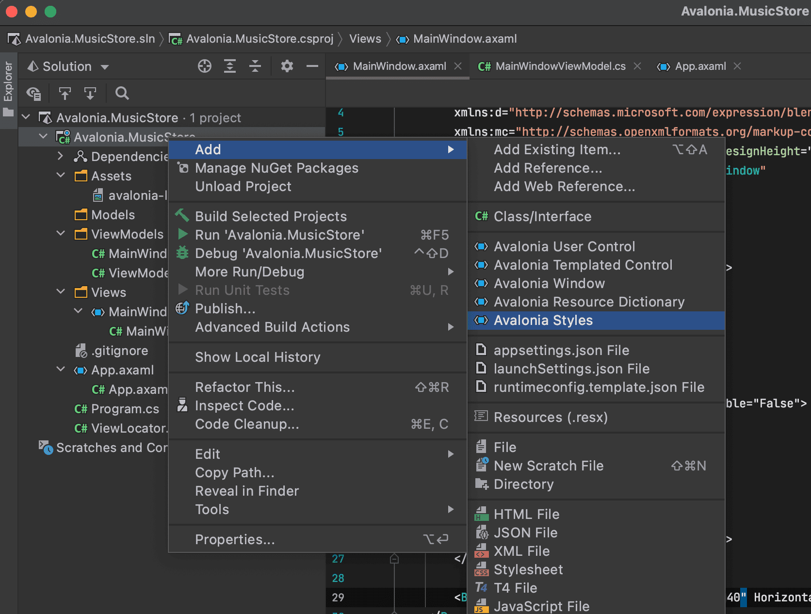
Enter the name Icons when prompted and press Enter.
A new xaml file will be created that we can put styles or icons inside.
<Styles xmlns="https://github.com/avaloniaui"
        xmlns:x="http://schemas.microsoft.com/winfx/2006/xaml">
    <Design.PreviewWith>
        <Border Padding="20">
            <!-- Add Controls for Previewer Here -->
        </Border>
    </Design.PreviewWith>

    <!-- Add Styles Here -->
</Styles>
Add your Icon code inside wrapped in a Style element as a resource like so.
<Styles xmlns="https://github.com/avaloniaui"
        xmlns:x="http://schemas.microsoft.com/winfx/2006/xaml">
    <Design.PreviewWith>
        <Border Padding="20">
            <!-- Add Controls for Previewer Here -->
        </Border>
    </Design.PreviewWith>

    <!-- Add Styles Here -->
    <Style>
        <Style.Resources>
            <StreamGeometry x:Key="store_microsoft_regular">M11.5 9.5V13H8V9.5H11.5Z M11.5 17.5V14H8V17.5H11.5Z M16 9.5V13H12.5V9.5H16Z M16 17.5V14H12.5V17.5H16Z M8 6V3.75C8 2.7835 8.7835 2 9.75 2H14.25C15.2165 2 16 2.7835 16 3.75V6H21.25C21.6642 6 22 6.33579 22 6.75V18.25C22 19.7688 20.7688 21 19.25 21H4.75C3.23122 21 2 19.7688 2 18.25V6.75C2 6.33579 2.33579 6 2.75 6H8ZM9.5 3.75V6H14.5V3.75C14.5 3.61193 14.3881 3.5 14.25 3.5H9.75C9.61193 3.5 9.5 3.61193 9.5 3.75ZM3.5 18.25C3.5 18.9404 4.05964 19.5 4.75 19.5H19.25C19.9404 19.5 20.5 18.9404 20.5 18.25V7.5H3.5V18.25Z</StreamGeometry>
        </Style.Resources>
    </Style>
</Styles>
Open App.axaml and add a StyleInclude so that the Icons.axamlcan be loaded.
<Application.Styles>
    <FluentTheme Mode="Dark"/>
    <StyleInclude Source="avares://Avalonia.MusicStore/Icons.axaml" />
</Application.Styles>
Now build the application so that the Icons are available in the previewer.
Return to MainWindow.axaml, we can add the Icon to the Button like so...
<Button Margin="40" HorizontalAlignment="Right" VerticalAlignment="Top" Command="{Binding BuyMusicCommand}">
    <PathIcon Data="{StaticResource store_microsoft_regular}" />
</Button>
Running the application we now have a nice button.