TextBox
The TextBox presents an area for typed (keyboard) input. You can use it for single-line fields such as a username, or enable multi-line editing for longer-form content like notes or comments.
Useful properties
You will probably use these properties most often:
| Property | Type | Description |
|---|---|---|
Text | string | The current text in the input. |
PlaceholderText | string | Appears as a faded hint whenever the input is empty. Sometimes called a watermark. |
PlaceholderForeground | IBrush | The brush used to render the placeholder text. |
PasswordChar | char | Hides any characters typed, replacing them with the given character instead. |
RevealPassword | bool | When true, shows the actual password text instead of mask characters. |
AcceptsReturn | bool | Makes the input multi-line by allowing the user to enter line returns. |
AcceptsTab | bool | Allows the user to insert tab characters instead of moving focus. |
TextWrapping | TextWrapping | Defines how horizontal line overflow is handled. Options: NoWrap, Wrap, WrapWithOverflow. |
MaxLength | int | Limits the number of characters the user can enter. 0 means no limit. |
IsReadOnly | bool | When true, the user can select and copy text but cannot edit it. |
TextAlignment | TextAlignment | Horizontal alignment of the text: Left, Center, Right. |
InnerLeftContent | object | Content displayed inside the TextBox on the left side (for icons or labels). |
InnerRightContent | object | Content displayed inside the TextBox on the right side (for buttons or indicators). |
MinLines | int | Minimum number of visible lines. The TextBox sizes itself to show at least this many lines when AcceptsReturn is true. |
CaretBlinkInterval | TimeSpan | The interval at which the caret blinks. Set to TimeSpan.Zero to disable blinking. |
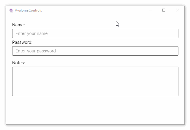
Example
This example has a basic one-line text box, a password box, and a text-wrapping multiline text box:
<StackPanel Margin="20">
  <TextBlock Margin="0 5">Name:</TextBlock>
  <TextBox PlaceholderText="Enter your name"/>
  <TextBlock Margin="0 5">Password:</TextBlock>
  <TextBox PasswordChar="*" PlaceholderText="Enter your password"/>
  <TextBlock Margin="0 15 0 5">Notes:</TextBlock>
  <TextBox Height="100" AcceptsReturn="True" TextWrapping="Wrap"/>
</StackPanel>
Watermark (placeholder text)
Set PlaceholderText to display a hint when the TextBox is empty. You can style the hint color with PlaceholderForeground:
<TextBox PlaceholderText="e.g. [email protected]"
         PlaceholderForeground="Gray" />
The placeholder disappears automatically as soon as your user begins typing and reappears when the text is cleared.
Multi-line input
To accept multiple lines, set AcceptsReturn to True. Combine it with TextWrapping="Wrap" so that long lines wrap instead of scrolling horizontally. Use MinLines to guarantee a minimum visible height:
<TextBox AcceptsReturn="True"
         TextWrapping="Wrap"
         MinLines="4"
         PlaceholderText="Enter your comments here..." />
If you also set AcceptsTab to True, pressing Tab inserts a tab character rather than moving focus to the next control.
Limiting input length
Use MaxLength to cap the number of characters your user can type. This is useful for fields with a known maximum, such as postal codes or usernames:
<TextBox MaxLength="50" PlaceholderText="Username (max 50 characters)" />
A value of 0 (the default) means no limit is applied.
Validation
You can validate TextBox input through data-annotation attributes on your view model. Avalonia's binding system surfaces validation errors automatically when you implement INotifyDataErrorInfo. For example, using the CommunityToolkit.Mvvm source generators:
using System.ComponentModel.DataAnnotations;
using CommunityToolkit.Mvvm.ComponentModel;

public partial class MyViewModel : ObservableValidator
{
    [ObservableProperty]
    [NotifyDataErrorInfo]
    [Required(ErrorMessage = "Email is required.")]
    [EmailAddress(ErrorMessage = "Enter a valid email address.")]
    private string _email = "";
}
<TextBox Text="{Binding Email}" PlaceholderText="Email address" />
When validation fails, the TextBox displays an error border and tooltip by default. You can customize this appearance through the control's :error pseudo-class in your styles.
View model binding
Bind Text with two-way mode (the default for TextBox.Text):
<TextBox Text="{Binding Username}" PlaceholderText="Enter username" />
[ObservableProperty]
private string _username = "";
Input with inner content
You can add icons or buttons inside the TextBox using InnerLeftContent and InnerRightContent:
<TextBox PlaceholderText="Search...">
    <TextBox.InnerRightContent>
        <Button Content="✕" Command="{Binding ClearSearchCommand}"
                Background="Transparent" BorderThickness="0" Padding="4" />
    </TextBox.InnerRightContent>
</TextBox>