Focus
Focus refers to the InputElement which is expected to receive keyboard input and are typically
distinguished with a visual indicator. The most familiar example is a TextBox with a blinking cursor inside, but
non-textual controls like Button and Slider also participate in focus.
IsFocused and Focusable
IsFocused is a get-only property that keeps track of the InputElement's focus state.
The Focusable property enables or disables the ability to focus an InputElement. Elements which cannot be focused
can still be interacted with via pointer, so some care should be taken that a functional keyboard equivalent (such as
hotkeys) is available when possible.
Explicit Focusing
To explicitly assign focus to any InputElement, call its .Focus() method from code. Optionally, you may specify the
NavigationMethod and KeyModifiers to simulate as if the focus were triggered by a specific focus navigation flow. Explicit
focusing is often used to focus a specific InputElement in a data entry form upon loading or to programmatically move
to the next InputControl once the current input has been satisfied.
| NavigationMethod | Trigger Description |
|---|---|
| Tab | Tab key press |
| Pointer | Pointer interaction |
| Directional | 2D Directional (XYFocus) |
| Unspecified | Default |
Focus Events
InputElements expose GotFocus and LostFocus events. The GotFocusEventArgs contains the NavigationMethod and
KeyModifiers used to trigger the focus navigation.
Focus Pseudoclasses
These pseudoclasses are helpful when styling Controls that are Focusable.
| Pseudoclass | Description |
|---|---|
| :focus | The Control has focus. |
| :focus-within | The Control has focus or contains a descendant that has focus. |
| :focus-visible | The Control has focus and should show a visual indicator. |
The FocusAdorner property is used to show a default focus visual, typically a Border, around a Control with
:focus-visible. When using :focus-visible to show a custom visual indicator, setting FocusAdorner to null will
avoid showing a duplicate indicator.
FocusManager
The FocusManager provides global access to focus functionality, such as retrieving the currently focused element or
clearing focus. For additional information, see the FocusManager docs.
Tab Focus Navigation
Focus navigation by tab occurs when the user presses tab on their keyboard. InputElements with their IsTabStop property
set to true will be available for tab focus navigation. The TabIndex specifies the priority with lower numeric values being
navigated to first. When the TabIndex of multiple controls is equal, the priority is based on a Visual Tree traversal order.
The KeyboardNavigation.TabNavigation attached property can set a KeyboardNavigationMode onto any InputElement acting as
a container and modify its tab navigation characteristics.
| KeyboardNavigationMode | Container Item Traversal |
|---|---|
| Continue | Continues past items and into the next container |
| Cycle | Cycles through and wraps back within its own items |
| Contained | Stops at the beginning/end item |
| Once | Container and children receive focus only once as a group |
| None | Items will not be focused by tab navigation |
| Local | TabIndex is considered for items in local subtree only |
Directional Focus Navigation v11.1
Focus navigation through XYFocus is a 2D directional scheme enabling spatial navigation from the focused control
towards another control in a cardinal direction: left, right, up, or down. By default, XYFocus.NavigationModes is set
to allow Gamepad and Remote navigation.
| KeyDeviceType | Device |
|---|---|
| Disabled | Any key device XY navigation is disabled. |
| Keyboard | Keyboard arrow keys can be used. |
| Gamepad | Gamepad controller DPad can be used. |
| Remote | Remote control can be used. |
| Enabled | All devices can be used. |
Gamepad inputs are supported on devices that can natively send these inputs, such as Android and Tizen. However, Avalonia currently lacks cross-platform Gamepad APIs required for broad out-of-the-box support.
Navigation Strategy
When 2D directional navigation is enabled, a disambiguation strategy is used to select the navigation target.
| XYFocusNavigationStrategy | Navigation Target |
|---|---|
| Auto | Inherits strategy from ancestor. Projection if no ancestor specifies. |
| Projection | First element encountered when projecting a line in the navigation direction. |
| NavigationDirectionDistance | Closest element to the axis of the navigation line. |
| RectilinearDistance | Closest element based on the shortest Manhattan distance. |
Explicit Navigation
XYFocus allows each control to specify an explicit navigation target when a direction is pressed via XYFocus.Up,
XYFocus.Down, XYFocus.Left, and XYFocus.Right. This has priority over any navigation strategy.
Focus engagement is not yet implemented, so combining Directional focus navigation with controls that also handle directional input themselves may have some limitations, especially with visuals.
Example
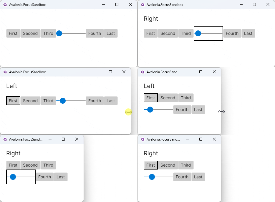
The following demonstrates how to use Directional focus navigation in a WrapPanel. It explicitly allows navigation to
wrap from the first to the last element and vice-versa.
The Slider provides an example of mixing navigation with control interaction. On Desktop, pressing the Enter key while
the Slider is focused will begin an interaction where the user will modify the Slider.Value instead of causing
navigation. Pressing Enter a second time will end the interaction and resume Directional focus navigation.
<Window
    XYFocus.NavigationModes="Enabled"
    XYFocus.UpNavigationStrategy="Projection"
    XYFocus.DownNavigationStrategy="Projection"
    XYFocus.LeftNavigationStrategy="Projection"
    XYFocus.RightNavigationStrategy="Projection">
    <Grid>
        <WrapPanel>
            <Button x:Name="first"
                Content="First"
                XYFocus.Left="{Binding #last}" />
            <Button Content="Second" />
            <Button Content="Third" />

            <Slider Width="100" Maximum="100" />

            <Button Content="Fourth" />
            <Button x:Name="last"
                Content="Last"
                XYFocus.Right="{Binding #first}" />
        </WrapPanel>
    </Grid>
</Window>
