Обзор панелей
Элементы Panel - это компоненты, которые управляют отрисовкой элементов - их размером и габаритами, их позицией и расположением их дочернего содержимого. Avalonia UI предоставляет ряд предопределенных элементов Panel, а также возможность создавать пользовательские элементы Panel.
Класс Panel
Panel является базовым классом для всех элементов, обеспечивающих поддержку макета в Avalonia. Производные элементы Panel используются для позиционирования и размещения элементов в XAML и коде.
Avalonia включает комплексный набор производных реализаций панелей, которые позволяют создавать множество сложных макетов. Эти производные классы предоставляют свойства и методы, обеспечивающие реализацию большинства стандартных сценариев пользовательского интерфейса. Разработчики, не сумевшие найти поведение размещения дочерних элементов, соответствующее их потребностям, могут создавать новые макеты, переопределяя методы ArrangeOverride и MeasureOverride. Для получения дополнительной информации о пользовательском поведении макета см. Создание пользовательской панели.
Общие члены Panel
Все элементы Panel поддерживают базовые свойства размера и позиционирования, определенные Control, включая Height, Width, HorizontalAlignment, VerticalAlignment и Margin. Для получения дополнительной информации о свойствах позиционирования, определенных Control, см. Обзор выравнивания, полей и отступов.
Panel предоставляет дополнительные свойства, имеющие решающее значение для понимания и использования макета. Свойство Background используется для заполнения области между границами производного элемента панели с помощью Brush. Children представляет коллекцию дочерних элементов, из которых состоит Panel.
Присоединенные свойства
Производные элементы панели широко используют присоединенные свойства. Присоединенное свойство — это специализированная форма свойства зависимости, которая не имеет обычной «обертки» свойства CLR (common language runtime). Присоединенные свойства имеют специализированный синтаксис в XAML, который можно увидеть в нескольких примерах ниже.
Одно из назначений присоединенного свойства — позволить дочерним элементам хранить уникальные значения свойства, которое фактически определено родительским элементом. Применение этой функциональности заключается в том, что дочерние элементы информируют родителя о том, как они хотели бы быть представлены в пользовательском интерфейсе, что чрезвычайно полезно для макета приложения.
Панели пользовательского интерфейса
В Avalonia доступно несколько классов панелей, оптимизированных для поддержки сценариев пользовательского интерфейса: Panel, Canvas, DockPanel, Grid, StackPanel, WrapPanel и RelativePanel. Эти элементы панели просты в использовании, универсальны и достаточно расширяемы для большинства приложений.
Canvas
Элемент Canvas позволяет позиционировать содержимое в соответствии с абсолютными координатами x и y. Элементы могут быть отрисованы в уникальном местоположении; или, если элементы занимают одни и те же координаты, порядок, в котором они появляются в разметке, определяет поряд�ок, в котором элементы отрисовываются.
Canvas обеспечивает наиболее гибкую поддержку макета среди всех Panel. Свойства Height и Width используются для определения области холста, а элементам внутри назначаются абсолютные координаты относительно области родительского Canvas. Четыре присоединенных свойства, Canvas.Left, Canvas.Top, Canvas.Right и Canvas.Bottom, обеспечивают точный контроль размещения объектов в пределах Canvas, позволяя разработчику точно позиционировать и располагать элементы на экране.
ClipToBounds в Canvas
Canvas может размещать дочерние элементы в любом положении на экране, даже в координатах, которые находятся за пределами его собственных определенных Height и Width. Кроме того, на Canvas не влияет размер его дочерних элементов. В результате дочерний элемент может перерисовать другие элементы за пределами ограничивающего прямоугольника родительского Canvas. По умолчанию Canvas позволяет дочерним элементам отрисовываться за пределами границ родительского Canvas. Если такое поведение нежелательно, свойство ClipToBounds можно установить в значение true. Это заставляет Canvas обрезать содержимое до своего собственного размера. Canvas — единственный элемент макета, который позволяет дочерним элементам отрисовываться за пределами своих границ.
Определение и использование Canvas
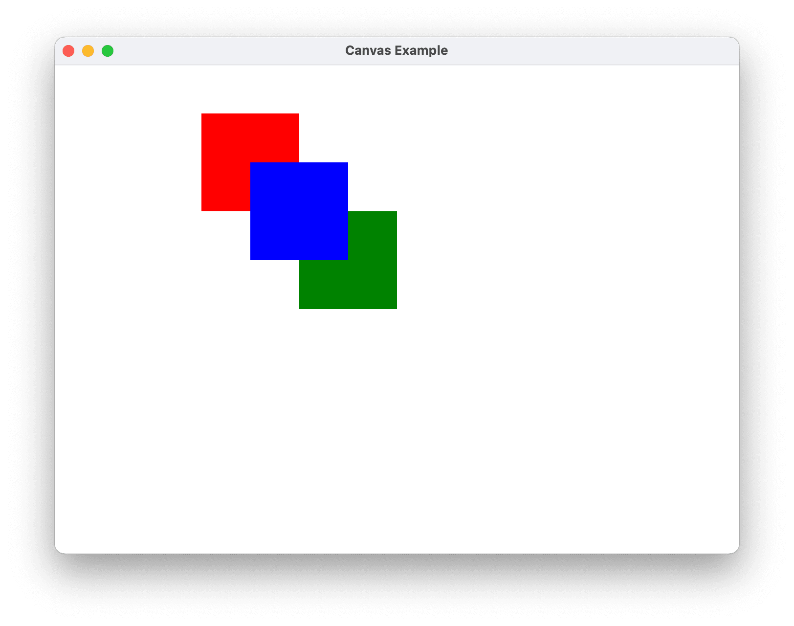
Canvas можно создать, просто используя XAML или код. Следующий пример демонстрирует, как использовать Canvas для абсолютного позиционирования содержимого. Этот код создает три квадрата размером 100 пикселей. Первый квадрат красный, и его верхняя левая позиция (x, y) указана как (0, 0). Второй квадрат зеленый, и его верхняя левая позиция — (100, 100), чуть ниже и правее первого квадрата. Третий квадрат синий, и его верхняя левая позиция — (50, 50), таким образом, он охватывает нижний правый квадрант первого квадрата и верхний левый квадрант второго. Поскольку третий квадрат размещается последним, он появляется поверх двух других квадратов, то есть перекрывающиеся части принимают цвет третьего квадрата.
- XAML
- C#
<Canvas Height="400" Width="400">
  <Canvas Height="100" Width="100" Top="0" Left="0" Background="Red"/>
  <Canvas Height="100" Width="100" Top="100" Left="100" Background="Green"/>
  <Canvas Height="100" Width="100" Top="50" Left="50" Background="Blue"/>
</Canvas>
// Create the Canvas
myParentCanvas = new Canvas();
myParentCanvas.Width = 400;
myParentCanvas.Height = 400;

// Define child Canvas elements
myCanvas1 = new Canvas();
myCanvas1.Background = Brushes.Red;
myCanvas1.Height = 100;
myCanvas1.Width = 100;
Canvas.SetTop(myCanvas1, 0);
Canvas.SetLeft(myCanvas1, 0);

myCanvas2 = new Canvas();
myCanvas2.Background = Brushes.Green;
myCanvas2.Height = 100;
myCanvas2.Width = 100;
Canvas.SetTop(myCanvas2, 100);
Canvas.SetLeft(myCanvas2, 100);

myCanvas3 = new Canvas();
myCanvas3.Background = Brushes.Blue;
myCanvas3.Height = 100;
myCanvas3.Width = 100;
Canvas.SetTop(myCanvas3, 50);
Canvas.SetLeft(myCanvas3, 50);

// Add child elements to the Canvas' Children collection
myParentCanvas.Children.Add(myCanvas1);
myParentCanvas.Children.Add(myCanvas2);
myParentCanvas.Children.Add(myCanvas3);
DockPanel
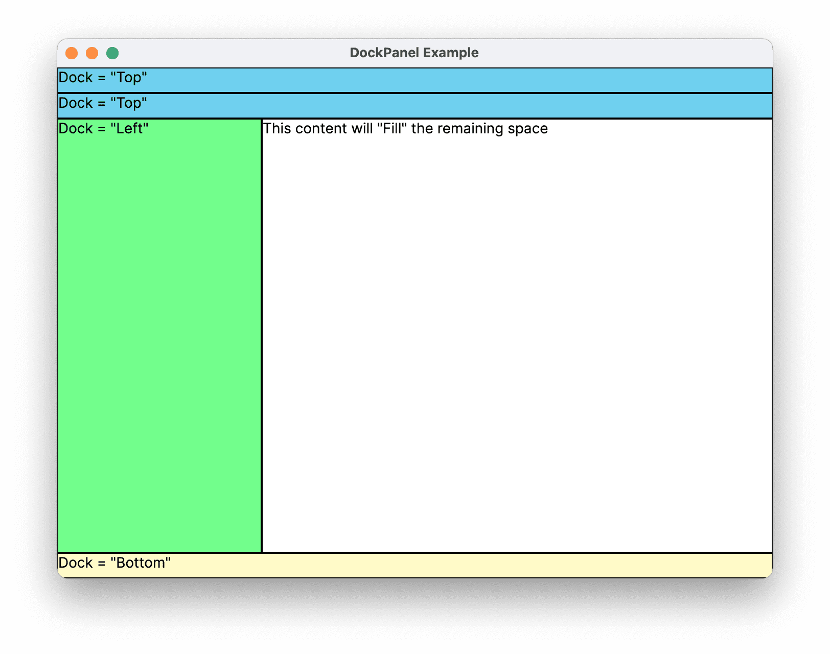
Элемент DockPanel использует присоединенное свойство DockPanel.Dock, установленное в дочерних элементах содержимого, для позиционирования содержимого вдоль краев контейнера. Когда DockPanel.Dock установлен в Top или Bottom, он располагает дочерние элементы выше или ниже друг друга. Когда DockPanel.Dock установлен в Left или Right, он располагает дочерние элементы слева или справа друг от друга. Свойство LastChildFill определяет положение последнего элемента, добавленного в качестве дочернего элемента DockPanel.
Вы можете использовать DockPanel для позиционирования группы связанных элементов, таких как набор кнопок. Или вы можете использовать его для создания «панельного» пользовательского интерфейса.
Изменение размера по содержимому
Если свойства Height и Width не указаны, DockPanel изменяет размер в соответствии с содержимым. Размер может увеличиваться или уменьшаться в соответствии с размером его дочерних элементов. Однако, когда эти свойства указаны и больше нет места для следующего указанного дочернего элемента, DockPanel не отображает этот дочерний элемент или последующие дочерние элементы и не измеряет последующие дочерние элементы.
LastChildFill
По умолчанию последний дочерний элемент элемента DockPanel «заполняет» оставшееся, нераспределенное пространство. Если такое поведение нежелательно, установите свойство LastChildFill в значение false.
Определение и использование DockPanel
Следующий пример демонстрирует, как разделить пространство с помощью DockPanel. Пять элементов Border добавляются как дочерние элементы родительского DockPanel. Каждый использует различное свойство позиционирования DockPanel для разделения пространства. Последний элемент «заполняет» оставшееся, нераспределенное пространство.
- XAML
- C#
<DockPanel LastChildFill="True">
  <Border Height="25" Background="SkyBlue" BorderBrush="Black" BorderThickness="1" DockPanel.Dock="Top">
    <TextBlock Foreground="Black">Dock = "Top"</TextBlock>
  </Border>
  <Border Height="25" Background="SkyBlue" BorderBrush="Black" BorderThickness="1" DockPanel.Dock="Top">
    <TextBlock Foreground="Black">Dock = "Top"</TextBlock>
  </Border>
  <Border Height="25" Background="LemonChiffon" BorderBrush="Black" BorderThickness="1" DockPanel.Dock="Bottom">
    <TextBlock Foreground="Black">Dock = "Bottom"</TextBlock>
  </Border>
  <Border Width="200" Background="PaleGreen" BorderBrush="Black" BorderThickness="1" DockPanel.Dock="Left">
    <TextBlock Foreground="Black">Dock = "Left"</TextBlock>
  </Border>
  <Border Background="White" BorderBrush="Black" BorderThickness="1">
    <TextBlock Foreground="Black">This content will "Fill" the remaining space</TextBlock>
  </Border>
</DockPanel>
// Create the DockPanel
DockPanel myDockPanel = new DockPanel();
myDockPanel.LastChildFill = true;

// Define the child content
Border myBorder1 = new Border();
myBorder1.Height = 25;
myBorder1.Background = Brushes.SkyBlue;
myBorder1.BorderBrush = Brushes.Black;
myBorder1.BorderThickness = new Thickness(1);
DockPanel.SetDock(myBorder1, Dock.Top);
TextBlock myTextBlock1 = new TextBlock();
myTextBlock1.Foreground = Brushes.Black;
myTextBlock1.Text = "Dock = Top";
myBorder1.Child = myTextBlock1;

Border myBorder2 = new Border();
myBorder2.Height = 25;
myBorder2.Background = Brushes.SkyBlue;
myBorder2.BorderBrush = Brushes.Black;
myBorder2.BorderThickness = new Thickness(1);
DockPanel.SetDock(myBorder2, Dock.Top);
TextBlock myTextBlock2 = new TextBlock();
myTextBlock2.Foreground = Brushes.Black;
myTextBlock2.Text = "Dock = Top";
myBorder2.Child = myTextBlock2;

Border myBorder3 = new Border();
myBorder3.Height = 25;
myBorder3.Background = Brushes.LemonChiffon;
myBorder3.BorderBrush = Brushes.Black;
myBorder3.BorderThickness = new Thickness(1);
DockPanel.SetDock(myBorder3, Dock.Bottom);
TextBlock myTextBlock3 = new TextBlock();
myTextBlock3.Foreground = Brushes.Black;
myTextBlock3.Text = "Dock = Bottom";
myBorder3.Child = myTextBlock3;

Border myBorder4 = new Border();
myBorder4.Width = 200;
myBorder4.Background = Brushes.PaleGreen;
myBorder4.BorderBrush = Brushes.Black;
myBorder4.BorderThickness = new Thickness(1);
DockPanel.SetDock(myBorder4, Dock.Left);
TextBlock myTextBlock4 = new TextBlock();
myTextBlock4.Foreground = Brushes.Black;
myTextBlock4.Text = "Dock = Left";
myBorder4.Child = myTextBlock4;

Border myBorder5 = new Border();
myBorder5.Background = Brushes.White;
myBorder5.BorderBrush = Brushes.Black;
myBorder5.BorderThickness = new Thickness(1);
TextBlock myTextBlock5 = new TextBlock();
myTextBlock5.Foreground = Brushes.Black;
myTextBlock5.Text = "This content will Fill the remaining space";
myBorder5.Child = myTextBlock5;

// Add child elements to the DockPanel Children collection
myDockPanel.Children.Add(myBorder1);
myDockPanel.Children.Add(myBorder2);
myDockPanel.Children.Add(myBorder3);
myDockPanel.Children.Add(myBorder4);
myDockPanel.Children.Add(myBorder5);
Grid
Элемент Grid объединяет функциональность абсолютного позиционирования и табличного элемента управления данными. Grid позволяет легко позиционировать элементы и применять к ним стили. Grid позволяет определять гибкие группировки строк и столбцов, и даже предоставляет механизм для обмена информацией о размерах между несколькими элементами Grid.
Поведение размеров столбцов и строк
Столбцы и строки, определенные в Grid, могут использовать преимущества размера Star для пропорционального распределения оставшегося пространства. Когда Star выбран в качестве высоты или ширины строки или столбца, этот столбец или строка получает взвешенную долю оставшегося доступного пространства. Это отличается от Auto, который будет распределять пространство равномерно в зависимости от размера содержимого в столбце или строке. Это значение выражается как * или 2* при использовании XAML. В первом случае строка или столбец получили бы пространство, равное доступному, во втором случае — в два раза больше и так далее. Комбинируя этот метод для пропорционального распределения пространства со значениями HorizontalAlignment и VerticalAlignment, равными Stretch, можно разделить пространство макета по процентам от экранного пространства. Grid — единственн�ая панель макета, способная распределять пространство таким образом.
Определение и использование Grid
Следующий пример демонстрирует, как создать пользовательский интерфейс, похожий на диалоговое окно "Выполнить", доступное в меню "Пуск" Windows.

- XAML
- C#
<Grid Background="Gainsboro"
      HorizontalAlignment="Left"
      VerticalAlignment="Top"
      Width="425"
      Height="165"
      ColumnDefinitions="Auto,*,*,*,*"
      RowDefinitions="Auto,Auto,*,Auto">

    <Image Grid.Row="0" Grid.Column="0" Source="{Binding runicon}" />

    <TextBlock Grid.Row="0" Grid.Column="1" Grid.ColumnSpan="4"
               Text="Type the name of a program, folder, document, or Internet resource, and Windows will open it for you."
               TextWrapping="Wrap" />

    <TextBlock Grid.Row="1" Grid.Column="0" Text="Open:" />

    <TextBox Grid.Row="1" Grid.Column="1" Grid.ColumnSpan="5" />

    <Button Grid.Row="3" Grid.Column="2" Content="OK" Margin="10,0,10,15" />

    <Button Grid.Row="3" Grid.Column="3" Content="Cancel" Margin="10,0,10,15" />

    <Button Grid.Row="3" Grid.Column="4" Content="Browse ..." Margin="10,0,10,15" />
</Grid>
// Create the Grid.
grid1 = new Grid ();
grid1.Background = Brushes.Gainsboro;
grid1.HorizontalAlignment = HorizontalAlignment.Left;
grid1.VerticalAlignment = VerticalAlignment.Top;
grid1.ShowGridLines = true;
grid1.Width = 425;
grid1.Height = 165;

// Define the Columns.
colDef1 = new ColumnDefinition();
colDef1.Width = new GridLength(1, GridUnitType.Auto);
colDef2 = new ColumnDefinition();
colDef2.Width = new GridLength(1, GridUnitType.Star);
colDef3 = new ColumnDefinition();
colDef3.Width = new GridLength(1, GridUnitType.Star);
colDef4 = new ColumnDefinition();
colDef4.Width = new GridLength(1, GridUnitType.Star);
colDef5 = new ColumnDefinition();
colDef5.Width = new GridLength(1, GridUnitType.Star);
grid1.ColumnDefinitions.Add(colDef1);
grid1.ColumnDefinitions.Add(colDef2);
grid1.ColumnDefinitions.Add(colDef3);
grid1.ColumnDefinitions.Add(colDef4);
grid1.ColumnDefinitions.Add(colDef5);

// Define the Rows.
rowDef1 = new RowDefinition();
rowDef1.Height = new GridLength(1, GridUnitType.Auto);
rowDef2 = new RowDefinition();
rowDef2.Height = new GridLength(1, GridUnitType.Auto);
rowDef3 = new RowDefinition();
rowDef3.Height = new GridLength(1, GridUnitType.Star);
rowDef4 = new RowDefinition();
rowDef4.Height = new GridLength(1, GridUnitType.Auto);
grid1.RowDefinitions.Add(rowDef1);
grid1.RowDefinitions.Add(rowDef2);
grid1.RowDefinitions.Add(rowDef3);
grid1.RowDefinitions.Add(rowDef4);

// Add the Image.
img1 = new Image();
img1.Source = runicon;
Grid.SetRow(img1, 0);
Grid.SetColumn(img1, 0);

// Add the main application dialog.
txt1 = new TextBlock();
txt1.Text = "Type the name of a program, folder, document, or Internet resource, and Windows will open it for you.";
txt1.TextWrapping = TextWrapping.Wrap;
Grid.SetColumnSpan(txt1, 4);
Grid.SetRow(txt1, 0);
Grid.SetColumn(txt1, 1);

// Add the second text cell to the Grid.
txt2 = new TextBlock();
txt2.Text = "Open:";
Grid.SetRow(txt2, 1);
Grid.SetColumn(txt2, 0);

// Add the TextBox control.
tb1 = new TextBox();
Grid.SetRow(tb1, 1);
Grid.SetColumn(tb1, 1);
Grid.SetColumnSpan(tb1, 5);

// Add the buttons.
button1 = new Button();
button2 = new Button();
button3 = new Button();
button1.Content = "OK";
button2.Content = "Cancel";
button3.Content = "Browse ...";
Grid.SetRow(button1, 3);
Grid.SetColumn(button1, 2);
button1.Margin = new Thickness(10, 0, 10, 15);
button2.Margin = new Thickness(10, 0, 10, 15);
button3.Margin = new Thickness(10, 0, 10, 15);
Grid.SetRow(button2, 3);
Grid.SetColumn(button2, 3);
Grid.SetRow(button3, 3);
Grid.SetColumn(button3, 4);

grid1.Children.Add(img1);
grid1.Children.Add(txt1);
grid1.Children.Add(txt2);
grid1.Children.Add(tb1);
grid1.Children.Add(button1);
grid1.Children.Add(button2);
grid1.Children.Add(button3);
StackPanel
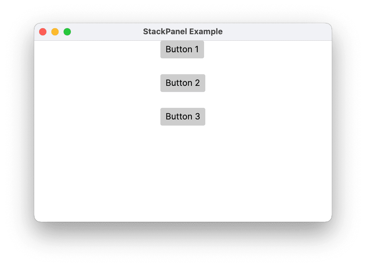
Панель StackPanel позволяет «складывать» элементы в заданном направлении. Направление стека по умолчанию — вертикальное. Для управления потоком содержимого можно использовать свойство Orientation.
StackPanel в сравнении с DockPanel
Хотя DockPanel также может «складывать» дочерние элементы, DockPanel и StackPanel не дают аналогичных результатов в некоторых сценариях использования. Например, порядок дочерних элементов может влиять на их размер в DockPanel, но не в StackPanel. Это происходит потому, что StackPanel измеряет в направлении укладки как PositiveInfinity, тогда как DockPanel измеряет только доступный размер.
Определение и использование StackPanel
Следующий пример демонстрируе�т, как использовать StackPanel для создания набора вертикально расположенных кнопок. Для горизонтального расположения установите свойство Orientation в значение Horizontal.
- XAML
- C#
 <StackPanel HorizontalAlignment="Center"
                VerticalAlignment="Top"
                Spacing="25">
        <Button Content="Button 1" />
        <Button Content="Button 2" />
        <Button Content="Button 3" />
    </StackPanel>
// Define the StackPanel
myStackPanel = new StackPanel();
myStackPanel.HorizontalAlignment = HorizontalAlignment.Center;
myStackPanel.VerticalAlignment = VerticalAlignment.Top;
myStackPanel.Spacing = 25;

// Define child content
Button myButton1 = new Button();
myButton1.Content = "Button 1";
Button myButton2 = new Button();
myButton2.Content = "Button 2";
Button myButton3 = new Button();
myButton3.Content = "Button 3";

// Add child elements to the parent StackPanel
myStackPanel.Children.Add(myButton1);
myStackPanel.Children.Add(myButton2);
myStackPanel.Children.Add(myButton3);
WrapPanel
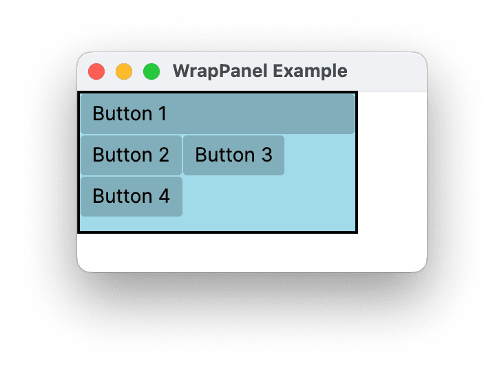
WrapPanel используется для последовательного размещения дочерних элементов слева направо, с переносом содержимого на следующую строку при достижении края родительского контейнера. Содержимое может быть ориентировано горизонтально или вертикально. WrapPanel полезен для простых сценариев плавающего пользовательского интерфейса. Его также можно использовать для применения единого размера ко всем его дочерним элементам.
Следующий пример демонстрирует, как создать WrapPanel для отображения элементов управления Button, которые переносятся на новую строку при достижении края своего контейнера.
- XAML
- C#
<Border HorizontalAlignment="Left" VerticalAlignment="Top" BorderBrush="Black" BorderThickness="2">
  <WrapPanel Background="LightBlue" Width="200" Height="100">
    <Button Width="200">Button 1</Button>
    <Button>Button 2</Button>
    <Button>Button 3</Button>
    <Button>Button 4</Button>
  </WrapPanel>
</Border>
// Instantiate a new WrapPanel and set properties
myWrapPanel = new WrapPanel();
myWrapPanel.Background = System.Windows.Media.Brushes.Azure;
myWrapPanel.Orientation = Orientation.Horizontal;
myWrapPanel.Width = 200;
myWrapPanel.HorizontalAlignment = HorizontalAlignment.Left;
myWrapPanel.VerticalAlignment = VerticalAlignment.Top;

// Define 3 button elements. The last three buttons are sized at width
// of 75, so the forth button wraps to the next line.
btn1 = new Button();
btn1.Content = "Button 1";
btn1.Width = 200;
btn2 = new Button();
btn2.Content = "Button 2";
btn2.Width = 75;
btn3 = new Button();
btn3.Content = "Button 3";
btn3.Width = 75;
btn4 = new Button();
btn4.Content = "Button 4";
btn4.Width = 75;

// Add the buttons to the parent WrapPanel using the Children.Add method.
myWrapPanel.Children.Add(btn1);
myWrapPanel.Children.Add(btn2);
myWrapPanel.Children.Add(btn3);
myWrapPanel.Children.Add(btn4);
Вложенные элементы панели
Элементы Panel могут быть вложены друг в друга для создания сложных макетов. Это может оказаться очень полезным в ситуациях, когда одна Panel идеально подходит для части пользовательского интерфейса, но может не соответствовать потребностям другой части пользовательского интерфейса.
Нет практического ограничения на количество вложений, которое может поддерживать ваше приложение, однако обычно лучше ограничить ваше приложение, используя только те панели, которые действительно необходимы для желаемого макета. Во многих случаях элемент Grid можно использовать вместо вложенных панелей благодаря его гибкости как контейнера макета. Это может повысить производительность вашего приложения, не допуская попадания ненужных элементов в дерево.
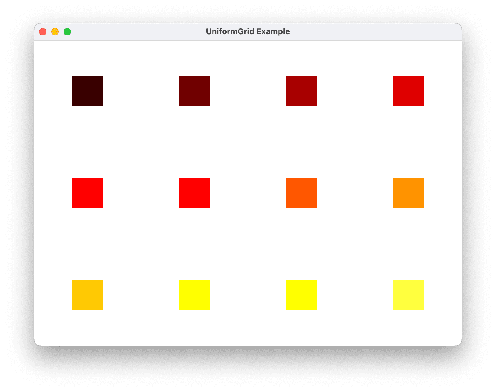
UniformGrid
UniformGrid — это тип панели, обеспечивающий однородный макет сетки. Это означает, что он располагает свои дочерние элементы в сетке, где все ячейки в сетке имеют одинаковый размер. В отличие от стандартной Grid, UniformGrid не поддерживает явные строки и столбцы, а также не предоставляет присоединенные свойства Grid.Row или Grid.Column.
Основной случай использования UniformGrid — когда вам нужно отобразить коллекцию элементов в формате сетки, где каждый элемент занимает одинаковое количество места.
Свойства UniformGrid
- Rows и Columns:
UniformGridиспользует свойстваRowsиColumnsдля определения макета своих дочерних элементов. Если вы установите только одно из этих свойств,UniformGridавтоматически вычислит другое, чтобы создать сетку, соответствующую общему количеству дочерних элементов. Есл�и вы не установите ни одно из свойств,UniformGridпо умолчанию будет использовать сетку 1x1.
Например, если у вас 12 элементов и вы установите Rows на 3, UniformGrid автоматически создаст 4 столбца. Если вы установите Columns на 4, он автоматически создаст 3 строки.
- FirstColumn: Свойство
FirstColumnпозволяет оставить определенное количество ячеек пустыми в первой строке сетки.
Определение и использование UniformGrid
Следующий пример демонстрирует, как определить и использовать UniformGrid. Пример создает UniformGrid с 3 строками и 4 столбцами и добавляет 12 прямоугольников в качестве дочерних элементов.
- XAML
- C#
<UniformGrid Rows="3" Columns="4">
  <Rectangle Width="50" Height="50" Fill="#330000"/>
  <Rectangle Width="50" Height="50" Fill="#660000"/>
  <Rectangle Width="50" Height="50" Fill="#990000"/>
  <Rectangle Width="50" Height="50" Fill="#CC0000"/>
  <Rectangle Width="50" Height="50" Fill="#FF0000"/>
  <Rectangle Width="50" Height="50" Fill="#FF3300"/>
  <Rectangle Width="50" Height="50" Fill="#FF6600"/>
  <Rectangle Width="50" Height="50" Fill="#FF9900"/>
  <Rectangle Width="50" Height="50" Fill="#FFCC00"/>
  <Rectangle Width="50" Height="50" Fill="#FFFF00"/>
  <Rectangle Width="50" Height="50" Fill="#FFFF33"/>
  <Rectangle Width="50" Height="50" Fill="#FFFF66"/>
</UniformGrid>
// Create the UniformGrid
UniformGrid myUniformGrid = new UniformGrid();
myUniformGrid.Rows = 3;
myUniformGrid.Columns = 4;

// Define the child content
for (int i = 0; i < 12; i++)
{
    Rectangle myRectangle = new Rectangle();
    myRectangle.Fill = new SolidColorBrush(Color.FromRgb((byte)(i * 20), 0, 0));
    myRectangle.Width = 50;
    myRectangle.Height = 50;
    myUniformGrid.Children.Add(myRectangle);
}
В приведенном выше примере каждый Rectangle автоматически назначается ячейке в сетке в том порядке, в котором они были добавлены.