TextTrimming
Overview
The TextTrimming property allows you to control how text is displayed when it exceeds the maximum available space in a control. This property is accessible by text-displaying controls, such as TextBlock, SelectableTextBlock or ContentPresenter.
Text trimming adds an ellipsis (…) to indicate truncated text, instead of abruptly cutting off the text.
Avalonia uses the Unicode ellipsis character U+2026 by default, not three periods.
Trimming modes
Avalonia provides six text trimming options:
- None
- CharacterEllipsis
- WordEllipsis
- PrefixCharacterEllipsis
- LeadingCharacterEllipsis
- PathSegmentEllipsis
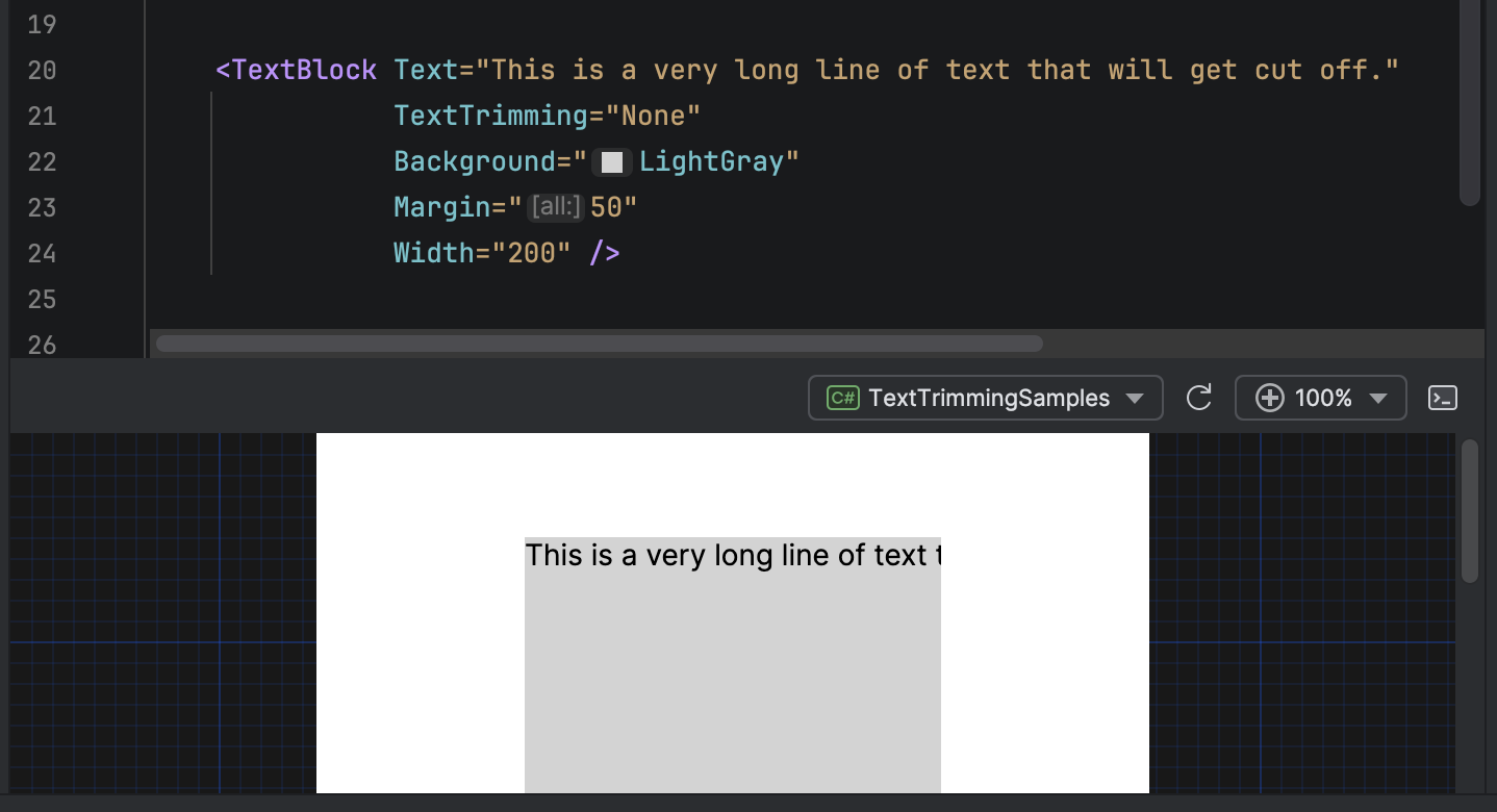
None
No trimming is applied. Text is cut off when it reaches the boundary of the control.
<TextBlock Text="This is a very long line of text that will get cut off."
           TextTrimming="None"
           Width="200" />
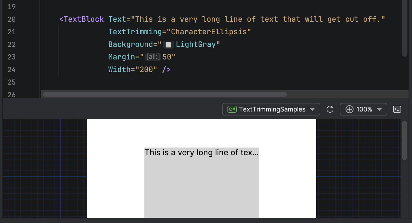
CharacterEllipsis
Trims text after a character ends. An ellipsis is added where the text is truncated.
Intended for general-purposes trimming, when your UI design requires precise space usage.
<TextBlock Text="This is a very long line of text that will get cut off."
           TextTrimming="CharacterEllipsis"
           Width="200" />
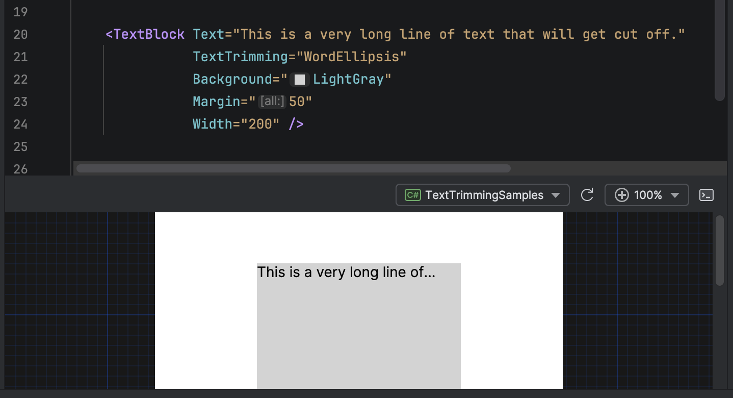
WordEllipsis
Trims text after a word ends. Whole words are preserved, and an ellipsis is added when this is no longer possible.
Intended to maximize readability by preventing incomplete words from appearing.
<TextBlock Text="This is a very long line of text that will get cut off."
           TextTrimming="WordEllipsis"
           Width="200" />
PrefixCharacterEllipsis
Trims text in the middle. The beginning and end of the text string are displayed, with an ellipsis separating them.
Default is to show the first eight characters, then an ellipsis, then however many characters are required to fill the available space.
Intended for file paths, URLs, or any other text where both the beginning and end should be displayed.
<TextBlock Text="C:\Users\Documents\Projects\MyProject\source.cs"
           TextTrimming="PrefixCharacterEllipsis"
           Width="200" />

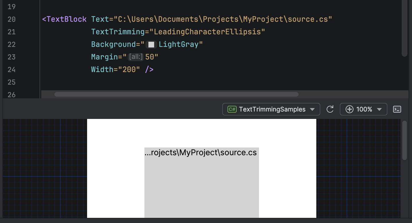
LeadingCharacterEllipsis
Trims text from the beginning. An ellipsis starts the displayed text, followed by the characters at the end of the text.
Intended for file paths or any other text where only the end is important.
<TextBlock Text="C:\Users\Documents\Projects\MyProject\source.cs"
           TextTrimming="LeadingCharacterEllipsis"
           Width="200" />
PathSegmentEllipsis
Collapses interior path segments while preserving the start (drive letter, server name) and end (filename) of a file path or URL. The algorithm removes segments near the middle of the path and replaces them with an ellipsis.
For example, C:\Users\Alice\Documents\Projects\Avalonia\src\Button.cs becomes C:\Users\...\Button.cs when space is limited.
<TextBlock Text="C:\Users\Alice\Documents\Projects\Avalonia\src\Controls\Button.cs"
           TextTrimming="PathSegmentEllipsis"
           Width="200" />
This mode recognizes both forward slashes and backslashes as path separators, so it works for file system paths and URLs.
Example uses
Combining with MaxWidth
Combine TextTrimming with MaxWidth to create responsive text displays that maintain a consistent area on your UI.
<TextBlock Text="{Binding UserName}"
           MaxWidth="300"
           TextTrimming="CharacterEllipsis" />
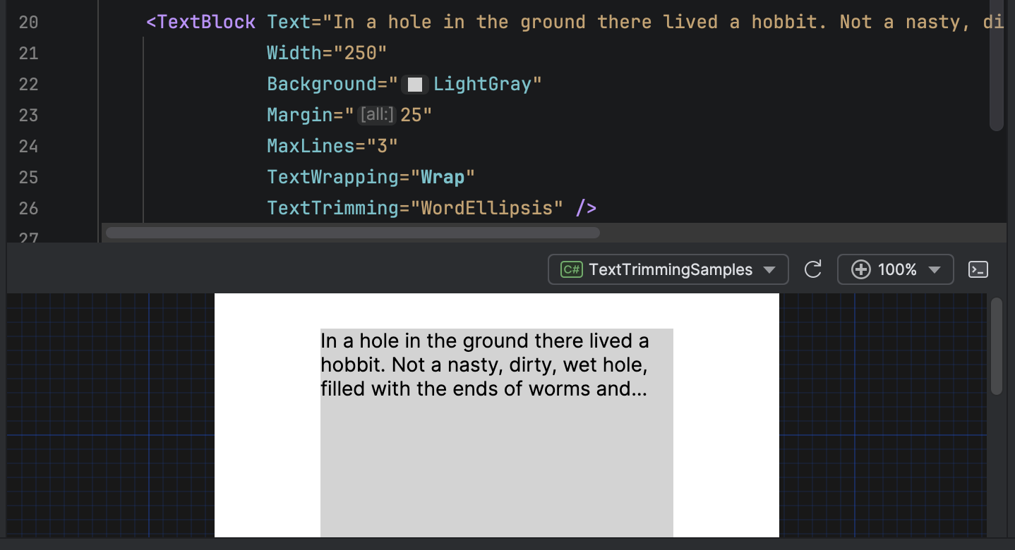
Combining with TextWrapping
Combine TextTrimming and TextWrapping to apply trimming to the last visible line when wrapping is enabled.
<TextBlock Text="{Binding Content}"
           Width="300"
           MaxLines="3"
           TextWrapping="Wrap"
           TextTrimming="WordEllipsis" />