ItemsRepeater
The ItemsRepeater displays repeating data from a bound collection. Unlike ListBox, it provides no built-in selection, scrolling, or chrome. Instead, it gives you full control over how items are laid out and rendered, while still supporting UI virtualization for large data sets.
You supply two things to an ItemsRepeater:
- A data source via the
ItemsSourceproperty. - A data template via the
ItemTemplateproperty that defines how each item looks.
By default, items are arranged in a vertical StackLayout. You can swap this for a horizontal StackLayout or a UniformGridLayout by setting the Layout property.
When to use ItemsRepeater
Use ItemsRepeater when you need a lightweight, virtualized list or grid without built-in selection. The table below compares it with related controls:
| Control | Selection | Virtualization | Best for |
|---|---|---|---|
ListBox | Built-in | Yes | Selectable lists |
ItemsControl | None | No (by default) | Small collections, custom layouts |
ItemsRepeater | None | Yes | Large collections, custom layouts, performance |
If you need selection behavior, consider wrapping items in a Button (see Handling click events below) or using ListBox instead.
Useful properties
You will probably use these properties most often:
| Property | Description |
|---|---|
ItemsSource | The bound collection used as the data source. |
ItemTemplate | A DataTemplate that defines the visual structure for each item. |
Layout | The layout strategy for arranging items. Defaults to a vertical StackLayout. |
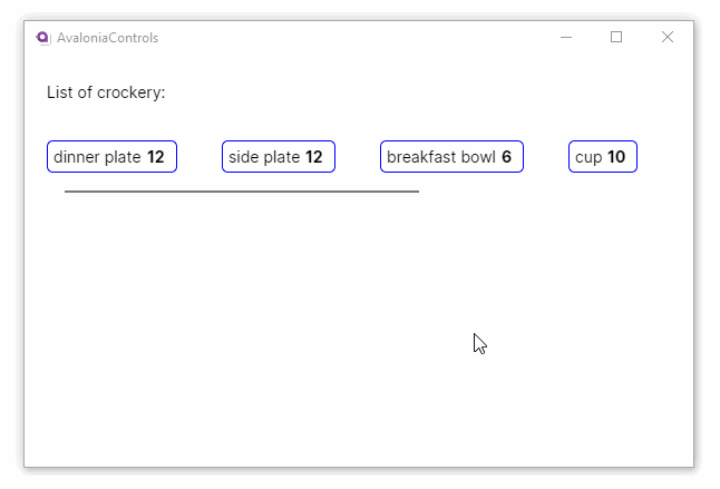
Vertical list example
This example binds an observable collection of crockery items to an ItemsRepeater, with custom formatting provided by the data template:
<StackPanel Margin="20">
  <TextBlock Margin="0 5">List of crockery:</TextBlock>
  <ItemsRepeater ItemsSource="{Binding CrockeryList}">
    <ItemsRepeater.ItemTemplate>
      <DataTemplate>
        <Border Margin="0,10,0,0"
                CornerRadius="5"
                BorderBrush="Blue" BorderThickness="1"
                Padding="5">
          <StackPanel Orientation="Horizontal">
            <TextBlock Text="{Binding Title}" />
            <TextBlock Margin="5 0" FontWeight="Bold"
                       Text="{Binding Number}" />
          </StackPanel>
        </Border>
      </DataTemplate>
    </ItemsRepeater.ItemTemplate>
  </ItemsRepeater>
</StackPanel>
using AvaloniaControls.Models;
using System.Collections.Generic;
using System.Collections.ObjectModel;

namespace AvaloniaControls.ViewModels
{
    public class MainWindowViewModel : ViewModelBase
    {
        public ObservableCollection<Crockery> CrockeryList { get; set; }

        public MainWindowViewModel()
        {
            CrockeryList = new ObservableCollection<Crockery>(new List<Crockery>
            {
                new Crockery("dinner plate", 12),
                new Crockery("side plate", 12),
                new Crockery("breakfast bowl", 6),
                new Crockery("cup", 10),
                new Crockery("saucer", 10),
                new Crockery("mug", 6),
                new Crockery("milk jug", 1)
            });
        }
    }
}
public class Crockery
{
    public string Title { get; set; }
    public int Number { get; set; }

    public Crockery(string title, int number)
    {
        Title = title;
        Number = number;
    }
}

Horizontal list example
You can display items horizontally by setting the Layout property to a horizontal StackLayout. Wrap the ItemsRepeater in a ScrollViewer so that items that overflow to the right remain accessible:
<StackPanel Margin="20">
  <TextBlock Margin="0 5">List of crockery:</TextBlock>
  <ScrollViewer HorizontalScrollBarVisibility="Auto">
    <ItemsRepeater ItemsSource="{Binding CrockeryList}" Margin="0 20">
      <ItemsRepeater.Layout>
        <StackLayout Spacing="40"
                     Orientation="Horizontal" />
      </ItemsRepeater.Layout>
      <ItemsRepeater.ItemTemplate>
        <DataTemplate>
          <Border Margin="0,10,0,0"
                  CornerRadius="5"
                  BorderBrush="Blue" BorderThickness="1"
                  Padding="5">
            <StackPanel Orientation="Horizontal">
              <TextBlock Text="{Binding Title}" />
              <TextBlock Margin="5 0" FontWeight="Bold"
                         Text="{Binding Number}" />
            </StackPanel>
          </Border>
        </DataTemplate>
      </ItemsRepeater.ItemTemplate>
    </ItemsRepeater>
  </ScrollViewer>
</StackPanel>
Layout options
The Layout property accepts any object that derives from AttachedLayout. Avalonia ships with two built-in options:
StackLayout
Arranges items in a single line, either vertically (default) or horizontally.
| Property | Description |
|---|---|
Orientation | Vertical (default) or Horizontal. |
Spacing | The distance in pixels between each item. |
UniformGridLayout
Arranges items in a wrapping grid of equally-sized cells. The number of columns adjusts automatically based on the available width, making it ideal for responsive card layouts.
<ScrollViewer>
    <ItemsRepeater ItemsSource="{Binding Products}">
        <ItemsRepeater.Layout>
            <UniformGridLayout MinItemWidth="250" MinItemHeight="180"
                               MinColumnSpacing="12" MinRowSpacing="12" />
        </ItemsRepeater.Layout>
        <ItemsRepeater.ItemTemplate>
            <DataTemplate>
                <Border Background="White" CornerRadius="8" Padding="16"
                        BorderBrush="#E5E7EB" BorderThickness="1">
                    <StackPanel Spacing="8">
                        <TextBlock Text="{Binding Name}" FontWeight="Bold" />
                        <TextBlock Text="{Binding Description}" TextWrapping="Wrap"
                                   Foreground="Gray" />
                    </StackPanel>
                </Border>
            </DataTemplate>
        </ItemsRepeater.ItemTemplate>
    </ItemsRepeater>
</ScrollViewer>
| Property | Description |
|---|---|
MinItemWidth | Minimum width for each item. |
MinItemHeight | Minimum height for each item. |
MinColumnSpacing | Minimum horizontal spacing between items. |
MinRowSpacing | Minimum vertical spacing between items. |
MaximumRowsOrColumns | Maximum number of rows or columns before wrapping. |
Handling click events
Because ItemsRepeater has no built-in selection, you can handle clicks by wrapping each item in a Button that invokes a command on your view model:
<ItemsRepeater ItemsSource="{Binding Items}">
    <ItemsRepeater.ItemTemplate>
        <DataTemplate>
            <Button Command="{Binding $parent[ItemsRepeater].((vm:MainViewModel)DataContext).SelectCommand}"
                    CommandParameter="{Binding}"
                    Background="Transparent" Padding="0">
                <Border Padding="12">
                    <TextBlock Text="{Binding Name}" />
                </Border>
            </Button>
        </DataTemplate>
    </ItemsRepeater.ItemTemplate>
</ItemsRepeater>
You can also handle Tapped or PointerPressed events on individual items if you prefer an event-based approach rather than commands.
Scrolling and virtualization
ItemsRepeater does not include a built-in scroll viewer. To enable scrolling, wrap it in a ScrollViewer:
<ScrollViewer>
    <ItemsRepeater ItemsSource="{Binding LargeCollection}">
        <ItemsRepeater.ItemTemplate>
            <DataTemplate>
                <TextBlock Text="{Binding}" Margin="4" />
            </DataTemplate>
        </ItemsRepeater.ItemTemplate>
    </ItemsRepeater>
</ScrollViewer>
When you place an ItemsRepeater inside a ScrollViewer, virtualization is enabled automatically. Only the items currently visible (plus a small buffer) are created, which keeps memory usage low and scrolling smooth even for collections with thousands of items.