ItemsControl
The ItemsControl is the base class for controls that display repeating data (for example, ListBox and ComboBox). It has no built-in formatting, selection, or scroll behavior. You can use it with data binding, styling, and data templates to create a completely custom repeating data control.
tip
If you need built-in selection support, use ListBox instead. If you need scrolling, wrap your ItemsControl in a ScrollViewer, or consider ListBox which includes one by default.
Useful properties
You will probably use these properties most often:
| Property | Description |
|---|---|
ItemsSource | The bound collection that is used as the data source for the control. |
ItemTemplate | A DataTemplate applied to each item. Use this to control how individual items look. |
ItemsPanel | The panel that hosts generated items. Defaults to a StackPanel. See custom ItemsPanel for details on replacing it. |
Styles | Styles applied to child elements of the ItemsControl. |
DisplayMemberBinding | A binding that selects the property to display when you do not supply an ItemTemplate. |
Practical notes
- Use
ObservableCollection<T>for yourItemsSourceso the UI updates automatically when you add or remove items at runtime. A plainList<T>will not notify the control of changes. ItemsControldoes not virtualize its children. If you are working with a large number of items, consider usingItemsRepeaterwith a virtualizing layout, or aListBoxwhich virtualizes by default.- To arrange items horizontally instead of vertically, replace the default
ItemsPanel:
<ItemsControl.ItemsPanel>
  <ItemsPanelTemplate>
    <WrapPanel Orientation="Horizontal" />
  </ItemsPanelTemplate>
</ItemsControl.ItemsPanel>
- Because
ItemsControlhas no built-in scrollbar, content that overflows the available height is clipped. Wrap the control in aScrollViewerif you need scrolling:
<ScrollViewer>
  <ItemsControl ItemsSource="{Binding MyItems}" />
</ScrollViewer>
Example
This example binds an observable collection of crockery items to an ItemsControl. A DataTemplate provides custom layout and formatting for each item:
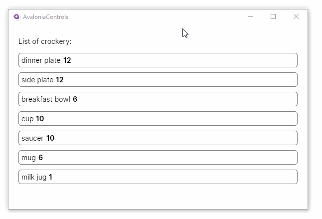
XAML
<StackPanel Margin="20">
  <TextBlock Margin="0 5">List of crockery:</TextBlock>
  <ItemsControl ItemsSource="{Binding CrockeryList}">
    <ItemsControl.ItemTemplate>
      <DataTemplate>
        <Border Margin="0,10,0,0"
                CornerRadius="5"
                BorderBrush="Gray" BorderThickness="1"
                Padding="5">
          <StackPanel Orientation="Horizontal">
            <TextBlock Text="{Binding Title}" />
            <TextBlock Margin="5 0" FontWeight="Bold"
                       Text="{Binding Number}" />
          </StackPanel>
        </Border>
      </DataTemplate>
    </ItemsControl.ItemTemplate>
  </ItemsControl>
</StackPanel>
C# view model
using AvaloniaControls.Models;
using System.Collections.Generic;
using System.Collections.ObjectModel;

namespace AvaloniaControls.ViewModels
{
    public class MainWindowViewModel : ViewModelBase
    {
        public ObservableCollection<Crockery> CrockeryList { get; set; }

        public MainWindowViewModel()
        {
            CrockeryList = new ObservableCollection<Crockery>(new List<Crockery>
            {
                new Crockery("dinner plate", 12),
                new Crockery("side plate", 12),
                new Crockery("breakfast bowl", 6),
                new Crockery("cup", 10),
                new Crockery("saucer", 10),
                new Crockery("mug", 6),
                new Crockery("milk jug", 1)
            });
        }
    }
}
C# item class
public class Crockery
{
    public string Title { get; set; }
    public int Number { get; set; }

    public Crockery(string title, int number)
    {
        Title = title;
        Number = number;
    }
}