Add Content to Dialog
Adding Content to the Dialog
Inside the dialog we would like the user to search for albums, and then select an album to buy.
To do this we will need to query a web api to return a list of items. This will take some time so the user may need to wait.
The UI in order to achieve this can consist of the following elements.
- A
TextBoxfor the user to type the album or artist name. - A
ProgressBarto tell the user their search request is happening. - A
ListBoxto display a list of Albums and allow the user to select one. - A
Buttonfor the user to confirm their selection. Effectively buying the album.
Controls can be laid out inside Panels. The most common ones are StackPanel and DockPanel.
A StackPanel will stack multiple controls on top of each other or next to each other depending on the Orientation that is set. The default being Vertical.
A DockPanel allows controls to be docked to any side the user wished via the DockPanel.Dock attached property. The last control inside a DockPanel if it doesn't have a Dock specified will fill the remaining space.
Right click on your Views folder and select Add → Avalonia User Control to add a new View to the project.
Name this MusicStoreView and press the Enter key when prompted.
Build the project so that the previewer will work.
Declare a <DockPanel>.
<DockPanel>

</DockPanel>
Inside the DockPanel add a <StackPanel>. Set DockPanel.Dock="Top" on the StackPanel so that it will be positioned at the top.
<DockPanel>
    <StackPanel DockPanel.Dock="Top">

    </StackPanel>
</DockPanel>
Inside the StackPanel add a TextBox and a ProgressBar.
<DockPanel>
    <StackPanel DockPanel.Dock="Top">
        <TextBox Text="{Binding SearchText}" Watermark="Search for Albums...." />
        <ProgressBar IsIndeterminate="True" IsVisible="{Binding IsBusy}" />
    </StackPanel>
</DockPanel>
Set the properties as shown. Notice we have bound the Text property of the TextBox to a property called SearchText. The View will expect to find this property on our MusicStoreViewModel and will keep that property in sync with whatever the user types. We also added a binding for the IsVisible to the IsBusy property.
To add these properties to our ViewModel open MusicStoreViewModel.cs . Make the class inherit ViewModelBase, so that it is capable of notifying changes.
Then add the following code:
using ReactiveUI;

namespace Avalonia.MusicStore.ViewModels
{
    public class MusicStoreViewModel : ViewModelBase
    {
        private string? _searchText;

        public string? SearchText
        {
            get => _searchText;
            set => this.RaiseAndSetIfChanged(ref _searchText, value);
        }
    }
}
Here we can see that we have a normal getter which returns the field, and we have a Setter that calls a method.
This calls RaiseAndSetIfChanged this method checks to see if value is different from the current _searchText field and if so, it changes it to the new value, and then raises an event to notify the View that it has changed.
Any View that has a {Binding SearchText} expression will automatically update, and stay in sync with this property.
Also add a boolean property named IsBusy with the same convention.
using ReactiveUI;

namespace Avalonia.MusicStore.ViewModels
{
    public class MusicStoreViewModel : ViewModelBase
    {
        private bool _isBusy;
        private string? _searchText;

        public string? SearchText
        {
            get => _searchText;
            set => this.RaiseAndSetIfChanged(ref _searchText, value);
        }

        public bool IsBusy
        {
            get => _isBusy;
            set => this.RaiseAndSetIfChanged(ref _isBusy, value);
        }
    }
}
Return to the MusicStoreView.axaml. So that we can add the remaining controls.
Back inside our DockPanel, add a Button and set it to Dock at the bottom. Set its Content to "Buy Album" its HorizontalAlignment to Center.
Then bind its Command to BuyMusicCommand which we will create in the next chapter.
<DockPanel>
    <StackPanel DockPanel.Dock="Top">
        <TextBox Text="{Binding SearchText}" Watermark="Search for Albums...." />
        <ProgressBar IsIndeterminate="True" IsVisible="{Binding IsBusy}" />
    </StackPanel>
    <Button Command="{Binding BuyMusicCommand}" Content="Buy Album" DockPanel.Dock="Bottom" HorizontalAlignment="Center" />
</DockPanel>
Add a ListBox to the DockPanel. Since this is the last item in the Panel it will fill the remaining space, and since the TextBox and ProgressBar are docked to the top inside a StackPanel and the Button is docked to the bottom. This ListBox will appear in between them and fill the space.
Bind the Items and SelectedItem properties as shown, set the Background to Transparent. Add a Margin of 0 20. This means left and right sides have 0 and top and bottom have 20. This creates some space between the other controls.
<ListBox Items="{Binding SearchResults}" SelectedItem="{Binding SelectedAlbum}" Background="Transparent" Margin="0 20" />
As you might imagine, the Items property needs some kind of List to bind to and the SelectedItem property needs some object to bind to also. However this time they will not be simple types like bool, int or string. They will be ViewModels, this is why we created the AlbumViewModel earlier.
Return to the MusicStoreViewModel.cs file and add the following code.
private AlbumViewModel? _selectedAlbum;

public ObservableCollection<AlbumViewModel> SearchResults { get; } = new();

public AlbumViewModel? SelectedAlbum
{
    get => _selectedAlbum;
    set => this.RaiseAndSetIfChanged(ref _selectedAlbum, value);
}
As you can see the SelectedAlbum property is implemented with the by now familiar pattern.
The SearchResults property does not require this pattern and is a special type, called ObservableCollection<T>. This comes from the using System.Collections.ObjectModel; namespace.
An observable collection is simply a List or Collection that when items are added or removed from it, it fires events so other code can be notified of changes to the list.
Notice this property is instantiated with = new ();. Forget this and it will be null and won't work.
Since we are using ObservableCollection when we bind the ListBoxs Items property to it, then the ListBox control will start listening to events and keep the Items inside the ListBox in sync with the ObservableCollection on the ViewModel.
The ListBox will see that the SearchResults has an item inside it, it will check the type of the item, which will be AlbumViewModel. The ListBox will then see if it has a DataTemplate for that type, which we don't. However it will find at the root of the application in App.axaml.
In order to do that we will create a special class named ViewLocator. Right click on project and Add→ Class/Interface:
using System;
using Avalonia.Controls;
using Avalonia.Controls.Templates;
using Avalonia.MusicStore.ViewModels;

namespace Avalonia.MusicStore
{
    public class ViewLocator : IDataTemplate
    {
        public bool SupportsRecycling => false;

        public IControl Build(object data)
        {
            var name = data.GetType().FullName!.Replace("ViewModel", "View");
            var type = Type.GetType(name);

            if (type != null)
            {
                return (Control) Activator.CreateInstance(type)!;
            }
            else
            {
                return new TextBlock {Text = "Not Found: " + name};
            }
        }

        public bool Match(object data)
        {
            return data is ViewModelBase;
        }
    }
}
And then add that to App.axaml:
<Application.DataTemplates>
   <local:ViewLocator />
</Application.DataTemplates>
This ViewLocator is a special DataTemplate that will take the typename, in this case Avalonia.MusicStore.ViewModels.AlbumViewModel and check to see if a View exists at Avalonia.MusicStore.Views.AlbumView.
If the ListBox finds one, it will display whatever xaml that View describes inside the ListBox, otherwise it will just show the typename inside the ListBox as a string.
Lets test this by adding a constructor on the MusicStoreViewModel.cs.
public MusicStoreViewModel()
{
    SearchResults.Add(new AlbumViewModel());
    SearchResults.Add(new AlbumViewModel());
    SearchResults.Add(new AlbumViewModel());
}
Before we can run this we need to add our MusicStoreView to our MusicStoreWindow which is currently empty.
At the top of MusicStoreWindow.axaml you will find some lines that begin xmlns:x etc.. add a line:
xmlns:local="using:Avalonia.MusicStore.Views"
Then inside the <Panel> add.
<local:MusicStoreView />
Your MusicStoreWindow.axaml should look like this.
<Window xmlns="https://github.com/avaloniaui"
        xmlns:x="http://schemas.microsoft.com/winfx/2006/xaml"
        xmlns:d="http://schemas.microsoft.com/expression/blend/2008"
        xmlns:mc="http://schemas.openxmlformats.org/markup-compatibility/2006"
        xmlns:local="using:Avalonia.MusicStore.Views"
        mc:Ignorable="d" d:DesignWidth="800" d:DesignHeight="450"
        x:Class="Avalonia.MusicStore.Views.MusicStoreWindow"
        Title="MusicStoreWindow"
        TransparencyLevelHint="AcrylicBlur"
        ExtendClientAreaToDecorationsHint="True"
        Width="1000" Height="550"
        WindowStartupLocation="CenterOwner">
    <Panel>
        <ExperimentalAcrylicBorder IsHitTestVisible="False">
            <ExperimentalAcrylicBorder.Material>
                <ExperimentalAcrylicMaterial
                    BackgroundSource="Digger"
                    TintColor="Black"
                    TintOpacity="1"
                    MaterialOpacity="0.65" />
            </ExperimentalAcrylicBorder.Material>
        </ExperimentalAcrylicBorder>

        <Panel Margin="40">
            <local:MusicStoreView />
        </Panel>
    </Panel>
</Window>
Run the application:
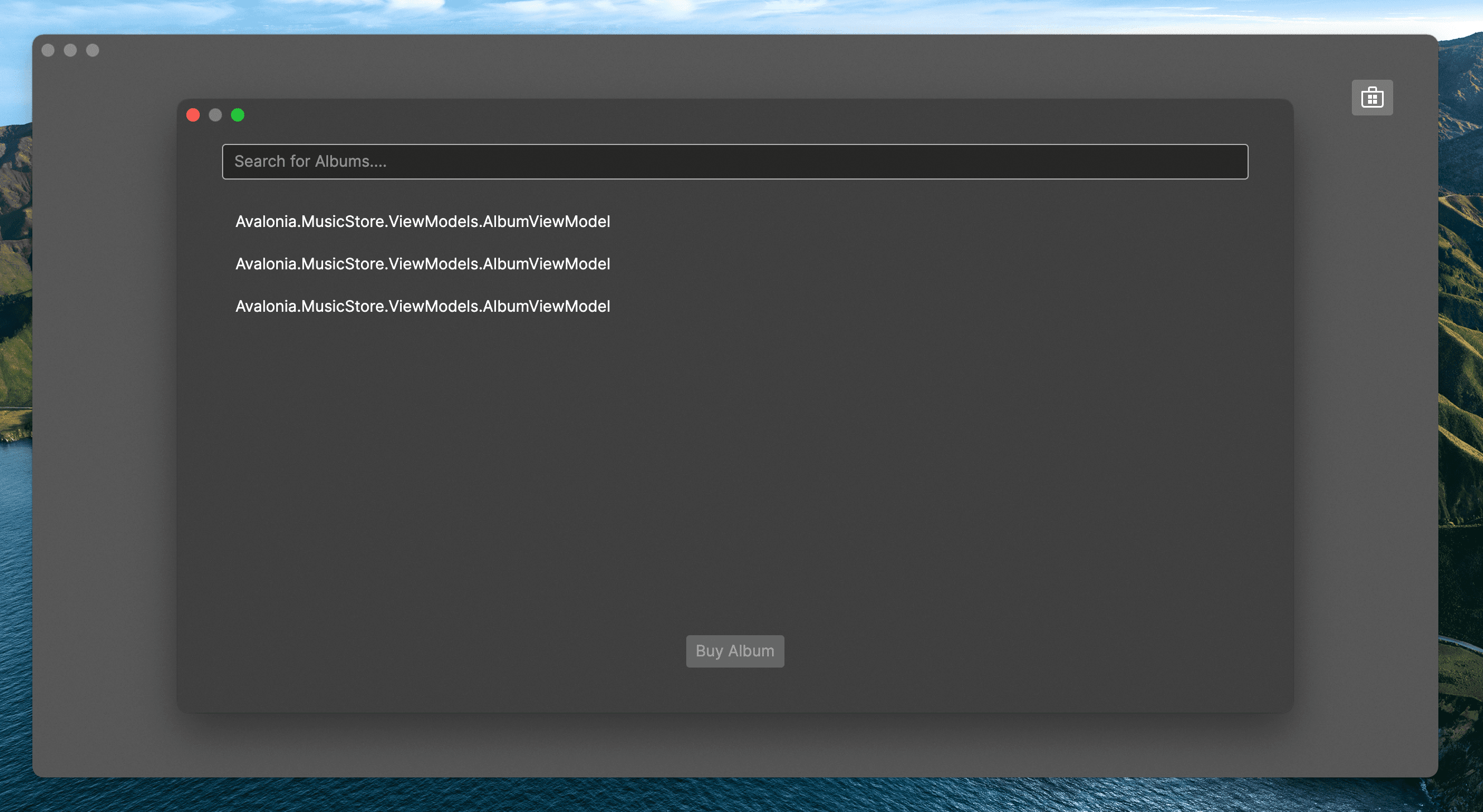
Our items are showing in the List... but not very visual.
Lets create an AlbumView that our ViewLocator will find and use instead.
Right click on your Views folder and select Add → Avalonia User Control. When prompted enter the name AlbumView and press Enter.
For the ViewLocator to do its thing, ensure that AlbumViewModel inherits ViewModelBase.
public class AlbumViewModel : ViewModelBase
{
}
In your newly created AlbumView add the following code:
<StackPanel Spacing="5" Width="200">
    <Border CornerRadius="10" ClipToBounds="True">
        <Panel Background="#7FFF22DD">
            <Image Width="200" Stretch="Uniform" Source="{Binding Cover}" />
            <Panel Height="200" IsVisible="{Binding Cover, Converter={x:Static ObjectConverters.IsNull}}">
                <PathIcon Height="75" Width="75" Data="{StaticResource music_regular}" />
            </Panel>
        </Panel>
    </Border>
    <TextBlock Text="{Binding Title}" HorizontalAlignment="Center" />
    <TextBlock Text="{Binding Artist}" HorizontalAlignment="Center" />
</StackPanel>
This shows a StackPanel to contain the controls. They are:
A border with a Corner radius set, and ClipToBounds set to True, this means that the content will be clipped with rounded corners.
The border contains a Panel with a Background set, using a hexadecimal color code.
This Panel contains an Image and a PathIcon in front of it. Add the source for the Icon to Icons.axaml:
<StreamGeometry x:Key="music_regular">M11.5,2.75 C11.5,2.22634895 12.0230228,1.86388952 12.5133347,2.04775015 L18.8913911,4.43943933 C20.1598961,4.91511241 21.0002742,6.1277638 21.0002742,7.48252202 L21.0002742,10.7513533 C21.0002742,11.2750044 20.4772513,11.6374638 19.9869395,11.4536032 L13,8.83332147 L13,17.5 C13,17.5545945 12.9941667,17.6078265 12.9830895,17.6591069 C12.9940859,17.7709636 13,17.884807 13,18 C13,20.2596863 10.7242052,22 8,22 C5.27579485,22 3,20.2596863 3,18 C3,15.7403137 5.27579485,14 8,14 C9.3521238,14 10.5937815,14.428727 11.5015337,15.1368931 L11.5,2.75 Z M8,15.5 C6.02978478,15.5 4.5,16.6698354 4.5,18 C4.5,19.3301646 6.02978478,20.5 8,20.5 C9.97021522,20.5 11.5,19.3301646 11.5,18 C11.5,16.6698354 9.97021522,15.5 8,15.5 Z M13,3.83223733 L13,7.23159672 L19.5002742,9.669116 L19.5002742,7.48252202 C19.5002742,6.75303682 19.0477629,6.10007069 18.3647217,5.84393903 L13,3.83223733 Z</StreamGeometry>
This means that when the Image source is not loaded the icon will be shown.
Outside the border we have some TextBlocks to show the albums title and artist name.
Notice the StackPanel has its Spacing property set to 5, this puts a space between each item.
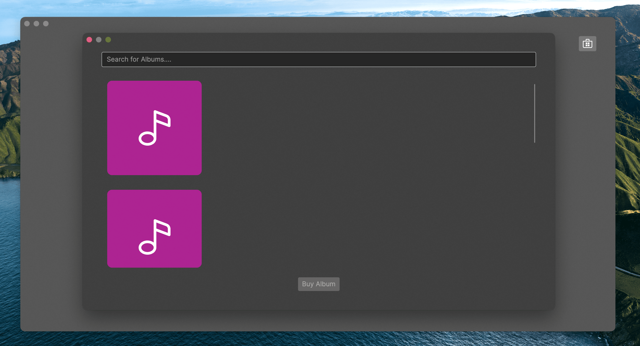
We shall come back to the Bindings in a moment, for now lets run the application and see what happens.
As can be seen the albums are displayed vertically. However it would be nice to have them horizontally and wrap around.
Luckily ListBox provides a solution to this with something called ItemsPanelTemplate. By default the ListBox has its ItemPanel property set to an ItemsPanelTemplate which contains a StackPanel, we can change this to a WrapPanel like so.
<ListBox Items="{Binding SearchResults}" SelectedItem="{Binding SelectedAlbum}" Background="Transparent" Margin="0 20">
    <ListBox.ItemsPanel>
        <ItemsPanelTemplate>
            <WrapPanel />
        </ItemsPanelTemplate>
    </ListBox.ItemsPanel>
</ListBox>
Now when we run the application we get:
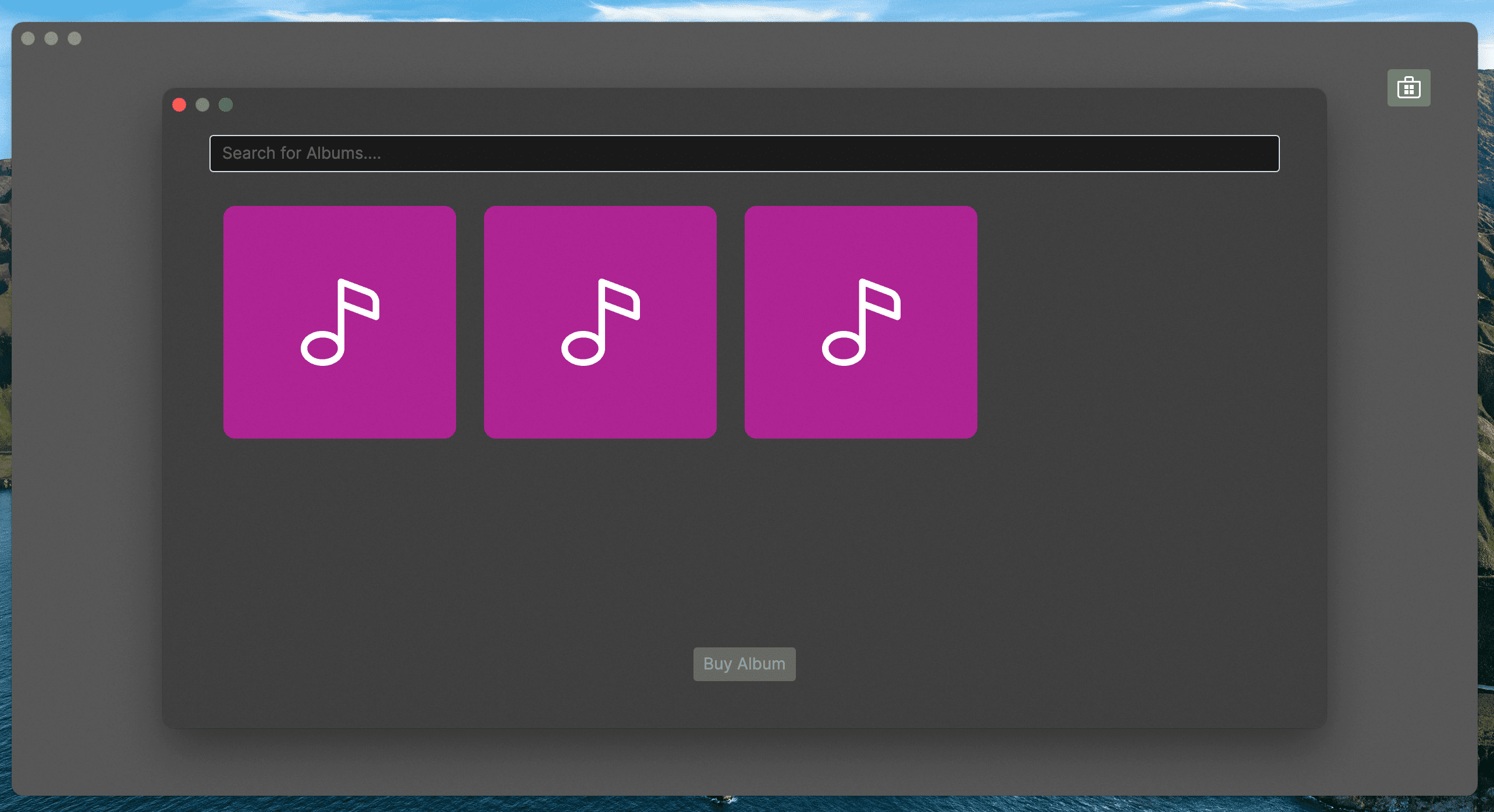
As our list gets more items, that will wrap around onto the next line, and the user will be able to scroll.
This is a very powerful and flexible feature in Avalonia. Any layout can be achieved, by implementing your own Panel class. However that is outside the scope of this tutorial.