TabControl
The TabControl allows us to switch between different pages by means of tabs like the tabs in web navigators or the ribbon menu (which uses tabs) in Word Office for instance.
Here is an animation of what you can achieve :

To create this, we'll describe the entire control (TabControl) and each individual tab+page (TabItem). Here is an example :
<TabControl>
  <TabItem Header="Circle" VerticalContentAlignment="Center">
    <TextBlock Text="I am in the circle page !" HorizontalAlignment="Left" VerticalAlignment="Center"/>
  </TabItem>
  <TabItem>
    <TabItem.Header>
      <TextBlock VerticalAlignment="Center">Triangle</TextBlock>
    </TabItem.Header>
    <StackPanel>
      <TextBlock Text="I am in the triangle page ! I'll put a button to show you that each page contains what you want." HorizontalAlignment="Left" VerticalAlignment="Center"/>
      <Button>A button in the triangle page !</Button>
    </StackPanel>
  </TabItem>
  <TabItem>
    <TabItem.Header>
      <TextBlock VerticalAlignment="Center">Square</TextBlock>
    </TabItem.Header>
    <StackPanel Orientation="Horizontal">
      <TextBlock Text="Square : " HorizontalAlignment="Left" VerticalAlignment="Center"/>
      <Rectangle Fill="Blue" Width="63" Height="41"/>
    </StackPanel>
  </TabItem>
</TabControl>
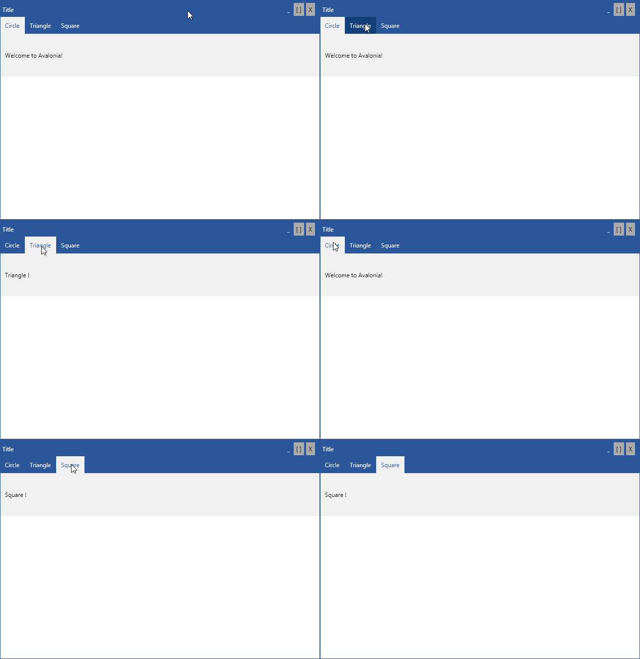
If you want to customize the look & feel of the TabControl
Let's have a look at a customized TabControl :

The grey part is the TabItem... Yes, the TabItem includes the tab AND the page associated to the tab. The tab is called the headerof the TabItem. Moreover, given the way TabControl has been implemented, tabs are in a WrapPanel. Thus, if you want to color in blue (like this is done above) the empty bar of the tabbed bar, you must change the background color of the WrapPanel of the TabControl. Here is the code used to obtain the result above (Note the workaround used to color some tabs : this is due to the way the control is implemented. It might change in the future.)
<Window.Styles>

  <Style Selector="TabControl">
    <Setter Property="Background" Value="#F0F0F0"/>
    <Setter Property="Height" Value="120"/>
  </Style>
  <Style Selector="TabControl WrapPanel">
    <Setter Property="Background" Value="#2B579A"/>
  </Style>

  <Style Selector="TabItem">
    <Setter Property="FontSize" Value="12"/>
    <Setter Property="Height" Value="34"/>
    <Setter Property="VerticalAlignment" Value="Center"/>
    <Setter Property="Background" Value="#2B579A"/>
    <Setter Property="Foreground" Value="#F0F0F0"/>
    <Setter Property="Margin" Value="0 0 0 0"/>
    <Setter Property="Padding" Value="10 0"/>
  </Style>
  <Style Selector="TabItem:pointerover /template/ ContentPresenter#PART_ContentPresenter">
    <Setter Property="Background" Value="#124078"/>
  </Style>

  <Style Selector="TabItem:focus">
    <Setter Property="Foreground" Value="#2B579A"/>
    <Setter Property="Margin" Value="0 0 0 0"/>
    <Setter Property="Padding" Value="10 0"/>
  </Style>
  <Style Selector="TabItem:focus /template/ ContentPresenter#PART_ContentPresenter">
    <Setter Property="Background" Value="#f0f0f0"/>
  </Style>

  <Style Selector="TabItem:selected">
    <Setter Property="Foreground" Value="#2B579A"/>
    <Setter Property="Margin" Value="0 0 0 0"/>
    <Setter Property="Padding" Value="10 0"/>
  </Style>
  <Style Selector="TabItem:selected /template/ ContentPresenter#PART_ContentPresenter">
    <Setter Property="Background" Value="#f0f0f0"/>
  </Style>

</Window.Styles>
Binding support
Dynamically generated TabItems through binding are also supported. In this case bind Items property. The TabStrip header content is defined by ItemTemplate property, while TabItem's content is defined by ContentTemplate property.
The following example uses a TabItemModel array to represent two tabs. Let's first create the model.
public class TabItemModel
{
    public string Header { get; }
    public string Content { get; }
    public TabItemModel(string header, string content)
    {
        Header = header;
        Content = content;
    }
}
Create an array of two TabItemModel instances and bind it to the DataContext.
DataContext = new TabItemModel[] {
    new TabItemModel("One", "Some content on first tab"),
    new TabItemModel("Two", "Some content on second tab"),
};
Finally create a TabControl and bind its Items property to the DataContext.
<TabControl Items="{Binding}">
    <TabControl.ItemTemplate>
      <DataTemplate>
        <TextBlock Text="{Binding Header}" />
      </DataTemplate>
    </TabControl.ItemTemplate>
    <TabControl.ContentTemplate>
      <DataTemplate>
        <DockPanel LastChildFill="True">
          <TextBlock Text="This is content of selected tab" DockPanel.Dock="Top" FontWeight="Bold" />
          <TextBlock Text="{Binding Content}" />
        </DockPanel>
      </DataTemplate>
    </TabControl.ContentTemplate>
  </TabControl>