Pseudoclasses
Pseudoclasses in Avalonia, similar to those in CSS, are keywords exposed by a Control that indicate a distinct control state. These states are used in style selectors to conditionally style controls. For example, a Button could have a different appearance while it is being pressed, or a TextBox while it is disabled.
Pseudoclass state is tracked by the Control's PseudoClasses property. By convention, pseudoclass names begin with a :, such as :pointerover or :pressed.
Common pseudoclasses
These pseudoclasses are defined by InputElement and are available on every Control:
| Pseudoclass | Description |
|---|---|
:disabled | The control is disabled and cannot be interacted with. |
:pointerover | The pointer is over the control as determined by hit testing. |
:focus | The control has focus. |
:focus-within | The control has focus or contains a descendant that has focus. |
:focus-visible | The control has focus and should show a visual indicator. |
Individual controls define additional pseudoclasses specific to their state. For example, CheckBox exposes :checked, and Button exposes :pressed.
Using pseudoclasses in selectors
Target a pseudoclass by appending it to a selector. The following applies bold text to a CheckBox when it is checked:
<Window.Styles>
    <Style Selector="CheckBox:checked">
        <Setter Property="FontWeight" Value="Bold" />
    </Style>
</Window.Styles>

<CheckBox Content="Pseudoselectors" />
A control can have multiple pseudoclasses active at once, and you can target multiple pseudoclasses in a single selector:
<Style Selector="Button.red:focus:pointerover">
This selector targets Button controls with the red style class that have both the :focus and :pointerover pseudoclasses active.
Creating custom pseudoclasses
When creating a custom control, you can define custom pseudoclasses to expose control state. Decorate the class with the [PseudoClasses] attribute to provide IDE support, and use PseudoClasses.Set to toggle state.
The PseudoClasses collection is a protected property. Custom pseudoclasses can only be set from within the control class itself, so they must be implemented through inheritance.
The following example defines a Button subclass that sets pseudoclasses based on which region of the button the pointer is over.
[PseudoClasses(":left", ":right", ":middle")]
public class AreaButton : Button
{
    protected override void OnPointerMoved(PointerEventArgs e)
    {
        base.OnPointerMoved(e);
        var pos = e.GetPosition(this);

        if (pos.X < Bounds.Width * 0.25)
            SetAreaPseudoclasses(true, false, false);
        else if (pos.X > Bounds.Width * 0.75)
            SetAreaPseudoclasses(false, true, false);
        else
            SetAreaPseudoclasses(false, false, true);
    }

    protected override void OnPointerExited(PointerEventArgs e)
    {
        base.OnPointerExited(e);
        SetAreaPseudoclasses(false, false, false);
    }

    private void SetAreaPseudoclasses(bool left, bool right, bool middle)
    {
        PseudoClasses.Set(":left", left);
        PseudoClasses.Set(":right", right);
        PseudoClasses.Set(":middle", middle);
    }
}
Because AreaButton derives from Button (a TemplatedControl), it needs its own ControlTheme so that selectors can target the new pseudoclasses:
<ControlTheme
    x:Key="{x:Type local:AreaButton}"
    BasedOn="{StaticResource {x:Type Button}}"
    TargetType="local:AreaButton" />
With the control theme in place, you can style the custom pseudoclasses using nested selectors:
<Window.Styles>
<Style Selector="local|AreaButton">
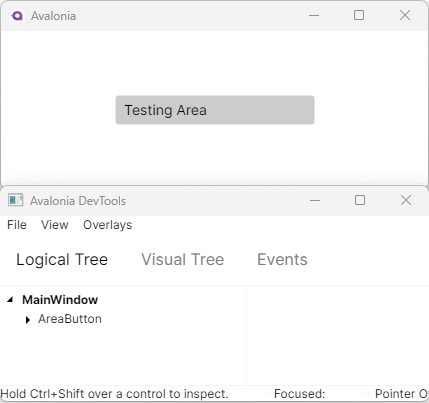
<Setter Property="Content" Value="Testing Area" />
<Setter Property="MinWidth" Value="200" />
<Style Selector="^:left">
<Setter Property="Content" Value="Left" />
</Style>
<Style Selector="^:right">
<Setter Property="Content" Value="Right" />
</Style>
<Style Selector="^:middle">
<Setter Property="Content" Value="Middle" />
</Style>
</Style>
</Window.Styles>
<local:AreaButton />
Custom controls automatically inherit pseudoclasses from their base classes, so AreaButton also responds to InputElement's :pointerover, :focus, and other built-in pseudoclasses.