SplitView
A SplitView presents a container with two parts: the main content zone and a side pane. The main content zone is always visible. The pane can be expanded and collapsed. The collapsed pane can be completely hidden, or left slightly open - with enough space to host some icon buttons for example.
Useful properties
You will probably use these properties most often:
| Property | Description |
|---|---|
PanePlacement | Sets the position of the pane: Left, Right, Top, or Bottom. |
IsPaneOpen | Boolean, default is true. Is the pane in its open state? |
DisplayMode | Controls how the pane is drawn in its open and closed states. See below. |
OpenPaneLength | Defines the width (or height for top/bottom) of the pane when it is open. |
CompactPaneLength | Defines the width (or height for top/bottom) of the pane when it is closed and the display mode is compact. |
The display mode property controls how the pane is drawn in its open and closed states. There are four options:
-
Overlay
The pane is completely hidden until opened. When open, the pane overlays the content area.
-
Inline
The pane is always visible, is a fixed width, and does not overlay the content area. The pane and content areas divide the available screen real estate, but if the container changes width, it is the content zone that resizes.
-
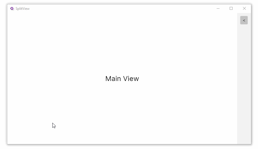
Compact Overlay
A narrow portion of the pane is always visible in this mode, which is just wide enough to show icons. The default closed pane width is 48px, which can be modified with the
CompactPaneLengthproperty value. If the pane is opened, it will overlay the content area. -
Compact Inline
A narrow portion of the pane is always visible in this mode, which is just wide enough to show icons. The default closed pane width is 48px, which can be modified with
CompactPaneLengthproperty value. If the pane is opened, it will reduce the size of the content zone.
Example
- XAML
<SplitView xmlns="https://github.com/avaloniaui"
           IsPaneOpen="True"
           DisplayMode="Inline"
           OpenPaneLength="100">
    <SplitView.Pane>
        <TextBlock Text="Pane"
                   FontSize="24"
                   VerticalAlignment="Center"
                   HorizontalAlignment="Center"/>
    </SplitView.Pane>

    <Grid>
        <TextBlock Text="Content"
                   FontSize="24"
                   VerticalAlignment="Center"
                   HorizontalAlignment="Center"/>
    </Grid>
</SplitView>
Compact display mode
You can use the MVVM pattern with the split view control and one of the compact display mode settings to implement a 'tool pane' style UI. There is enough room on the pane when it is closed to display an icon button that opens the pane.
Navigation sidebar pattern
A common use of SplitView is a collapsible navigation sidebar with icon buttons:
<SplitView IsPaneOpen="{Binding IsPaneOpen}"
           DisplayMode="CompactInline"
           CompactPaneLength="48"
           OpenPaneLength="200">
    <SplitView.Pane>
        <StackPanel>
            <Button Content="☰" Command="{Binding TogglePaneCommand}"
                    Width="48" HorizontalAlignment="Left" />
            <ListBox ItemsSource="{Binding NavItems}"
                     SelectedItem="{Binding SelectedNavItem}"
                     Background="Transparent">
                <ListBox.ItemTemplate>
                    <DataTemplate>
                        <StackPanel Orientation="Horizontal" Spacing="12" Height="40">
                            <PathIcon Data="{Binding Icon}" Width="16" />
                            <TextBlock Text="{Binding Title}" VerticalAlignment="Center" />
                        </StackPanel>
                    </DataTemplate>
                </ListBox.ItemTemplate>
            </ListBox>
        </StackPanel>
    </SplitView.Pane>
    <SplitView.Content>
        <ContentControl Content="{Binding CurrentPage}" />
    </SplitView.Content>
</SplitView>
[ObservableProperty]
private bool _isPaneOpen = true;

[RelayCommand]
private void TogglePane() => IsPaneOpen = !IsPaneOpen;
Pane placement
Position the pane on any side of the content area:
<!-- Pane on the right -->
<SplitView PanePlacement="Right"
           IsPaneOpen="True"
           DisplayMode="Inline"
           OpenPaneLength="250">
Top and Bottom placements create a vertical split where the pane appears above or below the content. OpenPaneLength and CompactPaneLength control the height of the pane in these orientations:
<!-- Pane on top -->
<SplitView PanePlacement="Top"
           IsPaneOpen="True"
           DisplayMode="Inline"
           OpenPaneLength="150">
    <SplitView.Pane>
        <TextBlock Text="Top pane" Margin="8" />
    </SplitView.Pane>
    <TextBlock Text="Main content" Margin="8" />
</SplitView>