Alignment, Margins and Padding
An Avalonia control exposes several properties that are used to precisely position child elements. This topic discusses four of the most important properties: HorizontalAlignment, Margin, Padding, and VerticalAlignment. The effects of these properties are important to understand, because they provide the basis for controlling the position of elements in Avalonia applications.
Introduction to Element Positioning
There are numerous ways to position elements using Avalonia. However, achieving ideal layout goes beyond simply choosing the right Panel element. Fine control of positioning requires an understanding of the HorizontalAlignment, Margin, Padding, and VerticalAlignment properties.
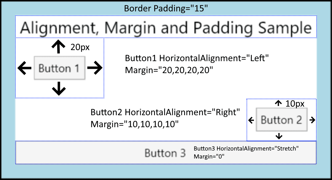
The following illustration shows a layout scenario that utilizes several positioning properties.
At first glance, the Button elements in this illustration may appear to be placed randomly. However, their positions are actually precisely controlled by using a combination of margins, alignments, and padding.
The following example describes how to create the layout in the preceding illustration. A Border element encapsulates a parent StackPanel, with a Padding value of 15 device independent pixels. This accounts for the narrow LightBlue band that surrounds the child StackPanel. Child elements of the StackPanel are used to illustrate each of the various positioning properties that are detailed in this topic. Three Button elements are used to demonstrate both the Margin and HorizontalAlignment properties.
<Window xmlns="https://github.com/avaloniaui"
        xmlns:x="http://schemas.microsoft.com/winfx/2006/xaml"
        x:Class="AvaloniaApplication2.MainWindow"
        Title="AvaloniaApplication2">
  <Border Background="LightBlue"
          BorderBrush="Black"
          BorderThickness="2"
          Padding="15">
    <StackPanel Background="White"
                HorizontalAlignment="Center"
                VerticalAlignment="Top">
      <TextBlock Margin="5,0"
                 FontSize="18"
                 HorizontalAlignment="Center">
        Alignment, Margin and Padding Sample
      </TextBlock>
      <Button HorizontalAlignment="Left" Margin="20">Button 1</Button>
      <Button HorizontalAlignment="Right" Margin="10">Button 2</Button>
      <Button HorizontalAlignment="Stretch">Button 3</Button>
    </StackPanel>
  </Border>
</Window>
The following diagram provides a close-up view of the various positioning properties that are used in the preceding sample. Subsequent sections in this topic describe in greater detail how to use each positioning property.

Understanding Alignment Properties
The HorizontalAlignment and VerticalAlignment properties describe how a child element should be positioned within a parent element's allocated layout space. By using these properties together, you can position child elements precisely. For example, child elements of a DockPanel can specify four different horizontal alignments: Left, Right, Center, or to Stretch to fill available space. Similar values are available for vertical positioning.
Explicitly set Height and Width properties on an element take precedence over the Stretch property value. Attempting to set Height, Width, and a HorizontalAlignment value of Stretch results in the Stretch request being ignored.
HorizontalAlignment Property
The HorizontalAlignment property declares the horizontal alignment characteristics to apply to child elements. The following table shows each of the possible values of the HorizontalAlignment property.
| Member | Description |
|---|---|
Left | Child elements are aligned to the left of the parent element's allocated layout space. |
Center | Child elements are aligned to the center of the parent element's allocated layout space. |
Right | Child elements are aligned to the right of the parent element's allocated layout space. |
Stretch (Default) | Child elements are stretched to fill the parent element's allocated layout space. Explicit Width and Height values take precedence. |
The following example shows how to apply the HorizontalAlignment property to Button elements. Each attribute value is shown, to better illustrate the various rendering behaviors.
<Button HorizontalAlignment="Left">Button 1 (Left)</Button>
<Button HorizontalAlignment="Right">Button 2 (Right)</Button>
<Button HorizontalAlignment="Center">Button 3 (Center)</Button>
<Button HorizontalAlignment="Stretch">Button 4 (Stretch)</Button>
The preceding code yields a layout similar to the following image. The positioning effects of each HorizontalAlignment value are visible in the illustration.
VerticalAlignment Property
The VerticalAlignment property describes the vertical alignment characteristics to apply to child elements. The following table shows each of the possible values for the VerticalAlignment property.
| Member | Description |
|---|---|
Top | Child elements are aligned to the top of the parent element's allocated layout space. |
Center | Child elements are aligned to the center of the parent element's allocated layout space. |
Bottom | Child elements are aligned to the bottom of the parent element's allocated layout space. |
Stretch (Default) | Child elements are stretched to fill the parent element's allocated layout space. Explicit Width and Height values take precedence. |
The following example shows how to apply the VerticalAlignment property to Button elements. Each attribute value is shown, to better illustrate the various rendering behaviors. For purposes of this sample, a Grid element with visible gridlines is used as the parent, to better illustrate the layout behavior of each property value.
<Border Background="LightBlue" BorderBrush="Black" BorderThickness="2" Padding="15">
    <Grid Background="White" ShowGridLines="True">
      <Grid.RowDefinitions>
        <RowDefinition Height="25"/>
        <RowDefinition Height="50"/>
        <RowDefinition Height="50"/>
        <RowDefinition Height="50"/>
        <RowDefinition Height="50"/>
      </Grid.RowDefinitions>
      <TextBlock Grid.Row="0" Grid.Column="0"
                 FontSize="18"
                 HorizontalAlignment="Center">
        VerticalAlignment Sample
      </TextBlock>
      <Button Grid.Row="1" Grid.Column="0" VerticalAlignment="Top">Button 1 (Top)</Button>
      <Button Grid.Row="2" Grid.Column="0" VerticalAlignment="Bottom">Button 2 (Bottom)</Button>
      <Button Grid.Row="3" Grid.Column="0" VerticalAlignment="Center">Button 3 (Center)</Button>
      <Button Grid.Row="4" Grid.Column="0" VerticalAlignment="Stretch">Button 4 (Stretch)</Button>
    </Grid>
</Border>
The preceding code yields a layout similar to the following image. The positioning effects of each VerticalAlignment value are visible in the illustration.
Understanding Margin Properties
The Margin property describes the distance between an element and its child or peers. Margin values can be uniform, by using syntax like Margin="20". With this syntax, a uniform Margin of 20 device independent pixels would be applied to the element. Margin values can also take the form of four distinct values, each value describing a distinct margin to apply to the left, top, right, and bottom (in that order), like Margin="0,10,5,25". Proper use of the Margin property enables very fine control of an element's rendering position and the rendering position of its neighbor elements and children.
A non-zero margin applies space outside the element's Bounds.
The following example shows how to apply uniform margins around a group of Button elements. The Button elements are spaced evenly with a ten-pixel margin buffer in each direction.
<Button Margin="10">Button 7</Button>
<Button Margin="10">Button 8</Button>
<Button Margin="10">Button 9</Button>
In many instances, a uniform margin is not appropriate. In these cases, non-uniform spacing can be applied. The following example shows how to apply non-uniform margin spacing to child elements. Margins are described in this order: left, top, right, bottom.
<Button Margin="0,10,0,10">Button 1</Button>
<Button Margin="0,10,0,10">Button 2</Button>
<Button Margin="0,10,0,10">Button 3</Button>
Understanding the Padding Property
Padding is similar to Margin in most respects. The Padding property is exposed on only on a few classes, primarily as a convenience: Border, TemplatedControl, and TextBlock are samples of classes that expose a Padding property. The Padding property enlarges the effective size of a child element by the specified Thickness value.
The following example shows how to apply Padding to a parent Border element.
<Border Background="LightBlue"
        BorderBrush="Black"
        BorderThickness="2"
        CornerRadius="45"
        Padding="25">
Using Alignment, Margins, and Padding in an Application
HorizontalAlignment, Margin, Padding, and VerticalAlignment provide the positioning control necessary to create a complex UI. You can use the effects of each property to change child-element positioning, enabling flexibility in creating dynamic applications and user experiences.
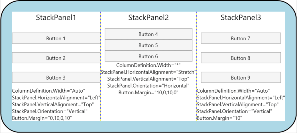
The following example demonstrates each of the concepts that are detailed in this topic. Building on the infrastructure found in the first sample in this topic, this example adds aGrid element as a child of the Border in the first sample. Padding is applied to the parent Border element. TheGrid is used to partition space between three child StackPanel elements. Button elements are again used to show the various effects of Margin and HorizontalAlignment. TextBlock elements are added to each ColumnDefinition to better define the various properties applied to the Button elements in each column.
<Border Background="LightBlue"
        BorderBrush="Black"
        BorderThickness="2"
        CornerRadius="45"
        Padding="25">
    <Grid Background="White" ShowGridLines="True">
      <Grid.ColumnDefinitions>
        <ColumnDefinition Width="Auto"/>
        <ColumnDefinition Width="*"/>
        <ColumnDefinition Width="Auto"/>
      </Grid.ColumnDefinitions>

    <StackPanel Grid.Column="0" Grid.Row="0"
                HorizontalAlignment="Left"
                Name="StackPanel1"
                VerticalAlignment="Top">
        <TextBlock FontSize="18" HorizontalAlignment="Center" Margin="0,0,0,15">StackPanel1</TextBlock>
        <Button Margin="0,10,0,10">Button 1</Button>
        <Button Margin="0,10,0,10">Button 2</Button>
        <Button Margin="0,10,0,10">Button 3</Button>
        <TextBlock>ColumnDefinition.Width="Auto"</TextBlock>
        <TextBlock>StackPanel.HorizontalAlignment="Left"</TextBlock>
        <TextBlock>StackPanel.VerticalAlignment="Top"</TextBlock>
        <TextBlock>StackPanel.Orientation="Vertical"</TextBlock>
        <TextBlock>Button.Margin="0,10,0,10"</TextBlock>
    </StackPanel>

    <StackPanel Grid.Column="1" Grid.Row="0"
                HorizontalAlignment="Stretch"
                Name="StackPanel2"
                VerticalAlignment="Top"
                Orientation="Vertical">
        <TextBlock FontSize="18" HorizontalAlignment="Center" Margin="0,0,0,15">StackPanel2</TextBlock>
        <Button Margin="10,0,10,0">Button 4</Button>
        <Button Margin="10,0,10,0">Button 5</Button>
        <Button Margin="10,0,10,0">Button 6</Button>
        <TextBlock HorizontalAlignment="Center">ColumnDefinition.Width="*"</TextBlock>
        <TextBlock HorizontalAlignment="Center">StackPanel.HorizontalAlignment="Stretch"</TextBlock>
        <TextBlock HorizontalAlignment="Center">StackPanel.VerticalAlignment="Top"</TextBlock>
        <TextBlock HorizontalAlignment="Center">StackPanel.Orientation="Horizontal"</TextBlock>
        <TextBlock HorizontalAlignment="Center">Button.Margin="10,0,10,0"</TextBlock>
    </StackPanel>

    <StackPanel Grid.Column="2" Grid.Row="0"
                HorizontalAlignment="Left"
                Name="StackPanel3"
                VerticalAlignment="Top">
        <TextBlock FontSize="18" HorizontalAlignment="Center" Margin="0,0,0,15">StackPanel3</TextBlock>
        <Button Margin="10">Button 7</Button>
        <Button Margin="10">Button 8</Button>
        <Button Margin="10">Button 9</Button>
        <TextBlock>ColumnDefinition.Width="Auto"</TextBlock>
        <TextBlock>StackPanel.HorizontalAlignment="Left"</TextBlock>
        <TextBlock>StackPanel.VerticalAlignment="Top"</TextBlock>
        <TextBlock>StackPanel.Orientation="Vertical"</TextBlock>
        <TextBlock>Button.Margin="10"</TextBlock>
    </StackPanel>
  </Grid>
</Border>
When compiled, the preceding application yields a UI that looks like the following illustration. The effects of the various property values are evident in the spacing between elements, and significant property values for elements in each column are shown within TextBlock elements.
