Toolbar and Selection Flyouts
By default, RichTextEditor includes a primary toolbar, a selection mini-bar, and a right-click context menu. Each of these toolbars is built from the same basic system and can be customized independently. You can swap layouts, add your own tools, fine-tune the overflow menu, re-theme buttons, and more. This guide takes you through your customization options, from most common to most advanced.
This control is available as part of Avalonia Pro or higher.
Toolbar architecture
The toolbar system separates UI presentation from behavioral logic. EditorToolbar is a TemplatedControl with a strongly-typed Tools collection (AvaloniaList<EditorTool>) marked as the [Content] property — XAML children are added to Tools automatically and can only be EditorTool instances. Action-bearing tools derive from ActionTool (which adds Action/Icon/ToolTipText); separators and groups derive from EditorTool directly.
EditorTool: the abstract base for any item hosted inside anEditorToolbarorToolbarGroup. It carries target-area visibility, overflow metadata, and editor-host discovery.ActionTool: the abstract base for tools that bind to anIEditorAction. AddsAction,Icon, andToolTipText, and synchronizesIsEnabledwithAction.CanExecute(host). Most concrete tools (button, toggle, combobox, flyout) derive from this.ToolbarGroup: itself anEditorTool. Hosts its own strongly-typedToolscollection of child tools. Groups share visibility status, i.e., they collapse together into the overflow menu if there is insufficient space. Groups can nest, and a nested group contributes its children to the enclosing top-level group's overflow section rather than collapsing as a unit, because a group carries no overflow menu item to stand in for its children.EditorToolbar: aTemplatedControlthat exposes a strongly-typedToolscollection (AvaloniaList<EditorTool>) marked as the[Content]property. Wires items to the editor, pushes the active target areas onto every tool, and runs the overflow-collapse layout pass. Items are inserted into aPanelnamedPART_ItemsHostin the control template, published as the constantEditorToolbar.PartItemsHost.
Both EditorToolbar and ToolbarGroup use a Panel template part named PART_ItemsHost. The default theme uses a WrapPanel; the toolbar embedded inside RichTextEditor uses a horizontal StackPanel. Re-template either control with any panel type to change the layout. Every templated toolbar control declares its parts with [TemplatePart] and publishes the names as public const string Part* members.
RichTextEditor
  └─ EditorToolbar            (TemplatedControl with [Content] Tools : AvaloniaList<EditorTool>)
       ├─ ToolbarGroup        (EditorTool with [Content] Tools, collective visibility)
       │    ├─ ButtonTool     (ActionTool)
       │    ├─ ToggleTool     (ActionTool)
       │    ├─ ToolbarGroup   (groups may nest)
       │    └─ ...
       ├─ SeparatorTool       (EditorTool, no action surface)
       └─ OverflowTool        (ActionTool, the "..." button that hosts collapsed tools)
Namespaces
using Avalonia.Controls.Documents.Primitives.Toolbar; // EditorToolbar, tools, groups
using Avalonia.Controls.Documents.Primitives.Actions; // EditorActions, IEditorAction
using Avalonia.Controls.Documents.Primitives; // EditorSelectionFlyout, EditorContextMenu
using Avalonia.Controls.Documents.Primitives.Adorners; // ToolbarTargetAreas
All of these types are available in XAML under the default Avalonia namespace (https://github.com/avaloniaui).
Migration from earlier EditorToolbar API
If you have existing code that uses the legacy ItemsControl-based surface, update it as follows:
| Before | After |
|---|---|
EditorToolbar.Items / ToolbarGroup.Items | Tools (typed AvaloniaList<EditorTool>, [Content]) |
EditorToolbar.ItemsPanel / ItemsSource | Removed. Re-template the toolbar with a Panel named PART_ItemsHost. |
EditorToolbar/ToolbarGroup derived from ItemsControl | Both are now TemplatedControl. ToolbarGroup derives from EditorTool. |
EditorTool.Action / Icon / ToolTipText | Moved to ActionTool. Custom action-bound tools should derive from ActionTool (passive tools stay on EditorTool). |
Implicit XAML child syntax (<EditorToolbar><ToolbarGroup>…</ToolbarGroup></EditorToolbar>) is unchanged — children are added to Tools via the [Content] attribute. Only explicit <EditorToolbar.Items> / <EditorToolbar.ItemsPanel> element-form usages need renaming. In code, replace toolbar.Items.Add(...) with toolbar.Tools.Add(...).
Changes in 12.3
| Change | What it means |
|---|---|
ToolbarGroup nests | Adding a group to another group's Tools used to throw, which surfaced as an XamlLoadException at parse time. Overflow descends the tree. |
EditorToolbar.EditorHost | Binds the toolbar to an editing host. Editor keeps its RichTextEditor? type. The toolbar drives whichever of the two carries a value. |
Toolbar pushes ActiveTargetAreas | The value is derived on every selection and document change. The per-tool theme setters that used to propagate it are gone. A tool that follows the caret binds IsVisible to IsVisibleForTargetArea, both settable properties. |
ToolbarTargetAreas.CaretAreas | Names the areas an ordinary caret reaches. Default for EditorTool.TargetAreas. |
| Clicking a tool bound to a block property action | Does nothing. It used to throw NotSupportedException from an unobserved task. |
Default toolbar
The built-in EditorToolbar, populated via RichTextEditor.Toolbar in the editor's default control theme, contains the following tools, appearing in this order and sorted into these groups.

- History — Undo, Redo
- Clipboard — Cut, Copy, Paste, Select All
- Font — Font family, Font size, Foreground color, Background color
- Inline formatting — Bold, Italic, Underline, Strikethrough, Superscript, Subscript, Link
- Lists — Bullet list, Numbered list
- Insert — Insert table, Insert image, Header and footer
- Block layout — Text alignment, Block border
- Image — Image size (shown only while the caret is on an image)
- Overflow — "..." button that presents collapsed tools when clicked
A second EditorToolbar, built from the same tool infrastructure, is hosted by the table overlay's actions flyout, appearing as the "..." button on a hovered cell and on row and column strip selections. It carries table structure actions only.
Most tools are context-sensitive, meaning they disappear automatically when out of context, e.g., list tools are hidden outside lists, table tools are hidden outside tables. This is done by declaring the ToolbarTargetAreas of each tool or group.
Replacing the default toolbar
There are two ways to customize the default toolbar, depending on your UI requirements.
Option 1: Set RichTextEditor.Toolbar
Assign a custom EditorToolbar to the Toolbar setter on RichTextEditor. Place this in the editor's control theme so it applies to every RichTextEditor in your application:
<Application.Resources>
  <ControlTheme x:Key="{x:Type RichTextEditor}"
                TargetType="RichTextEditor"
                BasedOn="{StaticResource {x:Type RichTextEditor}}">
    <Setter Property="Toolbar">
      <Template>
        <EditorToolbar>
          <ToolbarGroup>
            <ButtonTool Action="{x:Static EditorActions.Undo}" />
            <ButtonTool Action="{x:Static EditorActions.Redo}" />
          </ToolbarGroup>

          <SeparatorTool />

          <ToolbarGroup Classes="AreaAware" TargetAreas="Text">
            <ToggleTool Action="{x:Static EditorActions.Bold}" />
            <ToggleTool Action="{x:Static EditorActions.Italic}" />
            <ToggleTool Action="{x:Static EditorActions.Underline}" />
          </ToolbarGroup>

          <OverflowTool />
        </EditorToolbar>
      </Template>
    </Setter>
  </ControlTheme>
</Application.Resources>
Option 2: Build a toolbar separately from the editor
If you need the toolbar to live somewhere other than above the editor (e.g., in a side panel, in a window chrome, shared across multiple editors), you can hide the built-in toolbar and place an EditorToolbar wherever you want.
To do so, define the standalone EditorToolbar in XAML and attach it to the editor in the corresponding code-behind.
- XAML
- Code-behind
<DockPanel>
  <EditorToolbar x:Name="MyToolbar" DockPanel.Dock="Top">
    <ToolbarGroup>
      <ButtonTool Action="{x:Static EditorActions.Undo}" />
      <ButtonTool Action="{x:Static EditorActions.Redo}" />
    </ToolbarGroup>
    <ToolbarGroup Classes="AreaAware" TargetAreas="Text">
      <ToggleTool Action="{x:Static EditorActions.Bold}" />
      <ToggleTool Action="{x:Static EditorActions.Italic}" />
    </ToolbarGroup>
  </EditorToolbar>

  <RichTextEditor x:Name="MyEditor" ShowToolbar="False" />
</DockPanel>
public MainWindow()
{
    InitializeComponent();
    MyToolbar.Editor = MyEditor;
}
You can wire one EditorToolbar to different editors at runtime by reassigning EditorToolbar.Editor. This is a common pattern for tabbed document interfaces where a single shared toolbar tracks the active tab.
Minimalist example
A minimal toolbar with only Undo/Redo and Bold/Italic. Note that tool icons are set in a separate tag from the tool action.

<ControlTheme x:Key="{x:Type RichTextEditor}"
              TargetType="RichTextEditor"
              BasedOn="{StaticResource {x:Type RichTextEditor}}">
  <Setter Property="Toolbar">
    <Template>
      <EditorToolbar Margin="4">

        <ButtonTool Action="{x:Static EditorActions.Undo}">
            <ButtonTool.Icon>
                <ContentPresenter ContentTemplate="{StaticResource EditorIcons.Undo}" />
            </ButtonTool.Icon>
        </ButtonTool>

        <ButtonTool Action="{x:Static EditorActions.Redo}">
            <ButtonTool.Icon>
                <ContentPresenter ContentTemplate="{StaticResource EditorIcons.Redo}" />
            </ButtonTool.Icon>
        </ButtonTool>

        <SeparatorTool />

        <ToggleTool Action="{x:Static EditorActions.Bold}">
            <ToggleTool.Icon>
                <ContentPresenter ContentTemplate="{StaticResource EditorIcons.Bold}" />
            </ToggleTool.Icon>
        </ToggleTool>

        <ToggleTool Action="{x:Static EditorActions.Italic}" >
            <ToggleTool.Icon>
                <ContentPresenter ContentTemplate="{StaticResource EditorIcons.Italic}" />
            </ToggleTool.Icon>
        </ToggleTool>

      </EditorToolbar>
    </Template>
  </Setter>
</ControlTheme>
EditorTool types
Components on the toolbar, such as buttons, toggles, comboboxes, etc., are subclasses of EditorTool. The hierarchy is split in two:
EditorToolitself is the abstract base for any toolbar item. It handles target-area visibility, overflow metadata, focus-return helpers, and editor-host discovery.SeparatorToolandToolbarGroupderive from it directly because they don't bind to an action.ActionToolis the abstract intermediate that adds action-bearing properties (Action,Icon,ToolTipText) and keeps state in sync with the editor. Most concrete widgets — buttons, toggles, comboboxes, flyouts — derive from it.
In practice, you'll rarely need to use either base class directly. The built-in subclasses listed below have been designed to meet most use-cases.
Built-in subclasses
| Class | Base | Widget | Typical use |
|---|---|---|---|
ButtonTool | ActionTool | Button | One-shot commands, e.g., Undo, Cut, Paste. |
ToggleTool | ActionTool | Toggle button | Formatting, e.g., Bold, Italic. |
ListToggleTool | ToggleTool | Split toggle button | List toggles (bullet/numbered) that also reflect the active marker style. |
ComboBoxTool | ActionTool | Combobox | Selection from a list, e.g., font family, font size. |
ColorTool | ActionTool | Abstract base | Shared base for the two color pickers. Its SelectedColor is Color?, where null means no color. |
ColorPickerTool | ColorTool | Split button + Avalonia ColorPicker flyout | Pick an arbitrary color, e.g., foreground color, background color. |
ColorSwatchTool | ColorTool | Split button + swatch palette flyout | Pick from a fixed palette. |
AlignmentFlyoutTool | ActionTool | Button with flyout | Text alignment: Left, Right, Center, Justify. |
HyperlinkFlyoutTool | ActionTool | Button with flyout | Insert/edit hyperlinks. |
ImageFlyoutTool | ActionTool | Button with flyout | Insert and resize an inline image. |
ImageLinkFlyoutTool | ActionTool | Button with flyout | Attach or clear a hyperlink on the selected image. |
PageBandFlyoutTool | ActionTool | Button with flyout | Header and footer tools in one flyout. See Headers and footers for details. |
TablePickerTool | ActionTool | Grid picker | Insert a table by sizing a grid. |
BorderFlyoutTool | ActionTool | Button with flyout | Block border configuration, e.g., sides, thickness, color. |
OverflowTool | ActionTool | "..." button with flyout | Menu flyout that presents collapsed tools. |
SeparatorTool | EditorTool | Vertical rule | Visual divider. |
List marker styles are reached through ListToggleTool, which the default selection mini-bar uses. Outside a list, it behaves as a plain toggle. Inside a matching list, it becomes a split button whose secondary half opens the marker options for that list type, driving EditorActions.BulletMarkerStyle and EditorActions.NumberedMarkerStyle. The main toolbar uses a plain ToggleTool for the two list toggles, so marker style is not exposed there by default.
Core properties
EditorTool exposes the following on every toolbar item:
| Property | Type | Description |
|---|---|---|
TargetAreas | ToolbarTargetAreas | Contexts in which this tool should appear. Defaults to CaretAreas. See ToolbarTargetAreas. |
ActiveTargetAreas | ToolbarTargetAreas | Read-only. The areas the caret is currently in, pushed here by the host toolbar as the selection moves. |
IsVisibleForTargetArea | bool | Read-only. Whether TargetAreas matches ActiveTargetAreas. |
OverflowMenuItem | MenuItem? | Menu item shown when this tool is collapsed into the overflow menu. null means the tool cannot be collapsed. |
CanCollapseOverride | bool? | Explicit override for overflow collapse. |
ActionTool adds the action-bearing surface (inherited by every interactive tool):
| Property | Type | Description |
|---|---|---|
Action | IEditorAction? | The action this tool executes. |
Icon | object? | Display icon for the tool. |
ToolTipText | string? | Text displayed as tooltip on hover. Defaults to Action.DisplayName if unset. |
EditorToolbar itself carries:
| Property | Type | Description |
|---|---|---|
Editor | RichTextEditor? | The host this toolbar drives. Reassign it to retarget the toolbar at runtime. |
EditorHost | ITextEditorHost? | The host this toolbar drives that is not a RichTextEditor. |
Tools | AvaloniaList<EditorTool> | The [Content] collection of toolbar items. |
ActiveTargetAreas | ToolbarTargetAreas | Read-only. Derived from the selection and pushed onto every tool. |
ShowShortcuts | bool | Whether tooltips display the action's keyboard gesture. |
ToolSpacing | double | Uniform spacing between items in the toolbar panel. ToolbarGroup has one of its own for its children. |
XAML usage
<!-- One-shot command -->
<ButtonTool Action="{x:Static EditorActions.Undo}">
  <ButtonTool.Icon>
    <ContentPresenter ContentTemplate="{StaticResource EditorIcons.Undo}" />
  </ButtonTool.Icon>
</ButtonTool>

<!-- Formatting toggle -->
<ToggleTool Action="{x:Static EditorActions.Bold}">
  <ToggleTool.Icon>
    <ContentPresenter ContentTemplate="{StaticResource EditorIcons.Bold}" />
  </ToggleTool.Icon>
</ToggleTool>

<!-- Property combo with custom item template -->
<ComboBoxTool Action="{x:Static EditorActions.FontFamily}" Width="170">
  <ComboBoxTool.ItemTemplate>
    <DataTemplate DataType="FontFamily">
      <TextBlock Text="{Binding Name}" FontFamily="{Binding}" />
    </DataTemplate>
  </ComboBoxTool.ItemTemplate>
</ComboBoxTool>
Creating a custom tool
You can derive a custom implementation if you need a widget that isn't covered by the built-in subclasses. Pick the base class that matches your use case:
EditorTool— for passive widgets (status displays, decorative chips) that don't bind to an action. OverrideOnApplyTemplatefor template-part lookup andOnEditorHostAttachedto react when an editor host becomes available.ActionTool— for interactive tools that execute anIEditorAction. You inheritAction,Icon,ToolTipText, and anUpdateState()virtual that runs whenever the selection/content/document changes.
In both cases:
- Expose a control template that renders your widget.
- Override
OnApplyTemplateto get references to template parts. - For
ActionTool, overrideUpdateStateto refresh extra state (e.g., a custom badge). ForEditorTool, hookOnEditorHostAttachedand your own event subscriptions. - Inside handlers, call
EnsureEditorFocus()before executing an action so the caret returns to the editor.
Example: Word count tool

The word count display is a passive widget and does not execute an action. It derives from EditorTool directly. UpdateState lives on ActionTool, so a passive tool refreshes itself by subscribing to the host's own events in OnEditorHostAttached and unsubscribing in OnEditorHostDetached.
The implementation counts words by walking the document's DocumentSnapshot. Enumerating Run nodes and treating block boundaries and line breaks as word separators avoids allocating a full plain-text string and avoids merging the last word of one paragraph with the first word of the next.
- C#
- XAML control theme
- Usage
using Avalonia.Controls;
using Avalonia.Controls.Primitives;
using Avalonia.Controls.Documents.TextModel;
using Avalonia.Controls.Documents.Serialization.Snapshot;

public class WordCountTool : EditorTool
{
    private TextBlock? _countText;

    protected override void OnApplyTemplate(TemplateAppliedEventArgs e)
    {
        base.OnApplyTemplate(e);
        _countText = e.NameScope.Find<TextBlock>("PART_Count");
        Refresh();
    }

    protected override void OnEditorHostAttached()
    {
        base.OnEditorHostAttached();

        if (EditorHost is { } host)
        {
            host.ContentChanged += OnHostChanged;
            host.DocumentChanged += OnHostChanged;
        }

        Refresh();
    }

    protected override void OnEditorHostDetached()
    {
        if (EditorHost is { } host)
        {
            host.ContentChanged -= OnHostChanged;
            host.DocumentChanged -= OnHostChanged;
        }

        base.OnEditorHostDetached();
    }

    private void OnHostChanged(object? sender, EventArgs e) => Refresh();

    private void Refresh()
    {
        if (_countText is null) return;

        var doc = EditorHost?.TextDocument;
        if (doc is null)
        {
            _countText.Text = "0 words";
            return;
        }

        var snapshot = doc.CreateSnapshot();
        int words = CountWords(snapshot);
        _countText.Text = $"{words} word{(words == 1 ? "" : "s")}";
    }

    private static int CountWords(DocumentSnapshot snapshot)
    {
        int count = 0;
        bool inWord = false;

        foreach (var node in snapshot.EnumerateNodes())
        {
            var kind = node.Kind;
            if (kind == TextDocumentNodeKind.Run)
            {
                int remaining = node.Length;
                int pos = node.StartOffset;
                while (remaining > 0)
                {
                    var chunk = snapshot.GetTextMemory(pos, remaining);
                    if (chunk.IsEmpty) break;

                    foreach (char c in chunk.Span)
                    {
                        if (char.IsWhiteSpace(c)) inWord = false;
                        else if (!inWord) { inWord = true; count++; }
                    }

                    pos += chunk.Length;
                    remaining -= chunk.Length;
                }
            }
            else if (kind == TextDocumentNodeKind.LineBreak
                || (kind.Flags & NodeKindFlags.Block) != 0)
            {
                // Block boundary — never merge the last word of one paragraph
                // with the first word of the next.
                inWord = false;
            }
        }

        return count;
    }
}
<ControlTheme x:Key="{x:Type local:WordCountTool}" TargetType="local:WordCountTool">
  <Setter Property="Template">
    <ControlTemplate>
      <Border Padding="8,4"
              MinWidth="72"
              VerticalAlignment="Center">
        <TextBlock Name="PART_Count"
                   Classes="Caption"
                   Foreground="{DynamicResource TextControlForeground}"
                   VerticalAlignment="Center" />
      </Border>
    </ControlTemplate>
  </Setter>
</ControlTheme>
<EditorToolbar>
  <!-- ...other groups... -->
  <SeparatorTool />
  <local:WordCountTool />
</EditorToolbar>
Editor actions
Every tool binds to an IEditorAction supplied by the static EditorActions class. The action tells the tool how to execute the command, when it is available, and (for toggles and property actions) what state to display. Bind from XAML with {x:Static EditorActions.<Name>}, or invoke an action directly from code:
if (EditorActions.Bold.CanExecute(editorHost))
    EditorActions.Bold.Execute(editorHost);

// Clipboard actions are asynchronous
await EditorActions.Paste.ExecuteAsync(editorHost);

// Property actions get and set typed values
EditorActions.FontSize.SetValue(editorHost, 16.0);
var current = EditorActions.FontSize.GetValue(editorHost);

// Toggles report their checked state
bool isBold = EditorActions.Bold.IsChecked(editorHost);
EditorActions singletons are how you reference built-in actions. The concrete action classes behind them (e.g., BoldAction) are internal. InsertImageAction and InsertTableAction are exceptions: they are public to allow access to parameterized entry points.
You can still write custom editor actions using the public classes IEditorAction, IToggleAction, IPropertyAction, IPropertyAction<T>, IBlockPropertyAction, IBlockPropertyAction<T>, EditorAction, FormattingToggleAction<T>, PropertyAction<T> and BlockPropertyAction<T>.
An action's Gesture is what tooltips and menu items display. It registers nothing. The shortcut that actually fires is handled by the editor's keyboard component.
Reading action state
Every singleton is declared as IEditorAction. Cast to the interface that carries the state you want.
| Actions | Interface | State accessor |
|---|---|---|
Bold, Italic, Underline, Strikethrough, Superscript, Subscript, BlockBorder, AlignLeft, AlignCenter, AlignRight, AlignJustify, ToggleBulletList, ToggleNumberedList, DifferentFirstPage, DifferentOddAndEvenPages, LinkToPrevious | IToggleAction | IsChecked(host) |
FontFamily | IPropertyAction<FontFamily> | GetValue(host), SetValue(host, value), ClearValue(host) |
FontSize | IPropertyAction<double> | same |
ForegroundColor, BackgroundColor | IPropertyAction<IBrush?> | same |
LineHeight | IBlockPropertyAction<double> | same, plus HasConsistentValue(host) |
Margin, Padding, BorderThickness | IBlockPropertyAction<Thickness> | same |
BlockBackground, BorderBrush | IBlockPropertyAction<IBrush?> | same |
BulletMarkerStyle, NumberedMarkerStyle | IBlockPropertyAction<TextMarkerStyle> | same |
TextAlignmentAction | IBlockPropertyAction<TextAlignment> | same |
InsertImage | InsertImageAction | ExecuteWith(host, ...) |
InsertTable | InsertTableAction | ExecuteWithSize(host, rowCount, columnCount) |
IBlockPropertyAction<T> derives from IPropertyAction<T>, so its value members are inherited rather than redeclared.
IEditorAction.GetState(host) returns the same value untyped. It is kept for compatibility and says nothing about which family the value came from.
Invoking a block property action with no value does nothing. You must use SetValue to apply a block property.
Edit operations
| Action | Gesture | Description |
|---|---|---|
Undo | Ctrl+Z | Undo the last operation. |
Redo | Ctrl+Y | Redo the last undone operation. |
Cut | Ctrl+X | Cut the current selection to the clipboard. |
Copy | Ctrl+C | Copy the current selection to the clipboard. |
Paste | Ctrl+V | Paste clipboard contents at the caret. |
PasteUnformatted | N/A | Paste clipboard contents as plain text. |
SelectAll | Ctrl+A | Select all content. |
Text formatting
| Action | Gesture | Description |
|---|---|---|
Bold | Ctrl+B | Toggle bold. |
Italic | Ctrl+I | Toggle italic. |
Underline | Ctrl+U | Toggle underline. |
Strikethrough | Ctrl+- | Toggle strikethrough. |
Superscript | Ctrl+Shift++ | Toggle superscript baseline alignment. |
Subscript | Ctrl++ | Toggle subscript baseline alignment. |
FontFamily | N/A | Get or set the font family. |
FontSize | N/A | Get or set the font size. |
Colors
| Action | Description |
|---|---|
ForegroundColor | Get or set the text foreground color. |
BackgroundColor | Get or set the text background (highlight) color. |
Block alignment
| Action | Description |
|---|---|
TextAlignmentAction | Get or set block alignment as a value. |
AlignLeft | Left-align the blocks. |
AlignCenter | Center-align the blocks. |
AlignRight | Right-align the blocks. |
AlignJustify | Justify the blocks. |
Block spacing and styling
| Action | Description |
|---|---|
LineHeight | Get or set block line height. |
Margin | Get or set block margin. Uniform on all sides. |
Padding | Get or set block padding. Uniform on all sides |
BlockBackground | Get or set block background color. |
BorderThickness | Get or set block border thickness. |
BorderBrush | Get or set block border color. |
BlockBorder | Toggle block border on or off. |
Lists
| Action | Description |
|---|---|
ToggleBulletList | Wrap or unwrap as an unordered list. |
ToggleNumberedList | Wrap or unwrap as an ordered list. |
BulletMarkerStyle | Set the bullet marker style (e.g., Disc, Circle, Square). |
NumberedMarkerStyle | Set the numbered marker style (e.g., Decimal, LowerLatin, UpperRoman). |
Tables
| Action | Description |
|---|---|
InsertTable | Insert a table at the caret. Defaults to 3×3. |
InsertRowBefore | Insert a row above the current row. |
InsertRowAfter | Insert a row below the current row. |
DeleteRow | Delete the current row. |
InsertColumnBefore | Insert a column to the left of the current column. |
InsertColumnAfter | Insert a column to the right of the current column. |
DeleteColumn | Delete the current column. |
MergeCells | Merge the selected cells into one. |
SplitCell | Split the current merged cell. |
DeleteTable | Delete the entire table. |
Images
| Action | Description |
|---|---|
InsertImage | Insert an inline image at the caret. ExecuteWith takes the image data directly. |
ReplaceImage | Replace the selected image. |
DeleteImage | Delete the selected image. |
Headers and footers
| Action | Description |
|---|---|
GoToHeader | Enter the header of the caret's page. Creates the running header if none. |
GoToFooter | Enter the footer of the caret's page. Creates the running footer if none. |
RemoveHeader | Remove the header on the caret's page or the caret is inside. |
RemoveFooter | Remove the footer on the caret's page or the caret is inside. |
DifferentFirstPage | Toggle separate header and footer on the first page. |
DifferentOddAndEvenPages | Toggle separate headers and footers for odd / even pages. |
LinkToPrevious | Toggle whether the caret's section inherits the previous section's header and footer. |
InsertPageNumber | Insert a current-page field. |
InsertPageCount | Insert a page-count field. |
ReturnToBody | Leave the band and return the caret to the body. |
Footnotes
| Action | Description |
|---|---|
InsertFootnote | Insert a footnote anchor at the caret and open the note. |
GoToFootnote | Move the caret from an anchor into its note. |
GoToFootnoteReference | Move the caret from a note back to its anchor. |
Lookup by ID
Action IDs follow the pattern "Category.Name" (e.g., "Format.Bold", "Table.InsertRowAfter"). EditorActionIds names the ID of every built-in action as a public const string, so a lookup is written against a constant rather than a literal.
var action = EditorActions.GetById(EditorActionIds.Bold);
action?.Execute(editorHost);

// Enumerate every built-in action. All is an IReadOnlyList in
// declaration order, grouped by category.
foreach (var a in EditorActions.All)
    Console.WriteLine($"{a.Id}: {a.DisplayName}");
Springload behavior
When the selection is empty, toggle and property actions set a springload, meaning the formatting applies to the next character typed. This matches the behavior users expect from common word processors.
ToolbarGroup
ToolbarGroup groups a set of related tools to share collective visibility. If the group's TargetAreas don't match the current caret context, the entire group is hidden.
Nesting groups
Groups can nest. A ToolbarGroup is an EditorTool, so it can sit in another group's Tools. Nesting is how a sub-group gets its own TargetAreas or ToolSpacing inside a wider group.
Overflow descends the whole tree, and a nested group contributes its own children to the enclosing top-level group's menu section rather than collapsing as a unit. Setting CanCollapseOverride="False" on a nested group pins its children in place.
<ToolbarGroup Classes="AreaAware" TargetAreas="Text">
  <ToggleTool Action="{x:Static EditorActions.Bold}" />
  <ToggleTool Action="{x:Static EditorActions.Italic}" />

  <!-- Only while the caret is on an image -->
  <ToolbarGroup Classes="AreaAware" TargetAreas="Image">
    <ImageFlyoutTool />
    <ImageLinkFlyoutTool />
  </ToolbarGroup>
</ToolbarGroup>
Applying the AreaAware class
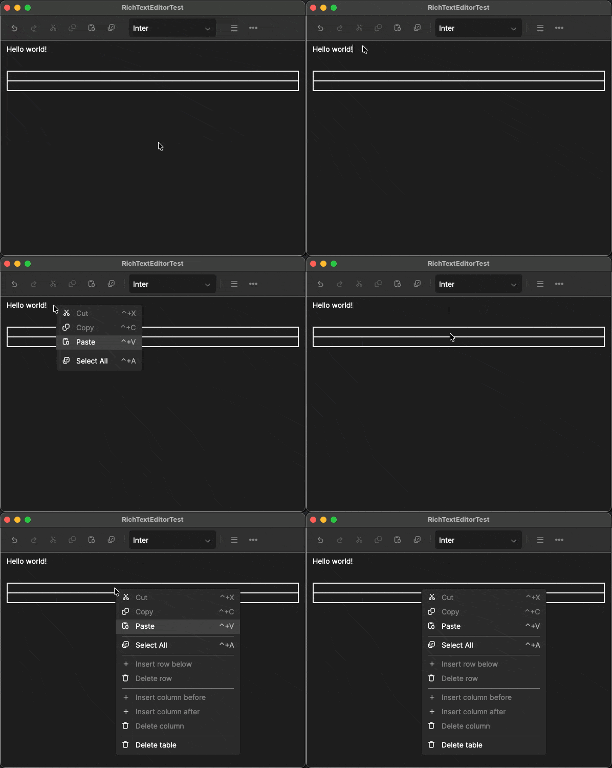
ToolbarGroup does not react to the editor's active context by default. To enable contextual awareness, add the AreaAware class. TargetAreas defaults to CaretAreas—see Toolbar target areas for which areas are included.
<!-- Text formatting group: Only visible when editing text -->
<ToolbarGroup Classes="AreaAware" TargetAreas="Text">
  <ToggleTool Action="{x:Static EditorActions.Bold}" />
  <ToggleTool Action="{x:Static EditorActions.Italic}" />
  <ToggleTool Action="{x:Static EditorActions.Underline}" />
</ToolbarGroup>

<!-- Table actions group: Only visible inside a table -->
<ToolbarGroup Classes="AreaAware" TargetAreas="Table">
  <ButtonTool Action="{x:Static EditorActions.InsertRowAfter}" />
  <ButtonTool Action="{x:Static EditorActions.DeleteRow}" />
</ToolbarGroup>

<!-- Always visible -->
<ToolbarGroup>
  <ButtonTool Action="{x:Static EditorActions.Undo}" />
  <ButtonTool Action="{x:Static EditorActions.Redo}" />
</ToolbarGroup>
Toolbar target areas
ToolbarTargetAreas is a [Flags] enum in Avalonia.Controls.Documents.Primitives.Adorners describing the contexts in which a tool, a menu entry or a block adorner applies. EditorToolbar derives the active areas from the selection on every selection and document change and pushes them onto every tool.
| Flag | Caret context |
|---|---|
None | No target area. |
Text | The caret is in any text-editable position. |
Block | The caret is in a block-level context. |
Table | The caret is in a table. |
List | The caret is in a list. |
Image | The caret is on an inline image. |
TableCells | The selection is a set of whole table cells. Driven by the selection shape rather than the caret's ancestry. |
PageBand | The caret is in a header or footer (band). Bands are text, so tools targeting text areas are available. |
Footnote | The caret is in a footnote. |
All | Visible in all areas. |
CaretAreas | Visible in caret-derived areas: Text, Block, Table, List and Image. Default for EditorTool.TargetAreas. |
CaretAreas is deliberately not every flag. TableCells, PageBand and Footnote must be opted into by name.
CaretAreas is new in v12.3. All is unchanged. Both are combinations of the other flags, so existing XAML such as TargetAreas="Text,List" or TargetAreas="All" still binds.
If required, you can combine ToolbarTargetAreas to make a tool visible in multiple contexts.
<ToolbarGroup Classes="AreaAware" TargetAreas="Text,List">
Managing the overflow menu
The overflow menu is the "..." button at the end of the toolbar. When the toolbar runs out of horizontal space, EditorToolbar collapses tools into this menu, starting from right to left by default.
Collection descends the whole tool tree. A nested ToolbarGroup contributes its own children rather than itself, and the menu reads in the same sequence the tools appear on the bar. A tool that is hidden by its target areas is skipped.
Rules for what collapses
CanCollapseOverride | OverflowMenuItem | Result |
|---|---|---|
null | set | Collapsible (default) |
null | null | Not collapsible |
true | set | Collapsible |
true | null | Not collapsible (no menu representation) |
false | set | Not collapsible (pinned) |
false | null | Not collapsible |
Declaring overflow representations
Each collapsible tool must have its own OverflowMenuItem. In most cases, the menu item can be a simple EditorMenuItem.
<!-- Collapses into a simple menu item with the same icon -->
<ButtonTool Action="{x:Static EditorActions.Cut}">
  <ButtonTool.Icon>
    <ContentPresenter ContentTemplate="{StaticResource EditorIcons.Cut}" />
  </ButtonTool.Icon>
  <ButtonTool.OverflowMenuItem>
    <EditorMenuItem Action="{x:Static EditorActions.Cut}">
      <EditorMenuItem.Icon>
        <ContentPresenter ContentTemplate="{StaticResource EditorIcons.Cut}" />
      </EditorMenuItem.Icon>
    </EditorMenuItem>
  </ButtonTool.OverflowMenuItem>
</ButtonTool>
Overflow for specialized tools
The following specialized subclasses of EditorMenuItem are available for tools that may not work well as plain menu items in an overflow menu.
| Source tool | Overflow item | Behavior |
|---|---|---|
ComboBoxTool (fonts) | FontFamilyMenuItem | Submenu of fonts, each rendered in its own typeface. |
ComboBoxTool (generic) | PropertyMenuItem | Submenu of values auto-populated from the action. |
ColorPickerTool / ColorSwatchTool | ColorMenuItem | Submenu with color swatches and optional "No Color". |
AlignmentFlyoutTool | TextAlignmentMenuItem | Submenu of alignment options. |
Examples
<!-- Font selector submenu -->
<ComboBoxTool Action="{x:Static EditorActions.FontFamily}" Width="170">
  <ComboBoxTool.OverflowMenuItem>
    <FontFamilyMenuItem Action="{x:Static EditorActions.FontFamily}" />
  </ComboBoxTool.OverflowMenuItem>
</ComboBoxTool>

<!-- Color picker submenu -->
<ColorPickerTool Action="{x:Static EditorActions.ForegroundColor}"
                       ToolTipText="Text color">
  <ColorPickerTool.OverflowMenuItem>
    <ColorMenuItem Action="{x:Static EditorActions.ForegroundColor}"
                         Header="Text color" />
  </ColorPickerTool.OverflowMenuItem>
</ColorPickerTool>

<!-- Text alignment submenu -->
<AlignmentFlyoutTool ToolTipText="Text alignment">
  <AlignmentFlyoutTool.OverflowMenuItem>
    <TextAlignmentMenuItem Header="Text alignment" />
  </AlignmentFlyoutTool.OverflowMenuItem>
</AlignmentFlyoutTool>
Pinning important tools
To guarantee a tool always stays in the toolbar, even when horizontal space is tight, omit OverflowMenuItem. Undo and Redo are pinned this way in the default toolbar. Use CanCollapseOverride="False" only when you want to keep an overflow definition for conditional toggling.
<!-- Undo can never be collapsed -->
<ButtonTool Action="{x:Static EditorActions.Undo}">
  <ButtonTool.Icon>
    <ContentPresenter ContentTemplate="{StaticResource EditorIcons.Undo}" />
  </ButtonTool.Icon>
</ButtonTool>
Default mini-bar
When the user selects text, a compact floating toolbar appears near the selection. This is the SelectionFlyout, an EditorSelectionFlyout (a Flyout subclass) that hosts a trimmed-down EditorToolbar.

The default mini-bar includes:
- Inline formatting (
Text): Bold, Italic, Underline, Strikethrough, Text color, Highlight color - List toggles (
Text,List): Bullet, Numbered (each aListToggleToolwhose split half offers marker styles) - Block configuration: Block background, Borders, Text alignment
- Table cell operations (
TableCells): Merge cells, Split cell, Delete row, Delete column - Image actions (
Image): Align left/center/right, Image size, Replace image, Add or edit link, Delete image
The mini-bar anchors to the block containing the selection, rather than the pointer. Each group declares its own TargetAreas, so the table cell and image groups appear only for those selections.
Replacing the default mini-bar
Within the <RichTextEditor> XAML tags, add a <RichTextEditor.SelectionFlyout> and specify a custom EditorSelectionFlyout. This can be used to host an EditorToolbar.
The outer Border named PART_Chrome is required — EditorSelectionFlyout uses it to distinguish the chrome from the surrounding shadow gutter when handling dismiss events.
This example shows a minimal mini-bar that only provides basic text formatting options.

<RichTextEditor>
  <RichTextEditor.SelectionFlyout>
    <EditorSelectionFlyout Placement="TopEdgeAlignedLeft"
                           OverlayDismissEventPassThrough="True">
      <Border Name="PART_Chrome" Classes="EditorMiniBarChrome">
        <EditorToolbar>

          <ToggleTool Action="{x:Static EditorActions.Bold}">
            <ToggleTool.Icon>
              <ContentPresenter ContentTemplate="{StaticResource EditorIcons.Bold}" />
            </ToggleTool.Icon>
          </ToggleTool>

          <ToggleTool Action="{x:Static EditorActions.Italic}">
            <ToggleTool.Icon>
              <ContentPresenter ContentTemplate="{StaticResource EditorIcons.Italic}" />
            </ToggleTool.Icon>
          </ToggleTool>

          <ToggleTool Action="{x:Static EditorActions.Underline}">
            <ToggleTool.Icon>
              <ContentPresenter ContentTemplate="{StaticResource EditorIcons.Underline}" />
            </ToggleTool.Icon>
          </ToggleTool>

        </EditorToolbar>
      </Border>
    </EditorSelectionFlyout>
  </RichTextEditor.SelectionFlyout>
</RichTextEditor>
Some recommendations:
- Apply the
EditorMiniBarChromestyle class to the surroundingBorderfor the default rounded, shadowed appearance. - Keep the set of tools small. The mini-bar should complement the main toolbar, not duplicate it.
Disabling the mini-bar
Within the <RichTextEditor> XAML tags, set SelectionFlyout to {x:Null} to turn it off entirely.
<RichTextEditor SelectionFlyout="{x:Null}" />
Default context menu
The contextual menu that opens when right-clicking within the text editor is the EditorContextMenu — a MenuFlyout subclass attached to RichTextEditor.ContextFlyout.
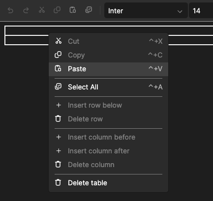
The default context menu contains:
- Cut, Copy, Paste
- Select All
- Table operations (Insert/Delete row, Insert/Delete column, Merge cells, Split cell, Delete table), visible only when the caret is inside a table
- Image operations (Replace image, Delete image), visible only on an image
- Page band operations (Insert page number, Insert page count, Return to body), visible only inside a header or footer
EditorContextMenu reads TargetAreas on each EditorMenuItem to hide items that do not apply to the current context. Unused separator lines left by hidden groups are also hidden automatically. Right-clicking moves the caret to the clicked position first before opening the menu. This ensures the menu opens with the correct context.
Replacing the context menu
Within the <RichTextEditor> XAML tags, add a <RichTextEditor.ContextFlyout> and specify a custom EditorContextMenu. To add actions to the menu, add individual tags for <EditorMenuItem>.
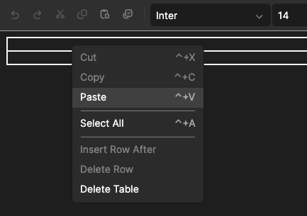
<RichTextEditor>
  <RichTextEditor.ContextFlyout>
    <EditorContextMenu Placement="Pointer">
      <EditorMenuItem Action="{x:Static EditorActions.Cut}" />
      <EditorMenuItem Action="{x:Static EditorActions.Copy}" />
      <EditorMenuItem Action="{x:Static EditorActions.Paste}" />

      <Separator />

      <EditorMenuItem Action="{x:Static EditorActions.SelectAll}" />

      <Separator />

      <!-- Only appears in tables -->
      <EditorMenuItem Action="{x:Static EditorActions.InsertRowAfter}"
                      TargetAreas="Table" />
      <EditorMenuItem Action="{x:Static EditorActions.DeleteRow}"
                      TargetAreas="Table" />
      <EditorMenuItem Action="{x:Static EditorActions.DeleteTable}"
                      TargetAreas="Table" />
    </EditorContextMenu>
  </RichTextEditor.ContextFlyout>
</RichTextEditor>
Adding property submenus
The same specialized menu items used for overflow also work in the context menu.
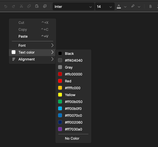
<EditorContextMenu Placement="Pointer">
  <EditorMenuItem Action="{x:Static EditorActions.Cut}" />
  <EditorMenuItem Action="{x:Static EditorActions.Copy}" />
  <EditorMenuItem Action="{x:Static EditorActions.Paste}" />

  <Separator />

  <FontFamilyMenuItem Action="{x:Static EditorActions.FontFamily}"
                            Header="Font" />
  <ColorMenuItem Action="{x:Static EditorActions.ForegroundColor}"
                       Header="Text color" />
  <TextAlignmentMenuItem Header="Alignment" TargetAreas="Text,Block" />
</EditorContextMenu>
Disabling the context menu
Within the <RichTextEditor> XAML tags, set ContextFlyout to {x:Null} to turn it off entirely.
<RichTextEditor ContextFlyout="{x:Null}" />
Theming and styling
Toolbar visuals are controlled through dynamic resources and style classes. You can override default settings at the application level, the window level, or on an individual EditorToolbar.
Sizing and color resources
| Resource | Default | Purpose |
|---|---|---|
EditorToolbarToolHeight | 30 | Tool button height. |
EditorToolbarToolMinWidth | 28 | Minimum tool button width. |
EditorToolbarToolPadding | 6,4 | Internal padding of tool buttons. |
EditorToolbarButtonCornerRadius | 6 | Corner radius of tool buttons. |
EditorToolbarToolOpacity | 0.9 | Tool opacity. |
EditorToolbarSeparatorHeight | 18 | Separator line height. |
EditorToolbarSubtleBorderBrush | Theme | Separator and subtle border color. |
EditorToolbarPointerOverBackgroundBrush | Theme | Hover background color. |
EditorToolbarCheckedBackgroundBrush | Theme | Active/checked background color. |
EditorToolbarDisabledForegroundBrush | Theme | Disabled foreground color. |
Example

<Application.Resources>
  <ResourceDictionary>
    <!-- Make toolbar buttons bigger -->
    <x:Double x:Key="EditorToolbarToolHeight">36</x:Double>
    <x:Double x:Key="EditorToolbarToolMinWidth">36</x:Double>
    <CornerRadius x:Key="EditorToolbarButtonCornerRadius">4</CornerRadius>

    <!-- Use a custom accent for checked tools -->
    <SolidColorBrush x:Key="EditorToolbarCheckedBackgroundBrush"
                     Color="#4CAF50" Opacity="0.25" />
  </ResourceDictionary>
</Application.Resources>
Style classes
| Class | Applies to | Effect |
|---|---|---|
ToolbarTool | Button, ToggleButton, SplitButton | Standard toolbar button sizing, transparency, hover/checked/disabled visuals, transitions. Apply when embedding a stock button inside an EditorToolbar so it blends with surrounding tools. |
AreaAware | ToolbarGroup, ToggleTool, SeparatorTool, TablePickerTool, AlignmentFlyoutTool, and other EditorTool subclasses | Binds the active target area from the ancestor EditorToolbar and optionally drives IsVisible. Required on ToolbarGroup for contextual visibility to work. |
EditorMiniBarChrome | Border | Compact rounded-border, drop-shadow appearance used by the default selection mini-bar. |
Example
Add a plain Button to the toolbar without it looking out of place.
<EditorToolbar>
  <ToolbarGroup>
    <Button Classes="ToolbarTool" Click="OnExport_Click">
      <PathIcon Data="{StaticResource ExportGeometry}" />
    </Button>
  </ToolbarGroup>
  <!-- ... -->
</EditorToolbar>
Targeted styles
For precise control, write a style selector that targets a specific element within the toolbar.
<Style Selector="EditorToolbar > ToolbarGroup > ToggleTool">
  <Setter Property="Margin" Value="2,0" />
</Style>