PipsPager
PipsPager is a page indicator control that displays a row of interactive dots (pips) representing pages in a paginated collection. Users click a pip or use the optional Previous/Next navigation buttons to change the selected page. When the number of pages exceeds MaxVisiblePips, the pips scroll automatically to keep the selected pip visible.
PipsPager is commonly used alongside a Carousel or CarouselPage, bound through SelectedPageIndex.
Useful Properties
You will probably use these properties most often:
| Property | Type | Default | Description |
|---|---|---|---|
NumberOfPages | int | 0 | Total number of pages represented by the pips. |
SelectedPageIndex | int | 0 | Zero-based index of the currently selected page. Supports two-way binding. Clamped to [0, NumberOfPages - 1]. |
MaxVisiblePips | int | 5 | Maximum number of pips visible at once. When NumberOfPages exceeds this value, the pips scroll automatically. Minimum value is 1. |
Orientation | Orientation | Horizontal | Layout direction of the pips. Horizontal or Vertical. |
IsPreviousButtonVisible | bool | true | Shows or hides the Previous navigation button. |
IsNextButtonVisible | bool | true | Shows or hides the Next navigation button. |
PreviousButtonTheme | ControlTheme? | null | Custom theme applied to the Previous navigation button. |
NextButtonTheme | ControlTheme? | null | Custom theme applied to the Next navigation button. |
Pseudo-classes
| Pseudo-class | Condition |
|---|---|
:first-page | SelectedPageIndex is 0. |
:last-page | SelectedPageIndex is NumberOfPages - 1 and NumberOfPages > 0. |
:horizontal | Orientation is Horizontal. |
:vertical | Orientation is Vertical. |
Events
| Event | Args type | Description |
|---|---|---|
SelectedIndexChanged | PipsPagerSelectedIndexChangedEventArgs | Raised when the selected page changes. Provides OldIndex and NewIndex. |
Keyboard Navigation
- Left / Up arrow: moves to the previous page.
- Right / Down arrow: moves to the next page.
- Home: jumps to the first page (index
0). - End: jumps to the last page (
NumberOfPages - 1).
Styling Resource Keys
Override these resource keys on the PipsPager or an ancestor to customize pip indicator colors:
| Resource key | Description |
|---|---|
PipsPagerSelectionIndicatorForeground | Default pip color. |
PipsPagerSelectionIndicatorForegroundSelected | Selected pip color. |
PipsPagerSelectionIndicatorForegroundPointerOver | Pip color on pointer hover. |
PipsPagerSelectionIndicatorForegroundPressed | Pip color when pressed. |
Examples
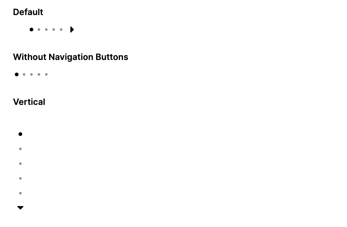
Basic PipsPager
<PipsPager NumberOfPages="5" />
PipsPager in Code
var pager = new PipsPager
{
    NumberOfPages = 5,
    MaxVisiblePips = 5
};
Vertical Orientation
<PipsPager NumberOfPages="5" Orientation="Vertical" />
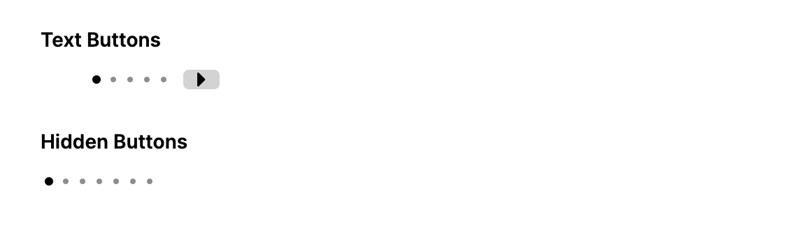
Without Navigation Buttons
<PipsPager NumberOfPages="10"
           MaxVisiblePips="5"
           IsPreviousButtonVisible="False"
           IsNextButtonVisible="False" />
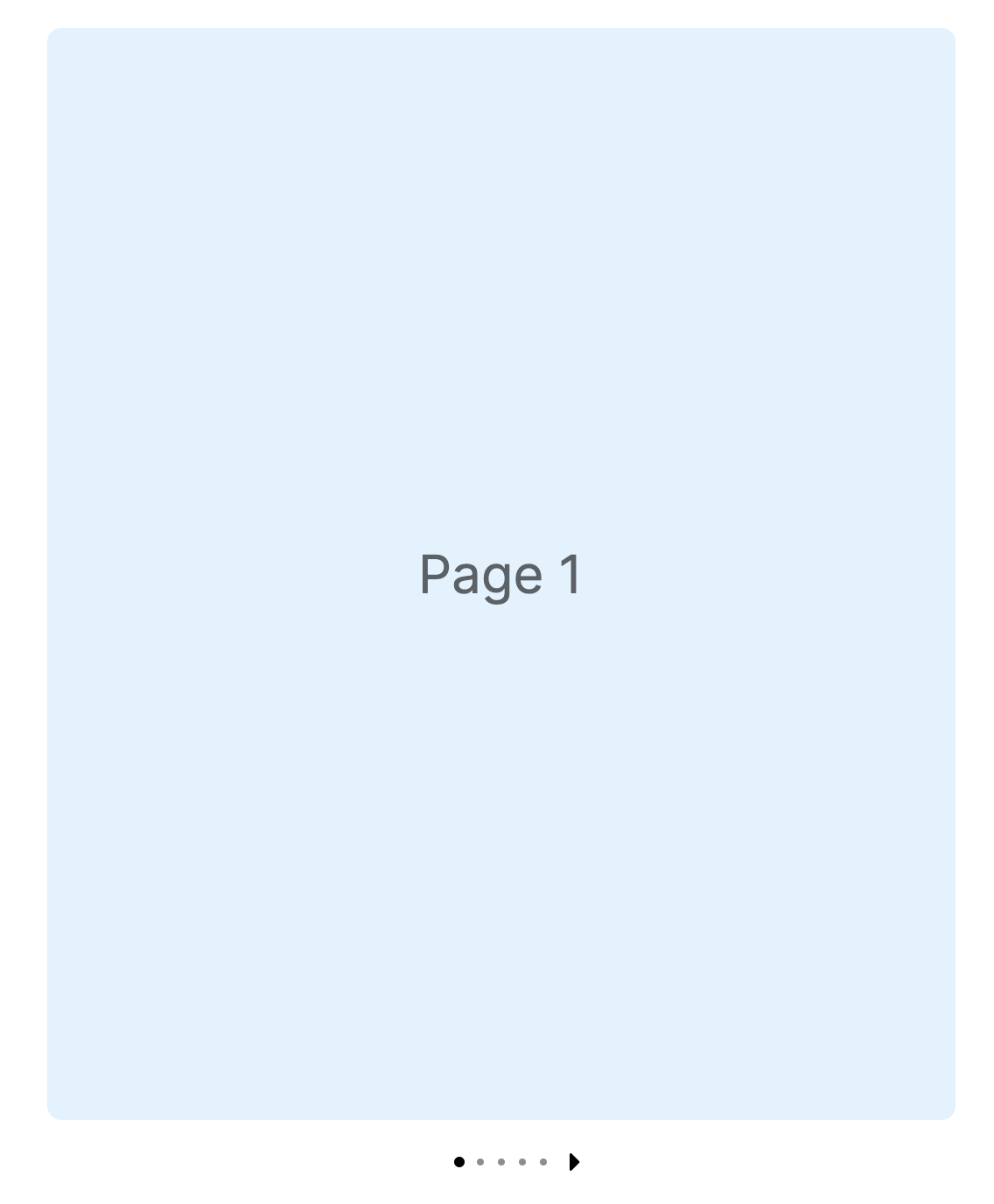
Two-Way Binding with a Carousel
Bind SelectedPageIndex to a Carousel.SelectedIndex for synchronized navigation:
<Grid RowDefinitions="*,Auto">
    <Carousel Name="GalleryCarousel"
              SelectedIndex="{Binding #GalleryPager.SelectedPageIndex, Mode=TwoWay}">
        <Carousel.Items>
            <Border Background="#E3F2FD" CornerRadius="8">
                <TextBlock Text="Page 1" FontSize="30"
                           VerticalAlignment="Center" HorizontalAlignment="Center" />
            </Border>
            <Border Background="#C8E6C9" CornerRadius="8">
                <TextBlock Text="Page 2" FontSize="30"
                           VerticalAlignment="Center" HorizontalAlignment="Center" />
            </Border>
            <Border Background="#FFE0B2" CornerRadius="8">
                <TextBlock Text="Page 3" FontSize="30"
                           VerticalAlignment="Center" HorizontalAlignment="Center" />
            </Border>
        </Carousel.Items>
    </Carousel>

    <PipsPager Name="GalleryPager"
               Grid.Row="1"
               NumberOfPages="3"
               HorizontalAlignment="Center"
               Margin="0,12,0,0" />
</Grid>
Two-Way Binding with a CarouselPage
<Grid RowDefinitions="*,Auto">
    <CarouselPage Name="DemoCarousel"
                  SelectedIndex="{Binding #Pager.SelectedPageIndex, Mode=TwoWay}">
        <ContentPage Header="Welcome">
            <TextBlock Text="Welcome" FontSize="28"
                       HorizontalAlignment="Center" VerticalAlignment="Center" />
        </ContentPage>
        <ContentPage Header="Features">
            <TextBlock Text="Features" FontSize="28"
                       HorizontalAlignment="Center" VerticalAlignment="Center" />
        </ContentPage>
        <ContentPage Header="Get Started">
            <TextBlock Text="Get Started" FontSize="28"
                       HorizontalAlignment="Center" VerticalAlignment="Center" />
        </ContentPage>
    </CarouselPage>

    <PipsPager Name="Pager"
               Grid.Row="1"
               NumberOfPages="3"
               HorizontalAlignment="Center"
               Margin="0,12,0,0" />
</Grid>
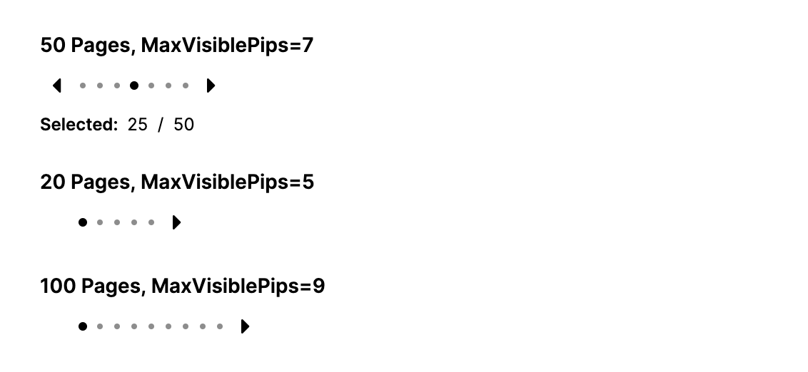
Large Collections with Auto-Scrolling Pips
When NumberOfPages exceeds MaxVisiblePips, the pip strip scrolls automatically to keep the selected pip visible:
<PipsPager NumberOfPages="50"
           MaxVisiblePips="7"
           SelectedPageIndex="25" />
Responding to Selection Changes
pager.SelectedIndexChanged += (sender, e) =>
{
    Console.WriteLine($"Changed from page {e.OldIndex} to {e.NewIndex}");
};
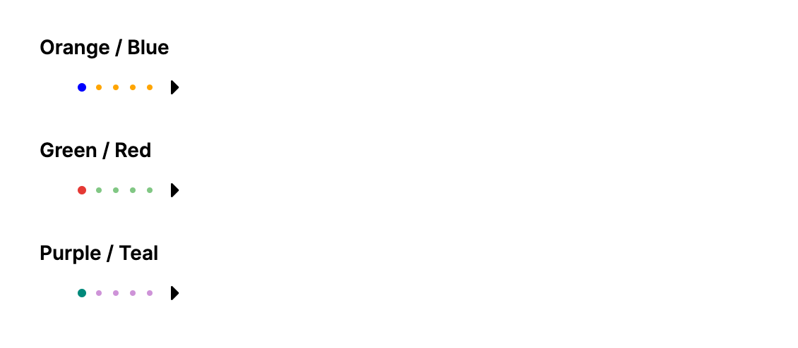
Custom Pip Colors
Override the indicator resource keys on the PipsPager to change pip colors:
<PipsPager NumberOfPages="5" MaxVisiblePips="5">
    <PipsPager.Resources>
        <SolidColorBrush x:Key="PipsPagerSelectionIndicatorForeground" Color="Orange" />
        <SolidColorBrush x:Key="PipsPagerSelectionIndicatorForegroundSelected" Color="Blue" />
        <SolidColorBrush x:Key="PipsPagerSelectionIndicatorForegroundPointerOver" Color="Gold" />
    </PipsPager.Resources>
</PipsPager>
Custom Button Themes
Replace the default chevron buttons with custom themed buttons using PreviousButtonTheme and NextButtonTheme:
<PipsPager NumberOfPages="5" MaxVisiblePips="5">
    <PipsPager.Resources>
        <ControlTheme x:Key="PrevTheme" TargetType="Button">
            <Setter Property="Content" Value="Prev" />
            <Setter Property="Background" Value="LightGray" />
            <Setter Property="Foreground" Value="Black" />
            <Setter Property="Padding" Value="8,2" />
            <Setter Property="Margin" Value="0,0,8,0" />
            <Setter Property="Template">
                <ControlTemplate>
                    <Border Background="{TemplateBinding Background}" CornerRadius="4">
                        <ContentPresenter Content="{TemplateBinding Content}"
                                          Margin="{TemplateBinding Padding}" />
                    </Border>
                </ControlTemplate>
            </Setter>
        </ControlTheme>
        <ControlTheme x:Key="NextTheme" TargetType="Button">
            <Setter Property="Content" Value="Next" />
            <Setter Property="Background" Value="LightGray" />
            <Setter Property="Foreground" Value="Black" />
            <Setter Property="Padding" Value="8,2" />
            <Setter Property="Margin" Value="8,0,0,0" />
            <Setter Property="Template">
                <ControlTemplate>
                    <Border Background="{TemplateBinding Background}" CornerRadius="4">
                        <ContentPresenter Content="{TemplateBinding Content}"
                                          Margin="{TemplateBinding Padding}" />
                    </Border>
                </ControlTemplate>
            </Setter>
        </ControlTheme>
    </PipsPager.Resources>
    <PipsPager.PreviousButtonTheme>
        <StaticResource ResourceKey="PrevTheme" />
    </PipsPager.PreviousButtonTheme>
    <PipsPager.NextButtonTheme>
        <StaticResource ResourceKey="NextTheme" />
    </PipsPager.NextButtonTheme>
</PipsPager>
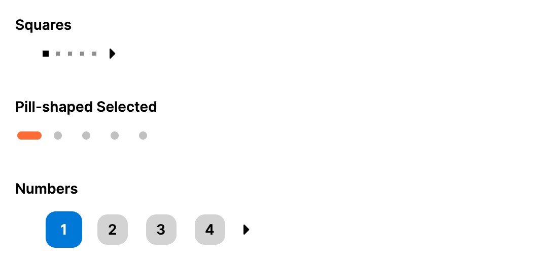
Custom Pip Templates (Pill-Shaped Indicator)
Use Style selectors targeting the inner ListBoxItem to replace the default dot shape. This example transforms the selected pip from a circle into a horizontal pill:
<PipsPager NumberOfPages="5"
           IsPreviousButtonVisible="False"
           IsNextButtonVisible="False">
    <PipsPager.Styles>
        <Style Selector="PipsPager /template/ ListBox ListBoxItem">
            <Setter Property="Width" Value="24" />
            <Setter Property="Height" Value="24" />
            <Setter Property="Padding" Value="0" />
            <Setter Property="Margin" Value="2,0" />
            <Setter Property="MinWidth" Value="0" />
            <Setter Property="MinHeight" Value="0" />
            <Setter Property="VerticalAlignment" Value="Center" />
            <Setter Property="Template">
                <ControlTemplate>
                    <Grid Background="Transparent">
                        <Border Name="Pip"
                                Width="8" Height="8" CornerRadius="4"
                                HorizontalAlignment="Center" VerticalAlignment="Center"
                                Background="#C0C0C0">
                            <Border.Transitions>
                                <Transitions>
                                    <DoubleTransition Property="Width" Duration="0:0:0.2" Easing="CubicEaseOut" />
                                    <DoubleTransition Property="Height" Duration="0:0:0.2" Easing="CubicEaseOut" />
                                    <CornerRadiusTransition Property="CornerRadius" Duration="0:0:0.2" Easing="CubicEaseOut" />
                                    <BrushTransition Property="Background" Duration="0:0:0.2" />
                                </Transitions>
                            </Border.Transitions>
                        </Border>
                    </Grid>
                </ControlTemplate>
            </Setter>
        </Style>
        <Style Selector="PipsPager /template/ ListBox ListBoxItem:pointerover /template/ Border#Pip">
            <Setter Property="Width" Value="10" />
            <Setter Property="Height" Value="10" />
            <Setter Property="CornerRadius" Value="5" />
            <Setter Property="Background" Value="#909090" />
        </Style>
        <Style Selector="PipsPager /template/ ListBox ListBoxItem:selected /template/ Border#Pip">
            <Setter Property="Width" Value="24" />
            <Setter Property="Height" Value="8" />
            <Setter Property="CornerRadius" Value="4" />
            <Setter Property="Background" Value="#FF6B35" />
        </Style>
        <Style Selector="PipsPager /template/ ListBox ListBoxItem:selected:pointerover /template/ Border#Pip">
            <Setter Property="Width" Value="24" />
            <Setter Property="Height" Value="8" />
            <Setter Property="CornerRadius" Value="4" />
            <Setter Property="Background" Value="#E85A2A" />
        </Style>
    </PipsPager.Styles>
</PipsPager>
Programmatic Control
// Set page count
pager.NumberOfPages = 20;

// Jump to a specific page
pager.SelectedPageIndex = 10;

// Limit visible pips
pager.MaxVisiblePips = 7;

// Switch to vertical
pager.Orientation = Orientation.Vertical;

// Hide navigation buttons
pager.IsPreviousButtonVisible = false;
pager.IsNextButtonVisible = false;