Menu
The menu control can add menu structure to an application. You will usually place a menu at the top edge of a dock panel control, so that it is drawn at the top of a window.
For reference information about the dock panel, see here.
Menu Items
A menu element will usually contain a set of nested <MenuItem> elements. The first level of menu items defines the horizontal part of the menu. Subsequent levels of menu items are drop-downs.
The caption of a menu item is set by the Header property. The content zone of a menu item can contain sub-items if required.
You can add menu separator lines by including a <Separator> element or by adding a menu item with its header set to the minus sign, like this:
<MenuItem Header="-" />
Useful Properties
You will probably use these properties most often:
| Element | Property | Description |
|---|---|---|
Menu | DockPanel.Dock | Position the menu on the top edge of a dock panel. |
MenuItem | Header | The menu item caption. |
MenuItem | InputGesture | The displayed key shortcut for the menu item. Setting this property does not cause the input gesture to be handled by the menu item, it simply displays the gesture text in the menu. |
MenuItem | Command | The command to be executed when the menu item is clicked or selected with the keyboard. |
MenuItem | MenuItem.Icon | Contains an icon graphic to display alongside the menu item. |
Separator | A menu item separator line. | |
ItemPanel | The container panel to place items in. By default, this is a StackPanel. See this page to customise the ItemsPanel. | |
Styles | The style that is applied to any child element of the ItemControl. |
Example
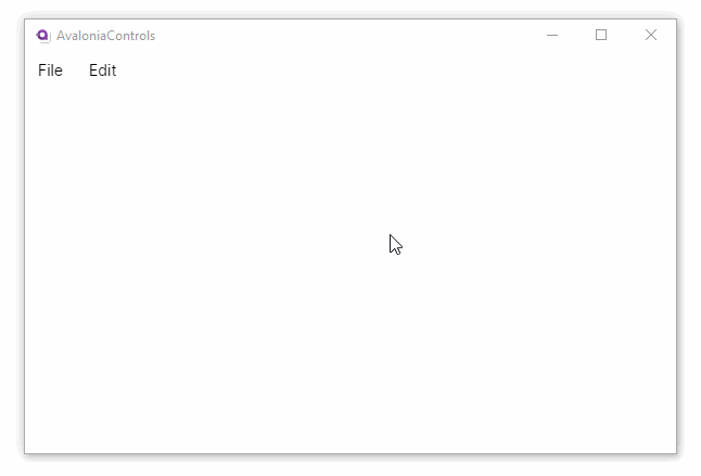
This example creates a menu docked at the top edge of a window.
<Window ...>
    <DockPanel>
    <Menu DockPanel.Dock="Top">
      <MenuItem Header="_File">
        <MenuItem Header="_Open..."/>
        <Separator/>
        <MenuItem Header="_Exit"/>
      </MenuItem>
      <MenuItem Header="_Edit">
        <MenuItem Header="Copy"/>
        <MenuItem Header="Paste"/>
      </MenuItem>
    </Menu>
    <TextBlock/>
  </DockPanel>
</Window>
Accelerator Keys
An accelerator key is identified by a single letter in the header preceded by an underscore. For example:
<MenuItem Header="_File">
It allows the user to access a menu item quickly. It is also sometimes called a hot key, access key or mnemonic.
The user can access this feature by first pressing the Alt key, and then the accelerator key (or they can be pressed together). This is demonstrated in the second of the menu sequences in the example above.
You will see that accelerator keys, where defined, are underlined on the menu as soon as the Alt key is pressed. Then any sub-menus are dropped down as soon as the accelerator key above is pressed.
Once keyboard interaction has been initiated with the Alt key, the user can also navigate the menus using the keyboard arrow keys. Menu items may be selected using the Enter key on the keyboard.
Menu Commands
To initiate an action, the command property of a menu item can be bound to an ICommand object. The command will be executed when the menu item is clicked or selected with the keyboard. For example:
<Menu>
    <MenuItem Header="_File">
        <MenuItem Header="_Open..." Command="{Binding OpenCommand}"/>
    </MenuItem>
</Menu>
For guidance on how to bind to commands, see here.
Menu Icons
A menu icon can be displayed by placing an image or a path icon in the <MenuItem.Icon> attached property. For example:
<MenuItem Header="_Edit">
  <MenuItem Header="Copy">
     <MenuItem.Icon>
        <PathIcon Data="{StaticResource copy_regular}"/>
     </MenuItem.Icon>
  </MenuItem>
  <MenuItem Header="Paste">
     <MenuItem.Icon>
        <PathIcon Data="{StaticResource clipboard_paste_regular}"/>
     </MenuItem.Icon>
</MenuItem>
For more detailed guidance on how to add icons to your menus, see here.
More Information
For the complete API documentation about this control, see here.
View the source code on GitHub Menu.cs