Defining properties for custom controls
When creating a custom control, you can give it the following types of properties. This page walks you through registering and using each type, so you can choose the right ones for your control.
- Styled property: Set by the Avalonia styling system.
- Direct property: Has a backing C# field, supports data binding.
- Attached property: Hosted in a separate container class, then configured in XAML.
Styled properties
A styled property stores its value inside the Avalonia property system, not a backing field. As a result, styled properties can participate in styling, animations and value precedence. Use a styled property when you want to allow users to style or animate the property.
For more information on using styles in Avalonia, see the Styles guide.
Naming conventions
The static field must follow the pattern [PropertyName]Property, e.g., BackgroundProperty, FontWeightProperty. Avalonia uses this convention to map XAML attributes to properties automatically.
Failure to follow this naming convention may result in "Unable to find suitable setter or adder for property" errors during compilation.
public static readonly StyledProperty<double> CornerRadiusProperty = ...
<local:MyControl CornerRadius="8" />
Registering a styled property
To register a styled property:
- Add a
static readonlyfield of typeStyledProperty<T>. - Use the method
AvaloniaProperty.Registerto register. - Provide a CLR getter and setter that call
GetValueandSetValuerespectively.
The following example registers a CornerRadius styled property with a default value of 0.0:
public class MyControl : Control
{
    public static readonly StyledProperty<double> CornerRadiusProperty =
        AvaloniaProperty.Register<MyControl, double>(nameof(CornerRadius), defaultValue: 0.0);

    public double CornerRadius
    {
        get => GetValue(CornerRadiusProperty);
        set => SetValue(CornerRadiusProperty, value);
    }
}
The CLR property getter/setter must only call GetValue and SetValue. Avoid adding other methods, because some property changes do not use the CLR property.
The Register method accepts these optional parameters:
| Parameter | Description |
|---|---|
name | The property name. Must match the CLR property name. |
defaultValue | The default value of the property. |
inherits | Whether the value inherits down the visual tree. |
defaultBindingMode | The default binding mode (OneWay, TwoWay, OneTime, or OneWayToSource). |
validate | A function that returns false for values that should be rejected. |
coerce | A function that adjusts the value before it is applied. |
Reusing an existing styled property
If another control already defines a property you wish to use (e.g., Background on Border), you can use AddOwner instead of registering a new property. By doing so, the properties share a single property identity, meaning styles targeting the property work on all controls that share it.
public class MyCustomControl : Control
{
    public static readonly StyledProperty<IBrush?> BackgroundProperty =
        Border.BackgroundProperty.AddOwner<MyCustomControl>();

    public IBrush? Background
    {
        get => GetValue(BackgroundProperty);
        set => SetValue(BackgroundProperty, value);
    }
}
Styling a custom property
Once a styled property is registered, users can target it in XAML to set its style. The following example sets the Background of a custom control through a style:
- MainWindow.axaml
- MyCustomControl.cs
<Window xmlns="https://github.com/avaloniaui"
        xmlns:x="http://schemas.microsoft.com/winfx/2006/xaml"
        xmlns:d="http://schemas.microsoft.com/expression/blend/2008"
        xmlns:cc="using:AvaloniaCCExample.CustomControls"
        xmlns:mc="http://schemas.openxmlformats.org/markup-compatibility/2006"
        mc:Ignorable="d" d:DesignWidth="800" d:DesignHeight="450"
        x:Class="AvaloniaCCExample.MainWindow"
        Title="Avalonia Custom Control">

  <Window.Styles>
    <Style Selector="cc|MyCustomControl">
      <Setter Property="Background" Value="Yellow"/>
    </Style>
  </Window.Styles>

  <cc:MyCustomControl Height="200" Width="300"/>

</Window>
using Avalonia;
using Avalonia.Controls;
using Avalonia.Media;

namespace AvaloniaCCExample.CustomControls
{
    public class MyCustomControl : Control
    {
        public static readonly StyledProperty<IBrush?> BackgroundProperty =
            Border.BackgroundProperty.AddOwner<MyCustomControl>();

        public IBrush? Background
        {
            get { return GetValue(BackgroundProperty); }
            set { SetValue(BackgroundProperty, value); }
        }

        public sealed override void Render(DrawingContext context)
        {
            if (Background != null)
            {
                var renderSize = Bounds.Size;
                context.FillRectangle(Background, new Rect(renderSize));
            }
            base.Render(context);
        }
    }
}

Direct properties
A direct property is backed by a conventional C# field. It does not participate in styling or animation, but supports data binding and change notifications. Use a direct property when:
- You need a read-only property. (Styled properties cannot be read-only.)
- You want better performance. (Values of direct properties are read directly from the field.)
- You want a property that cannot be styled.
Registering a direct property
Use AvaloniaProperty.RegisterDirect. Provide getter and setter delegates that point to your backing field:
public class MyControl : Control
{
    public static readonly DirectProperty<MyControl, string?> StatusProperty =
        AvaloniaProperty.RegisterDirect<MyControl, string?>(
            nameof(Status),
            o => o.Status,
            (o, v) => o.Status = v);

    private string? _status;

    public string? Status
    {
        get => _status;
        set => SetAndRaise(StatusProperty, ref _status, value);
    }
}
Always use SetAndRaise in the CLR setter instead of assigning the backing field directly. SetAndRaise updates the field and raises the property-changed notification in a single call. Calling SetValue on a direct property will throw an exception.
Read-only direct properties
To create a read-only property, omit the setter delegate from the registration call and keep the CLR setter private:
public class MyControl : Control
{
    public static readonly DirectProperty<MyControl, bool> IsActiveProperty =
        AvaloniaProperty.RegisterDirect<MyControl, bool>(
            nameof(IsActive),
            o => o.IsActive);

    private bool _isActive;

    public bool IsActive
    {
        get => _isActive;
        private set => SetAndRaise(IsActiveProperty, ref _isActive, value);
    }
}
Styled vs. direct properties
| Behavior | Styled property | Direct property |
|---|---|---|
| Participates in styling | Yes | No |
| Participates in animations | Yes | No |
| Supports value precedence | Yes | No (single value) |
| Can inherit values | Yes | No |
| Supports coercion | Yes | No |
| Performance | Property store lookup | Direct field access |
| Can be read-only | No | Yes |
Responding to property changes
For styled and direct properties, you can react to property value changes by overriding OnPropertyChanged in your control.
This example demonstrates reacting to a background change by invalidating the visual and thereby updating to the new background.
protected override void OnPropertyChanged(AvaloniaPropertyChangedEventArgs change)
{
    base.OnPropertyChanged(change);

    if (change.Property == BackgroundProperty)
    {
        // Invalidate the visual so the control repaints with the new background.
        InvalidateVisual();
    }
}
Data validation support
Data validation lets your control display an error when a bound property is detected as invalid.
Starting from Avalonia v12, properties registered with enableDataValidation: true report validation errors automatically. (i.e., You no longer need the UpdateDataValidation override calling DataValidationErrors.SetError from earlier versions of Avalonia.)
To add data validation to a custom control:
- Register the property with
enableDataValidation: true. - Wrap the custom control in a
DataValidationErrorscontrol, so that errors can be displayed to users. - Optionally, style the
:errorpseudoclass to change the control's appearance when data is invalid.
For more information on data validation in Avalonia in general, see Validation in data binding.
Enabling data validation on a property
enableDataValidation works with both styled properties and direct properties. It is set the same way whether you are registering a new property with Register or reusing an existing property with AddOWner.
You must set BindingMode.TwoWay on the property. Data validation works by returning the value to the binding source.
public static readonly StyledProperty<int> ValueProperty =
    AvaloniaProperty.Register<QuantityStepper, int>(nameof(Value),
        defaultValue: 1,
        defaultBindingMode: BindingMode.TwoWay,
        enableDataValidation: true);
Displaying errors with DataValidationErrors
To display data validation errors to the user, enclose your custom control in a DataValidationErrors control. DataValidationErrors is a ContentControl that provides attached properties to handle error states.
Use DataValidationErrors within <UserControl> for user controls, or within <ControlTemplate> for templated controls.
<ControlTemplate> / <UserControl>
  <DataValidationErrors>
    <!-- your control's visuals -->
  </DataValidationErrors>
</ControlTemplate> / </UserControl>
While a control has errors, DataValidationErrors sets the :error pseudoclass. Target the pseudoclass with a Style to customize how the control should look when in an error state.
- User control example
- Templated control example
<UserControl.Styles>
    <Style Selector="local|MyCustomControl:error Border#Frame">
        <Setter Property="BorderBrush" Value="Red" />
    </Style>
</UserControl.Styles>
<ControlTheme>
    <Style Selector="^:error /template/ Border#PART_Border">
        <Setter Property="BorderBrush" Value="Red" />
    </Style>
</ControlTheme>
Data validation example
The following example creates QuantitySelector, a control that sets a numeric value using + and - buttons. Data validation is enabled on Value, a styled property representing the number on the selector. It is bound to a view model that rejects quantities outside the range of 1–10. If an invalid value is set, the error state triggers, which turns the border red and displays an error message.
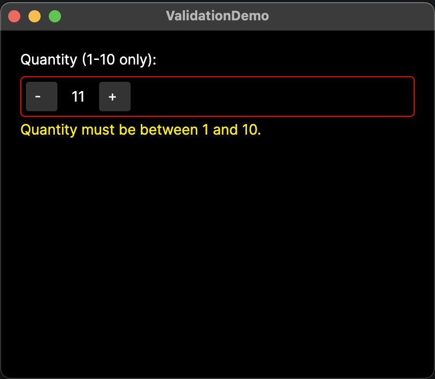
- QuantitySelector.axaml
- QuantitySelector.axaml.cs
- MainWindowViewModel.cs
- MainWindow.axaml
<UserControl xmlns="https://github.com/avaloniaui"
             xmlns:x="http://schemas.microsoft.com/winfx/2006/xaml"
             xmlns:local="using:ValidationDemo"
             x:Class="ValidationDemo.QuantitySelector"
             x:Name="root">

    <UserControl.Styles>
        <!-- Set the default color in Styles, not in the control itself.
             Colors set directly in the control override the :error style. -->
        <Style Selector="Border#Frame">
            <Setter Property="BorderBrush" Value="Gray" />
        </Style>
        <!-- Set the :error pseudoclass on the QuantitySelector. -->
        <Style Selector="local|QuantitySelector:error Border#Frame">
            <Setter Property="BorderBrush" Value="Red" />
        </Style>
    </UserControl.Styles>

    <DataValidationErrors Owner="{Binding #root}">
       <!-- Custom control layout goes inside DataValidationErrors. -->
       <Border x:Name="Frame" BorderThickness="1"
                CornerRadius="4" Padding="4">
           <StackPanel Orientation="Horizontal" Spacing="8">
                <Button Content="-" Click="DecreaseButtonClick" Width="32"/>
                <TextBlock Text="{Binding #root.Value}"
                           MinWidth="24" TextAlignment="Center"
                           VerticalAlignment="Center"/>
               <Button Content="+" Click="IncreaseButtonClick" Width="32"/>
            </StackPanel>
       </Border>
    </DataValidationErrors>

</UserControl>
using Avalonia;
using Avalonia.Controls;
using Avalonia.Data;
using Avalonia.Interactivity;

namespace ValidationDemo;

public partial class QuantitySelector : UserControl
{
    public QuantitySelector()
    {
        InitializeComponent();
    }

    // Register Value as a new styled property.

    public static readonly StyledProperty<int> ValueProperty =
        AvaloniaProperty.Register<QuantitySelector, int>(
            nameof(Value),
            defaultValue: 1,
            defaultBindingMode: BindingMode.TwoWay,
            enableDataValidation: true);

    // Provide a getter and setter for Value.
    public int Value
    {
        get => GetValue(ValueProperty);
        set => SetValue(ValueProperty, value);
    }

    // Create events for the buttons to decrease or increase Value.
    private void DecreaseButtonClick(object? sender, RoutedEventArgs e)
    {
        Value--;
    }

    private void IncreaseButtonClick(object? sender, RoutedEventArgs e)
    {
        Value++;
    }
}
using System;
using System.Collections;
using System.ComponentModel;

namespace ValidationDemo.ViewModels;

// View model implements INotifyPropertyChanged and INotifyDataErrorInfo to process data validation.
public partial class MainWindowViewModel : ViewModelBase, INotifyPropertyChanged, INotifyDataErrorInfo
{
    private int _quantity = 1;

    // Tell the binding to read the property for errors.
    public int Quantity
    {
        get => _quantity;
        set
        {
            if (_quantity == value)
                return;

            _quantity = value;
            PropertyChanged?.Invoke(this, new PropertyChangedEventArgs(nameof(Quantity)));

            ErrorsChanged?.Invoke(this, new DataErrorsChangedEventArgs(nameof(Quantity)));
        }
    }

    // Define error conditions and the error message to display.
    public bool HasErrors => _quantity is < 1 or > 10;

    public IEnumerable GetErrors(string? propertyName)
    {
        if (propertyName == nameof(Quantity) && HasErrors)
            return new[] { "Quantity must be between 1 and 10." };

        return Array.Empty<string>();
    }

    public event PropertyChangedEventHandler? PropertyChanged;
    public event EventHandler<DataErrorsChangedEventArgs>? ErrorsChanged;
}
<!-- Ensure DataType is coming from the view model where Quantity is defined. -->
<Window xmlns="https://github.com/avaloniaui"
        xmlns:x="http://schemas.microsoft.com/winfx/2006/xaml"
        xmlns:vm="using:ValidationDemo.ViewModels"
        xmlns:local="using:ValidationDemo"
        x:Class="ValidationDemo.Views.MainWindow"
        x:DataType="vm:MainWindowViewModel"
        Title="ValidationDemo">

    <!-- Put the custom control in the main window and bind Value to Quantity. -->
    <StackPanel Margin="20" Spacing="8">
        <TextBlock Text="Quantity (1-10 only):"/>
        <local:QuantitySelector Value="{Binding Quantity}" />
    </StackPanel>

</Window>
Attached properties
An attached property lives in its own container class and is configured on compatible controls in XAML. This allows you to have additional properties that are not part of your custom control's own control class. For example, you may wish to use an attached property to allow child elements to specify their own layout positions within the parent custom control. (See Custom Panel for a practical example.)
Naming conventions
- Like styled properties, the static field for the attached property follows the pattern
[PropertyName]Property. - The name parameter is
[PropertyName]alone (without thePropertysuffix).
Registering an attached property
- Add a new container class inheriting from
AvaloniaObject. - Use the
AvaloniaProperty.RegisterAttachedmethod to register the attached property. - Provide a CLR getter and setter that call
GetValueandSetValuerespectively. - Further define the behavior of the property, as necessary.
The following example creates an attached property called IsDimmed in a standalone file DimExtensions.cs. It is a Boolean property that renders a control at 50% opacity when True.
using Avalonia;
using Avalonia.Controls;

namespace MyApp;

// Attached properties live in a container class that inherits from AvaloniaObject.
public class DimExtensions : AvaloniaObject
{
    // Register the attached property. The type arguments are:
    //    <owner class, type it can be set on, value type>.
    public static readonly AttachedProperty<bool> IsDimmedProperty =
        AvaloniaProperty.RegisterAttached<DimExtensions, Control, bool>("IsDimmed");

    // Provide static getter and setter. The XAML system finds these by name.
    public static void SetIsDimmed(Control element, bool value) =>
        element.SetValue(IsDimmedProperty, value);

    public static bool GetIsDimmed(Control element) =>
        element.GetValue(IsDimmedProperty);

    // React when the value changes.
    static DimExtensions()
    {
        IsDimmedProperty.Changed.AddClassHandler<Control>((control, _) =>
            control.Opacity = GetIsDimmed(control) ? 0.5 : 1.0);
    }
}
Using the attached property in XAML
Declare the namespace in XAML. Then, set the attached property using dot notation.
The following example shows the IsDimmed attached property from the previous section applied to two buttons. The second button renders at half opacity because it is given IsDimmed=True.
<StackPanel>
    <Button Content="Normal" />
    <Button Content="Dimmed" local:DimExtensions.IsDimmed="True" />
</StackPanel>
Common pitfalls
- Mismatched names. The
nameargument you pass toRegistermust match the CLR property name exactly. A mismatch causes errors at run-time. - Using
SetValuewith a direct property. Direct properties requireSetAndRaise. CallingSetValuethrows anInvalidOperationException. - Adding a backing field for a styled property. Styled properties store values inside the Avalonia property system. If you read from a local field, you will get stale data. Always use
GetValueandSetValue. - Forgetting to call
base.OnPropertyChanged. If you overrideOnPropertyChanged, always call the base implementation first so the framework can process the change.
See also
- Avalonia property system: Full reference for styled, direct, and attached properties.
- Property value precedence: How Avalonia resolves competing property values.
- Metadata and callbacks: Default values, coercion, and validation.
- Validation in data binding: Validation approaches available to a view model, and customizing how errors are displayed.
- Defining events: Add routed events to your custom controls.
- Creating custom controls: Overview of the custom control types you can add properties to.